True Web Design
A system for well-structured and fully-responsive websites
The web has been a beautiful mess.
Visit your favourite landing pages. Each is beautiful in their own style until you use the Reader View option of your browser, or of the Elo extension. Then, you'd realize the mess in their structure.
The primary and reader views of stripe.com, showing good design and poor structure respectively.
The primary and reader views of apple.com, showing good design and poor structure respectively.
The primary and reader views of figma.com, showing good design and poor structure respectively.
The primary and reader views of linear.app, showing good design and poor structure respectively.
The primary and reader views of netlify.com, showing good design and poor structure respectively.
For ease of styling, webpages, which are literally documents, stopped being documents. They became shadows of their true self, ever since almost their inception.
When the web came to be over 3 decades ago, to share documents of information on the internet, one HTML element, because of the limited CSS properties at the time, tilt the trajectory of web design: the table element.
Table elements, meant to create multidimensional content, became a hack for multidimensional layout, all to make documents look more presentable on the web, like it is in magazines.
The unsemantic use of table elements died when CSS caught up with creating multidimensional layouts. However, the idea of tables continued to live. Div elements, which are "semantically" valid, became table containers, rows, and cells.
Ever since, we stopped marking for content; we started marking for style. The line between semantics and non-semantics blurred. All normalised, so far the interactables interact.
Webpages are now a bunch of text, not information. The web no longer consist of structured content.
Everything seems fine because majority of users, most of sighted users, derive meaning from how styles stitch content together.
Damned are the sighted users who'd prefer to use Reader Views.
Damned are the non-sighted users who must use Screen Readers to access a site, heavily depending on the structure to navigate their way.
Damned is the future of the web. The machine-readability and page extensions that depend on semantic structure of content.
While document structure is the basis — the first step, there is more to creating well-structured documents. More of making the page fully responsive on the frontend, before delving to the backend.
True Web Design, besides advocating for a well-structured document, furthers Responsive Web Design. Not only should a page be responsive to user's device width, it should also be responsive to user's preference of text size, typeface, color hue, and other document properties.
These are the true way.
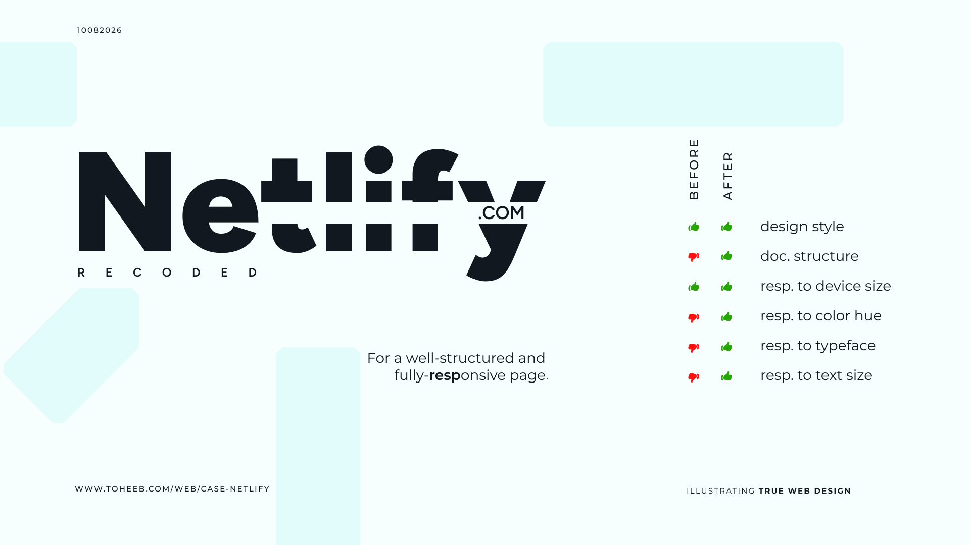
Truing Netlify.com A case study on recoding netlify.com with True Web Design.
Main Ingredients
Style Guide; for document flow, and responsiveness beyond device size.
Container Query; over Media Query, to ensure responsiveness to text size.
OKLCH; over other color formates, for its perceptual uniformity and human-friendly syntax, to ensure responsiveness fo a hue.
- Multi-class font; to ensure pages with multiple typefaces are maintained for any user's choice.