Engineering True Web Design — A Case Study
The universal UI system, tested on Stripe, Figma, Cursor, and all; proven on Smashing Magazine
It is mid 2026.
Over three decades into the existence of the World Wide Web. The web built on three core technologies, and refined by millions of articles on user experience.
Yet, somehow, what if I tell you — and then show you — that we've been coding web designs the wrong way all along? That we've been making fake web designs?
The industry is stuck in a retrogressing illusion of progress:
-
UI Designers craft web pages in free-form product design tools like Figma — Softwares disguised as web design tools, creating a false reality.
These tools aim to bridge the web gap with variables, auto-layout, and dev-mode. They forget that their achitecture, an absolute-positioning canvas at its core, fails to enforce the web's content model.
They design on content structured with frames, rectangles, and text boxes; ignoring the 100+ semantic elements defined by the HTML Living Standard, the primary technology of the web. The technology for user interaction.
Because these tools enforce little to no web constraints, designers are left ill-equipped to correctly flag, map, and architect visual elements for real-world developer handoffs; treating web designs like glorified print designs.
-
UI Developers and AI Agents inherit these flat mockups. Mockups whose content structure, which must be powered by HTML, is driven entirely by visual design, which will be powered by CSS — the second core web technology.
This creates a severe web anomaly. One where presentation now dictates structure, forgeting that the web once thrived without CSS.
Driven by a strict mandate to replicate these designs as it was shown, they code web interfaces that stopped being true web pages, that stopped being true web documents.
-
End Users end up with pages that look good in author mode — the raw presentation layer — and work well with a mouse in most cases.
However, because of the poor structure underneath, reader mode becomes a chaotic mess to read.
In any mode, navigation via keyboards, landmarks, headings, links, and so on, becomes completely unexpected.
Moreover, browser extensions, meant to help users enhance a page, becomes less and less relevant since the structure maintains no compliance with the standard.
In short, there's a systemic process where the tools fail the designers, the designers unknowingly fail the developers, and the developers ultimately fail the users.
Go and test the state of the web right now:
-
Visit your favourite homepage.
Go to Stripe, Vercel, Figma, Framer, Cursor, Lovable, Smashing Magazine, or just any page.
-
Wash off the make-up.
Use your browser's native Reader Mode, or the Reader Mode of the Elo Extension, to reveal the underlying structure of the page.
-
Analyze the skeleton.
See if what you see has a logical, readable flow; a simple test for document structure, for user interaction.
Confirming the good design and bad structure of the homepage of industry giants such as Stripe, Vercel, and Figma.
To reform the web design process, I introduced the True Web Design System, then stress-tested it on the homepage of one of the web's ultimate authorites: Smashing Magazine — the platform that host developers building and challenging the future of the web.
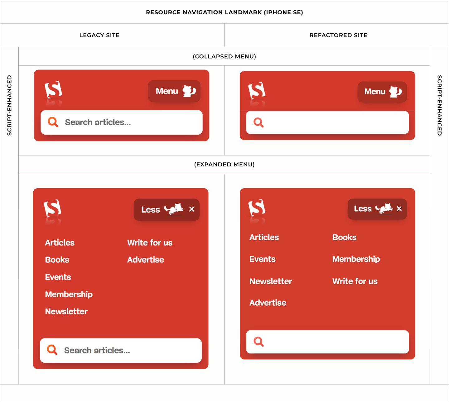
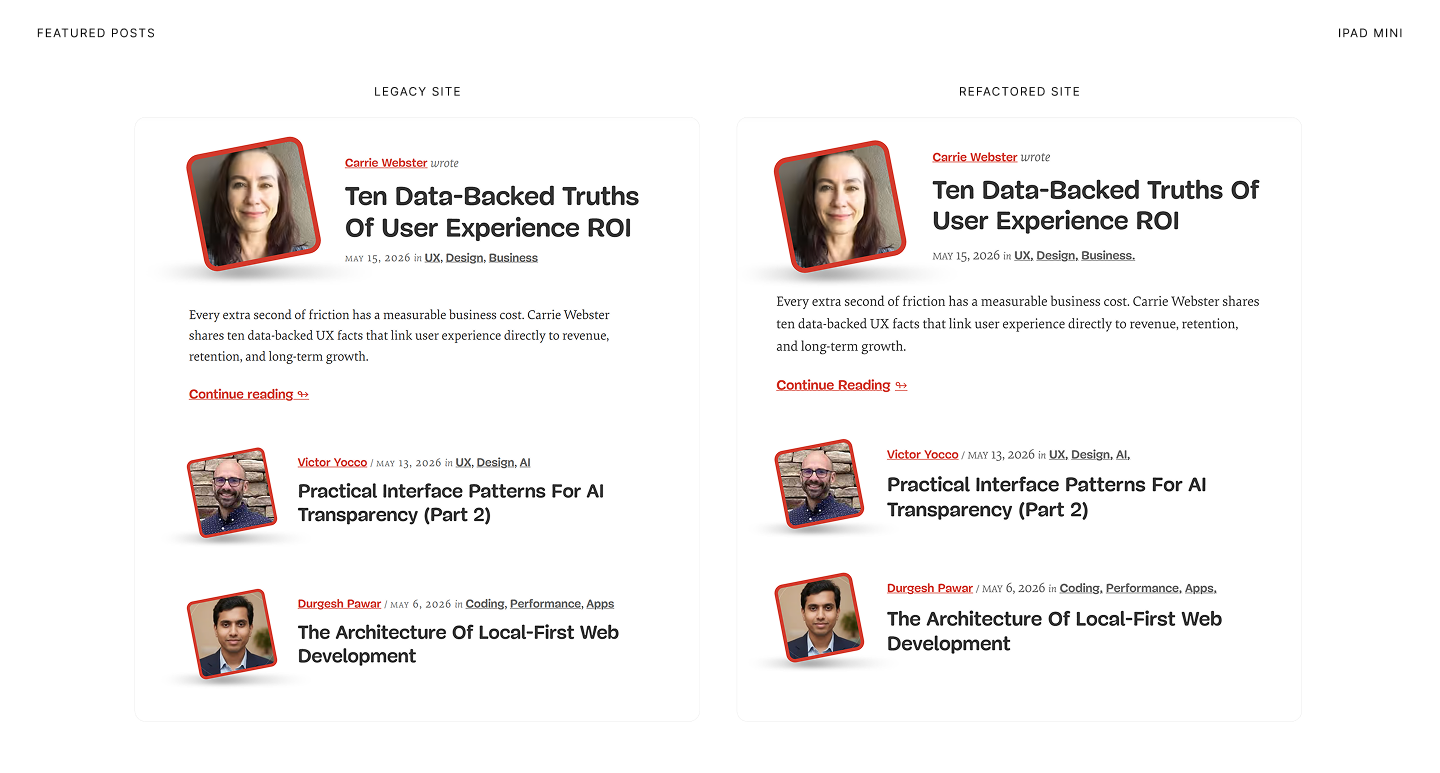
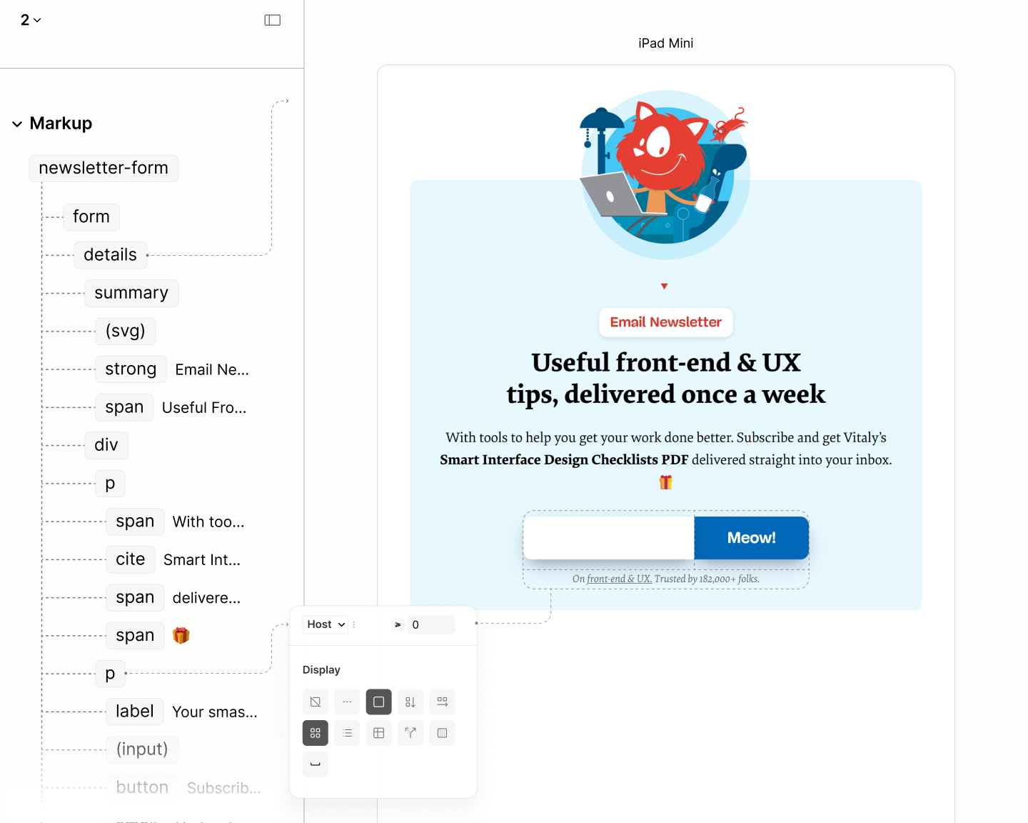
The following is a video of the author and reader modes of Smashing Magazine, side by side, respectively. A quick glance at the right shows the poor structure of the live site.
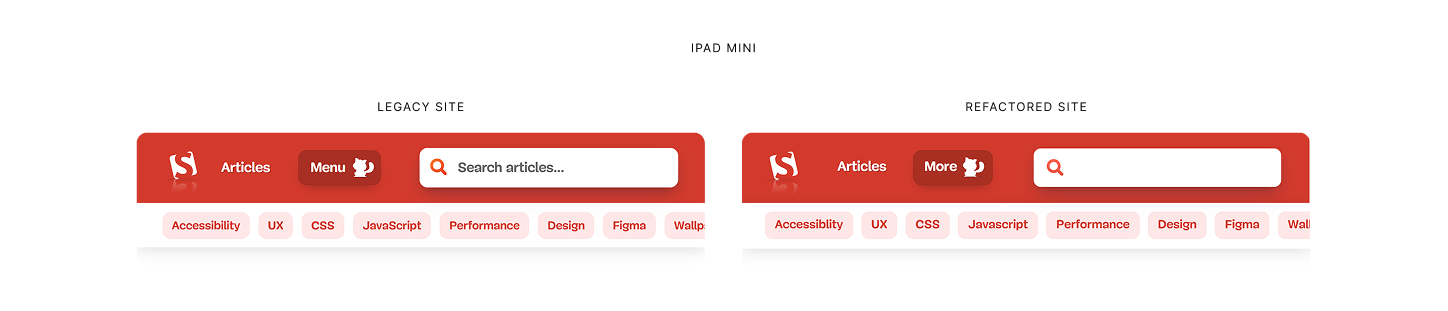
iPad Mini views of the author and reader modes of the Legacy Site, with their components scrolling simultaneously side by side.
Other responsive views
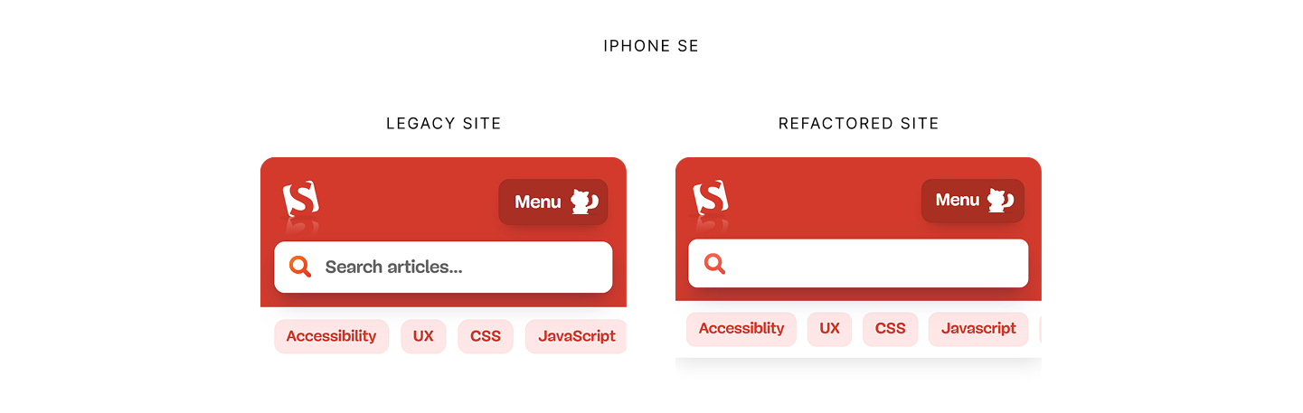
iPhone SE views of the author and reader modes of the Legacy Site, with their components scrolling simultaneously side by side.
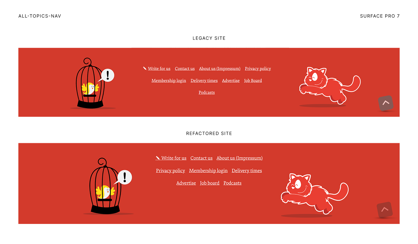
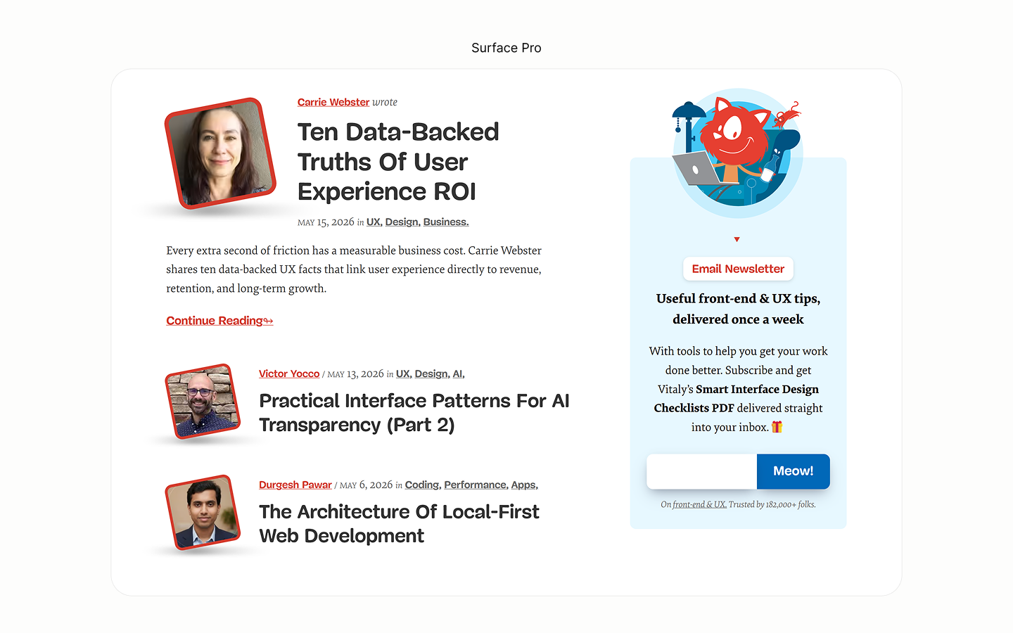
Surface Pro 7 views of the author and reader modes of the Legacy Site, with their components scrolling simultaneously side by side.
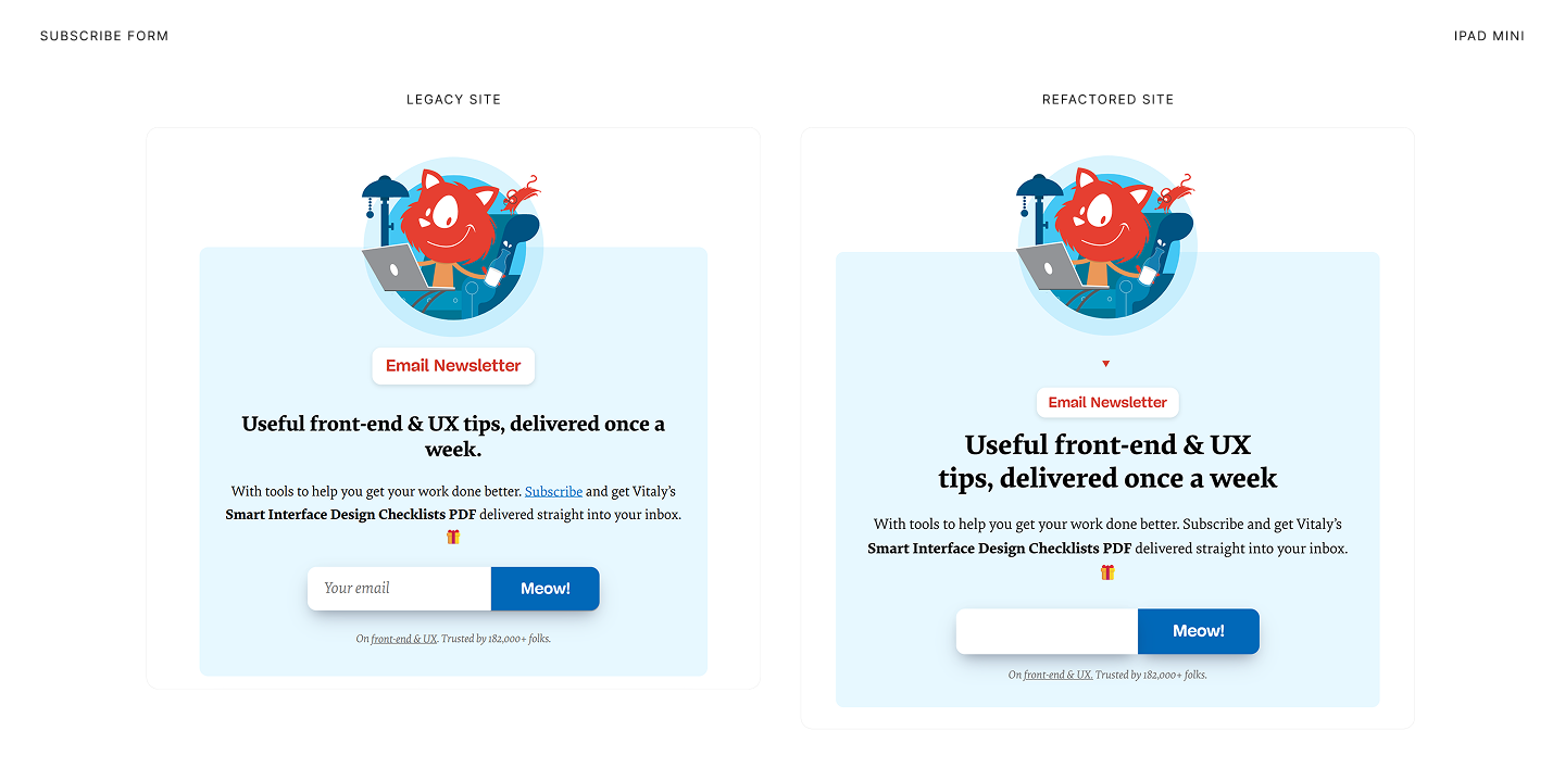
Refactoring the underlying structure of the page greatly improved not only the reading flow of the reader mode, but also the alternative navigation mechanisms for user interactions with content.
You can easily see which one looks like a document. Well structured. No superfluous headings.
iPad Mini views of the reader mode of the legacy and refactored sites, with their components scrolling simultaneously side by side.
Other responsive views
iPhone SE views of the reader mode of the legacy and refactored sites, with their components scrolling simultaneously side by side.
Surface Pro 7 views of the reader mode of the legacy and refactored sites, with their components scrolling simultaneously side by side.
True engineering and web constraints do no not compromise creative vision; they simply require a new approach. The refactored structure preserves the aesthetic design of the legacy site.
iPad Mini views of the author mode of the legacy and refactored sites, with their components scrolling simultaneously side by side.
Other responsive views
iPhone SE views of the author mode of the legacy and refactored sites, with their components scrolling simultaneously side by side.
Surface Pro 7 views of the author mode of the legacy and refactored sites, with their components scrolling simultaneously side by side.
Same design, yet better structure; engineered for the best user interaction possible.
iPad Mini views of the author and reader modes of the legacy and refactored sites, with their components scrolling simultaneously side by side.
Other responsive views
iPhone SE views of the author and reader modes of the legacy and refactored sites, with their components scrolling simultaneously side by side.
Surface Pro 7 views of the author and reader modes of the legacy and refactored sites, with their components scrolling simultaneously side by side.
To demonstrate this process — this approach to true web design — the following two subsections on the structure and design of the case study express the thought process. They put the Refactoring Code into relatable words with illustrations, videos, and footnotes.
NB The refactored design uses 2 breakpoints, 760px and 1200px, ensuring components in any column has at least one and a half alphabetical length.
Structure
The semantics that powers user interaction
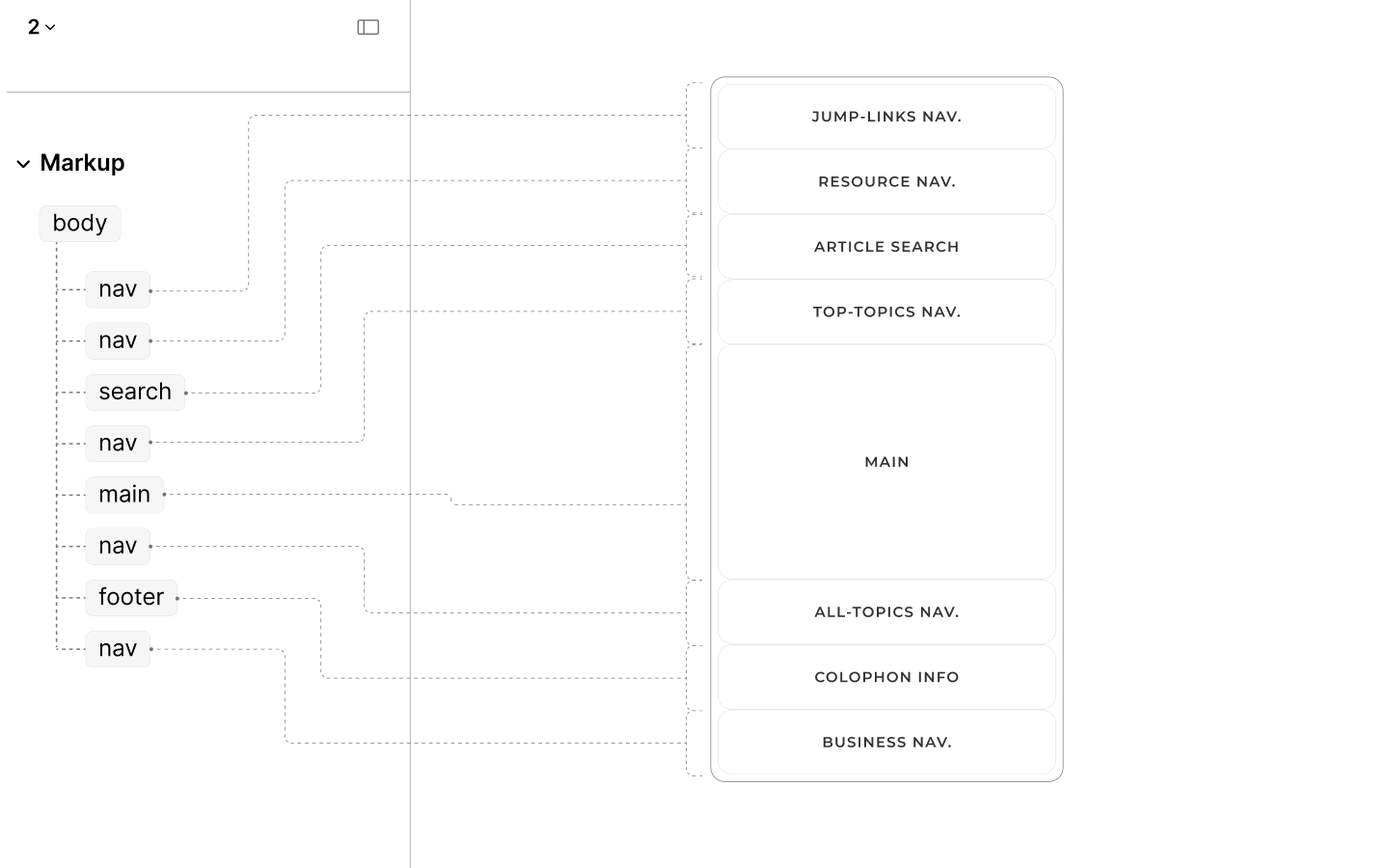
If at all, a web page, for it to be, must contain content — the primary content. This content should be in a Main Landmark to create the scope for other landmarks, such as for linking to other documents of the site.
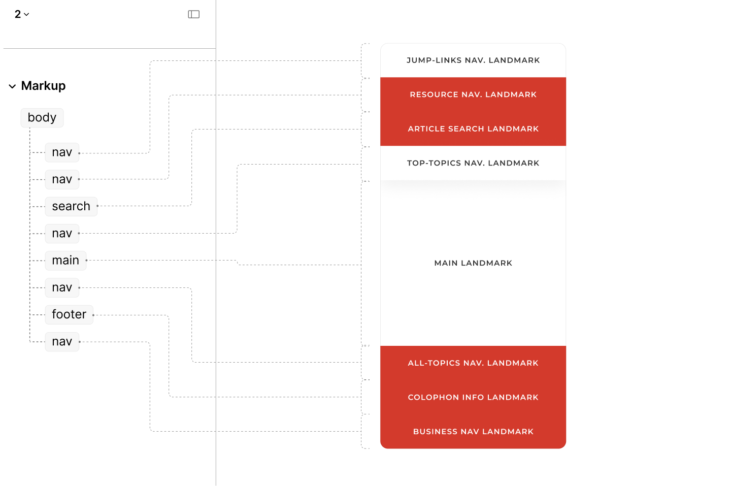
On Smashing Magazine, there are 5 landmarks.
Navigating the Legacy Site by landmarks, in Author and Reader Modes.
Those present landmarks, and the absence of some, come with at least five issues:
-
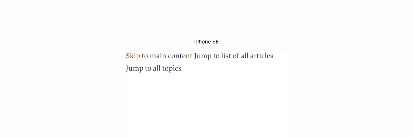
The Jump Links, as revealed at the start of the Reader View, are inaccessible to users navigating by landmarks, because of the lack of a containing landmark. They become ghosts.
-
The banner landmark is redundant. None of the content it contains, be it the links to resources or the form for searching articles, is for notification purpose.
One could guess it was there as a container for that reddish background in Author View, and as a landmark because it starts the page in Author Mode.
Either way, or for any other reason, the markup has been tainted.
-
The Mobile-only navigation landmark, the hack that introduces excess links of the "Main" Navigation Landmark, becomes a noise in the Reader Mode with its duplicate, inaccessible links.
-
Like the Jump Links, the Search Form area does not belong to a landmark. Another ghost.
The Content Info Landmark is over crowded. It contains more than it should chew. It contains diverse content: links for topics and businesses, separated by a colophon.
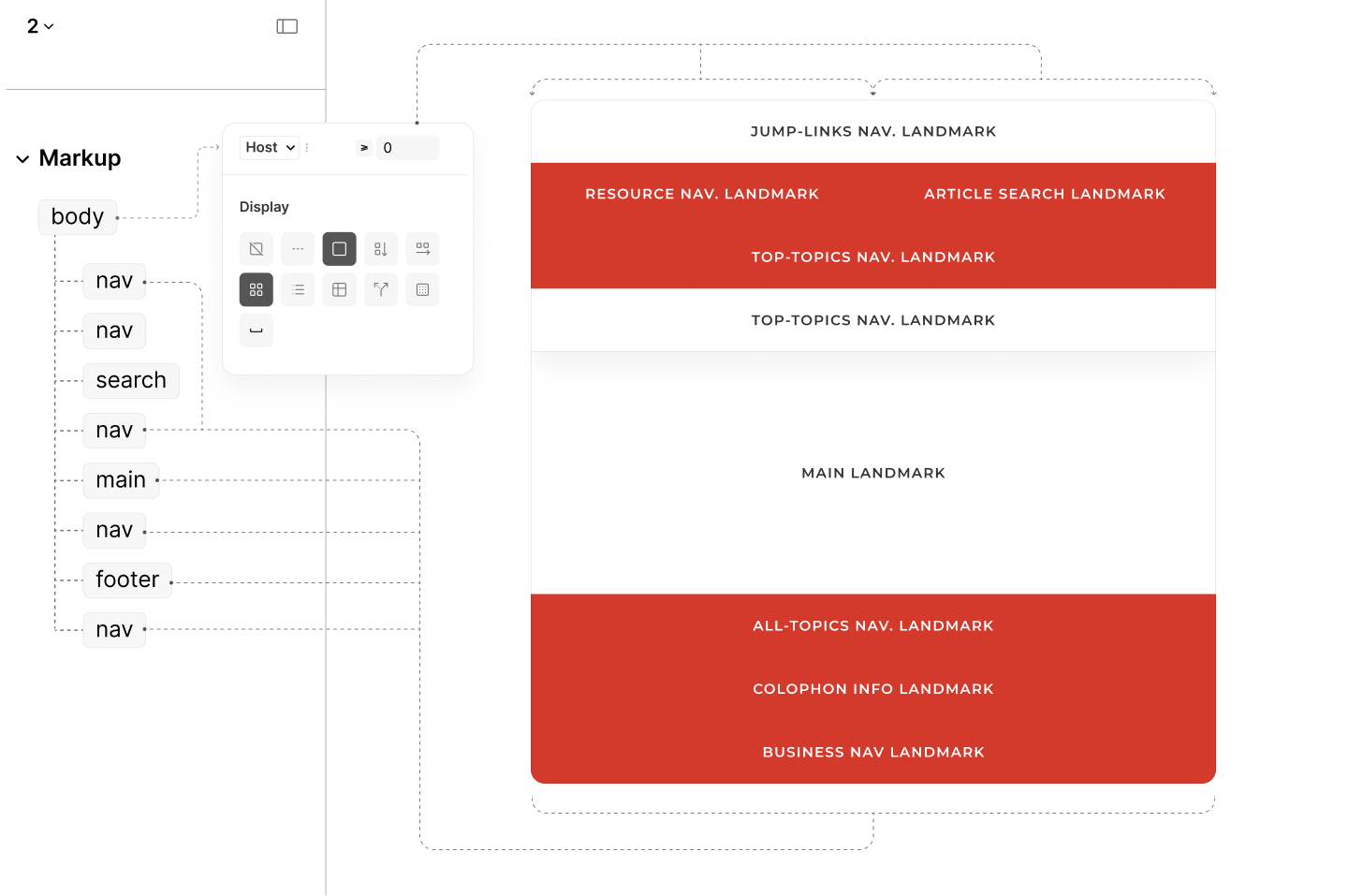
To avoid these issues, the Refactored Site employs 8 landmarks, as the content demands.
It starts with a navigation landmark for the Jump Links, followed by another for Resources, then, a search landmark for the Search Form, and, finally, a navigation landmark for the Top Topics, to complete the set before the main landmark.
After the Main Landmark, there is a navigation landmark to browse all topics, an Info Landmark for the brand's colophon, and a navigation landmark for the business links.
All without any wrappers.
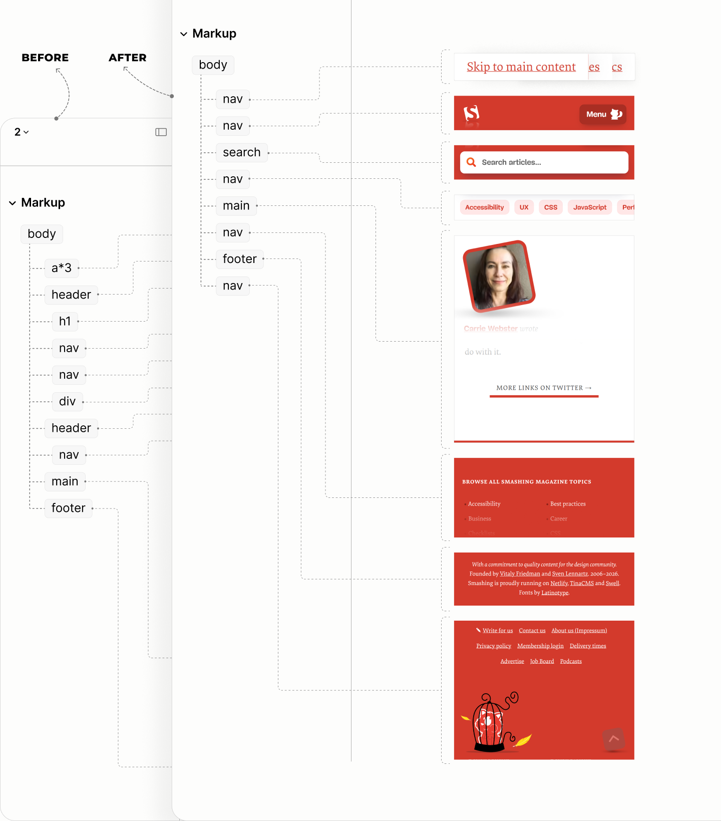
A comparison of the structure of landmarks in the legacy and refactored sites.
Jump Links Landmark
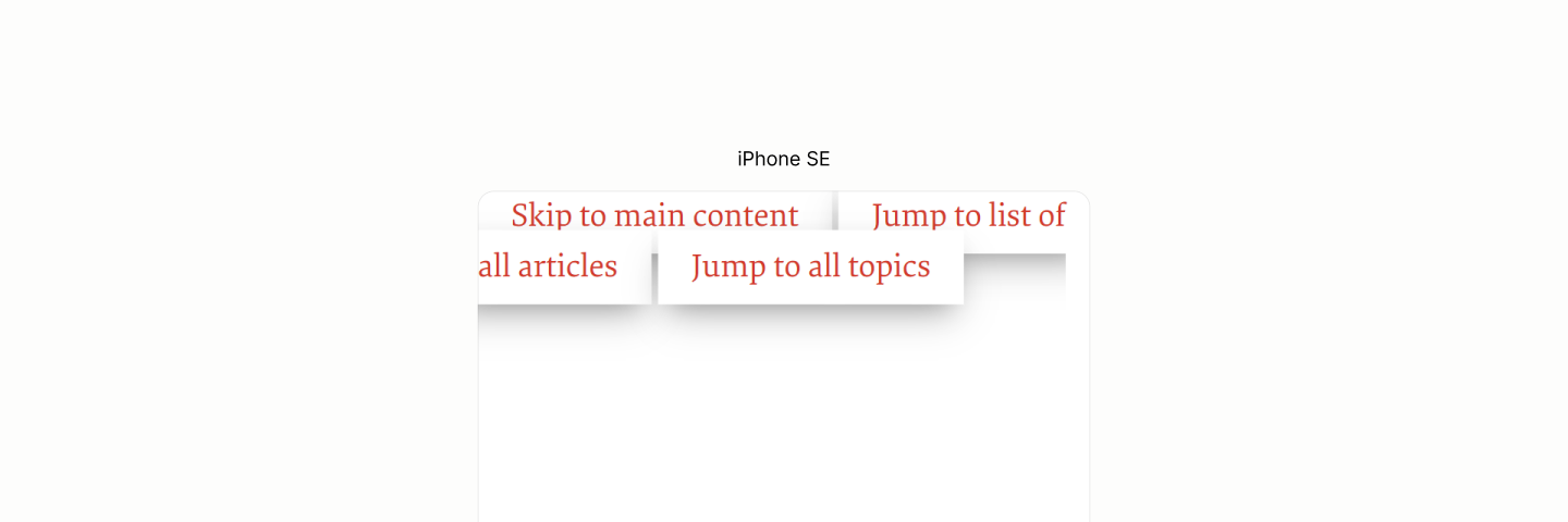
In the Legacy Site, Jump Links, while accessible to the keyboard navigation system, are inaccessible to the landmark navigation system. You can only tab into them.
Encounter with the first jump-link in author and reader modes of the Legacy site.
Rather, in the Refactored Site, those Jump Links rightfully claim their own landmark. By nesting them within a navigation landmark, they are elevated from digital orphans to discoverable links for the landmark system.
It takes no more than a paragraph to sufficiently contain these links.
This paragraph uses a title of Jump Links to label the set of those links.
Since the title does not contain a repetition of the landmark's name Navigation, it doubles as the landmark's label.
To avoid repetition of the labels by screen readers, the title is hidden to screen readers, leaving only the label of the landmark, even though the label is gotten from the title.
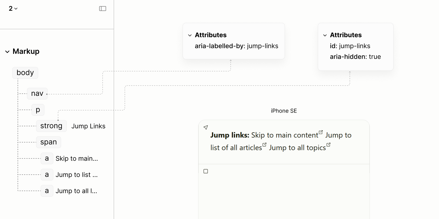
The structure and reader mode of the Jump Links navigation component.
Encounter with the first jump-link in the reader mode of the Legacy Site, vs in that of the Refactored site.
Resource Navigation Landmark
Following the Jump Links in the legacy site is a redundant banner landmark containing innuendoes: a link with a noisy label, wrapped in a misplaced heading; a primary navigation landmark with a confusing label; a duplicate navigation landmark that persists in the Reader Mode; and a mere container for the search form.
Composition of the Resource Navigation in the author and reader modes of the Legacy site.
All links in the now-defunct banner landmark has one thing in common: they are links to external pages; not links to different parts of a page, like the Jump Links.
These links, without any duplicate, make up one navigation landmark in the Refactored Site. By the nature of the content, it makes up the main navigation.
However, serving as the main navigation does not imply that the landmark be labeled "Main", as it was in the legacy site.
"Main" is a term reserved for one of the 8 landmarks, a compulsory landmark. Including it as a label for another landmark raises confusion.
Screen Readers will announce such landmark as "Main Navigation Landmark". Rather than interpreting "Main" as a qualifier for "navigation", a user may mistake the component for the "Main Landmark".
To avoid confusion, the Refactored Site drops a role-based labeling, such as "Main", for a content-based labeling, such as "Resource".
A comparison of the labels for the Resource navigation landmark and the main landmark in each of the legacy and refactored sites.
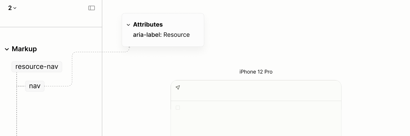
The structure and reader mode of an empty resource navigation landmark of the refactored site.
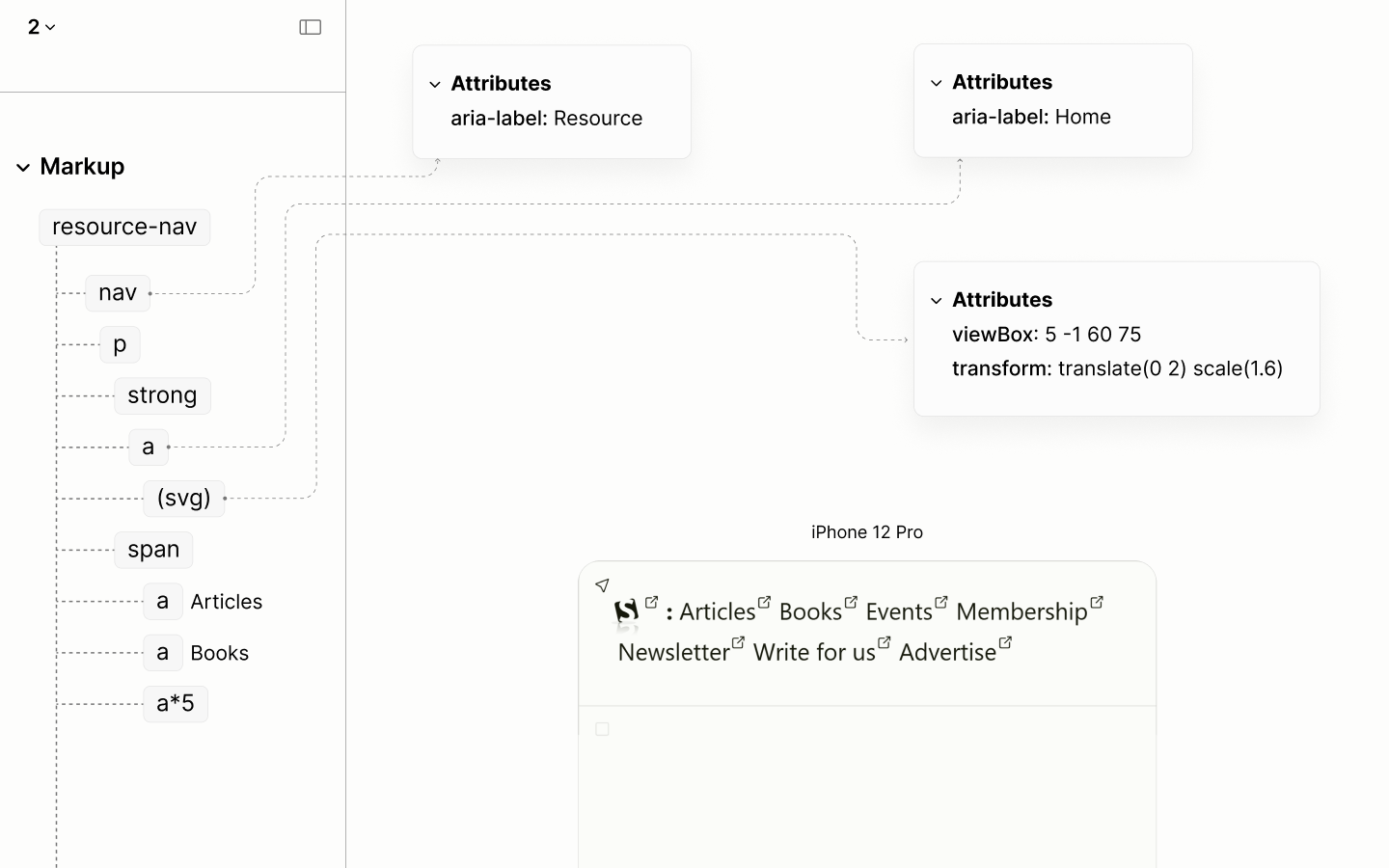
The first link, which contains the brand logo, linking to the homepage, requires two modifications:
-
Its lead status, which was via a heading in the legacy site, must be via the title of a paragraph.
Having a heading outside of the Main Landmark is like having a heading outside of the document.
Besides, placing the root heading — the very heading that should title only the current page — in a banner landmark that appears on every page of the site becomes meaningless. It is akin to giving every chapter of a book the exact same title.
-
Its label is simple and straightforward: Home.
It is unlike the legacy site which, not only mentions the purpose but also describes it, and describes the icon that accompanies it, creating noise.
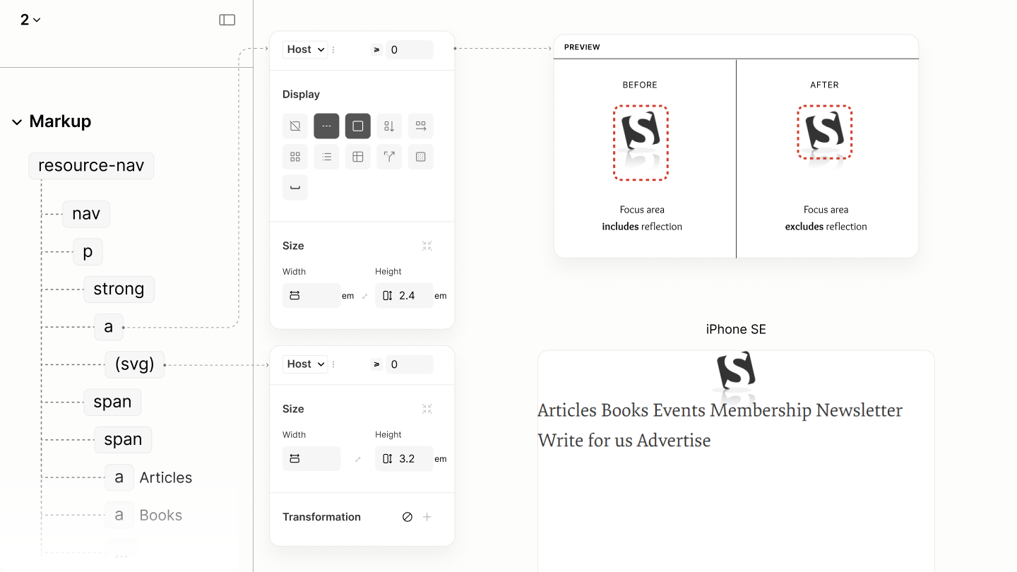
By design, the logo starts out as only a logomark, then, at the second breakpoint, when there's enough space considering other content, its includes the wordmark. 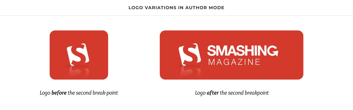
Because the Legacy Site uses a Picture Component to switch these two variants, the colors stopped being responsive. The initial white color of the logo, in anticipation for the reddish background in Author Mode, persist in the light mode of Reader Mode, which has a light background, making this logo becomes nearly invisible. 
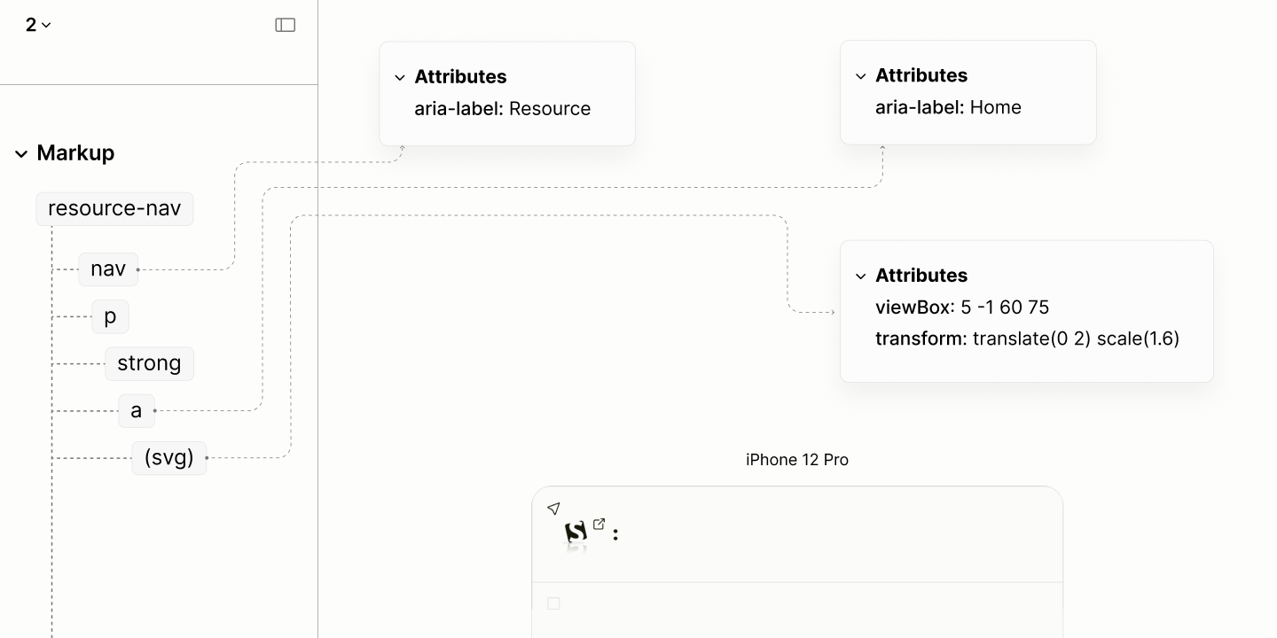
For a graphic to inherit the color of its text, and make good contrast with it background in Reader Mode, the Refactored Site leverages SVG. With the help of Javascript, the viewBox expands at the right time to ensure for responsive image content. 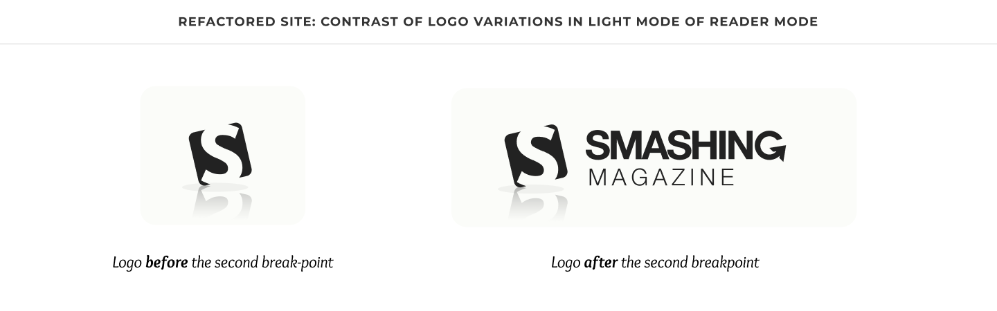
Because the logo comes with a reflection, a transform attribute applies on the SVG to make the baseline of the logo itself, not the reflection, align with the baseline of any text that comes after it.
The structure and reader mode of the refactored navigation, now with a title.
Following the Title, which contains the Home Link, is the Content containing a set of links to resources.
Unlike the Legacy Site, which wraps each link in a list item, the Refactored Site presents them as-is, for two reasons:
First, and more importantly, to prevent the set of links from occupying excessive vertical space in Reader View. 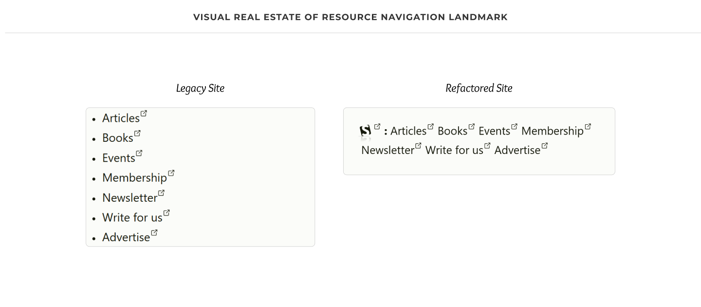
Second, to simplify the narration to screen reader users.
The structure and reader mode of the refactored navigation, now with its content.
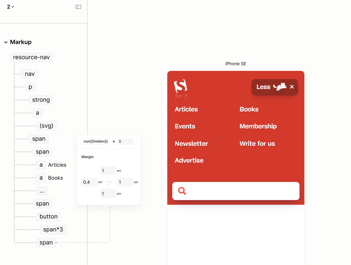
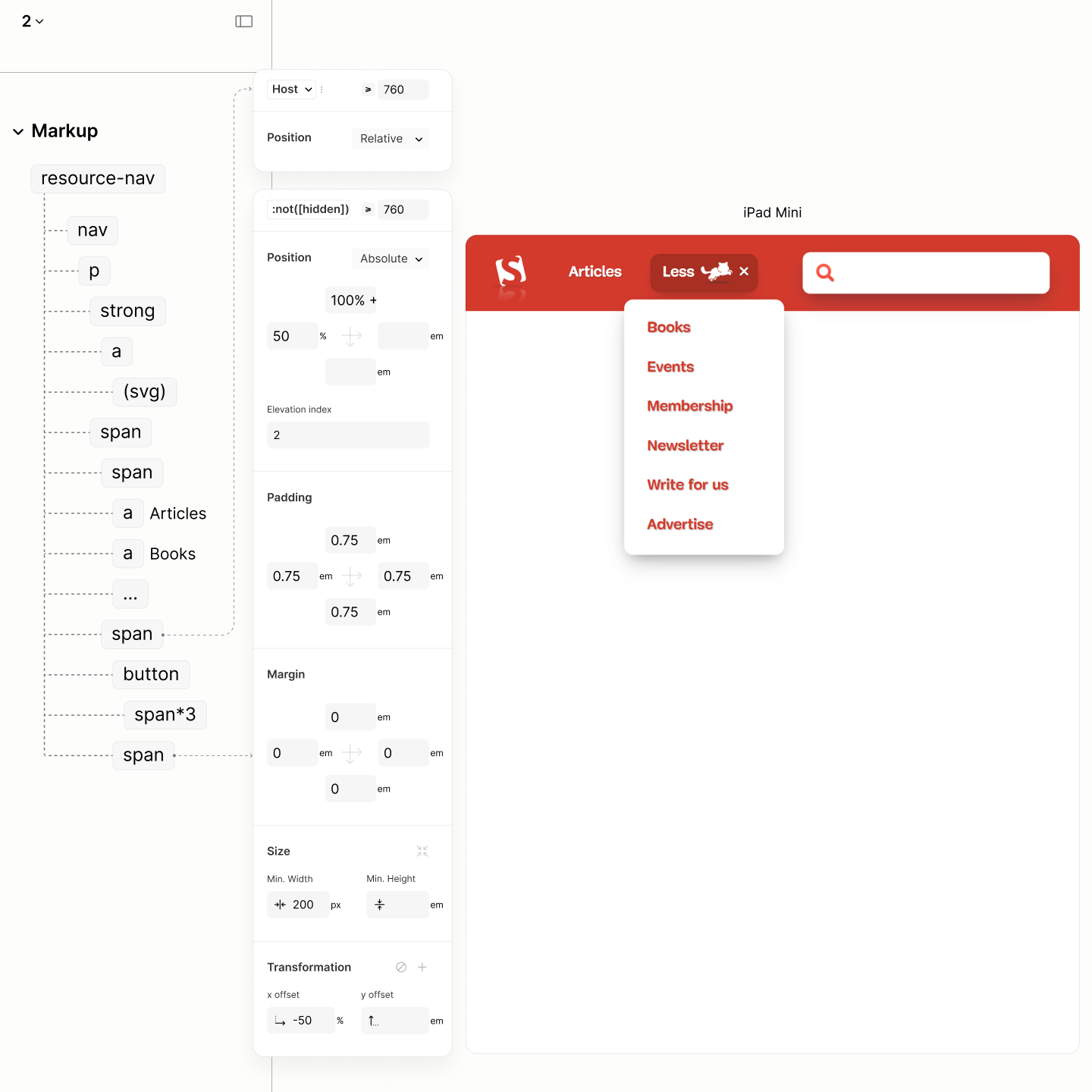
To facilitate the progressive disclosure of links in Author Mode on limited viewport, the Refactored Site groups the links in the Content as one unit, then add a hidden container, called More Part, to contain the structure for that functionality.
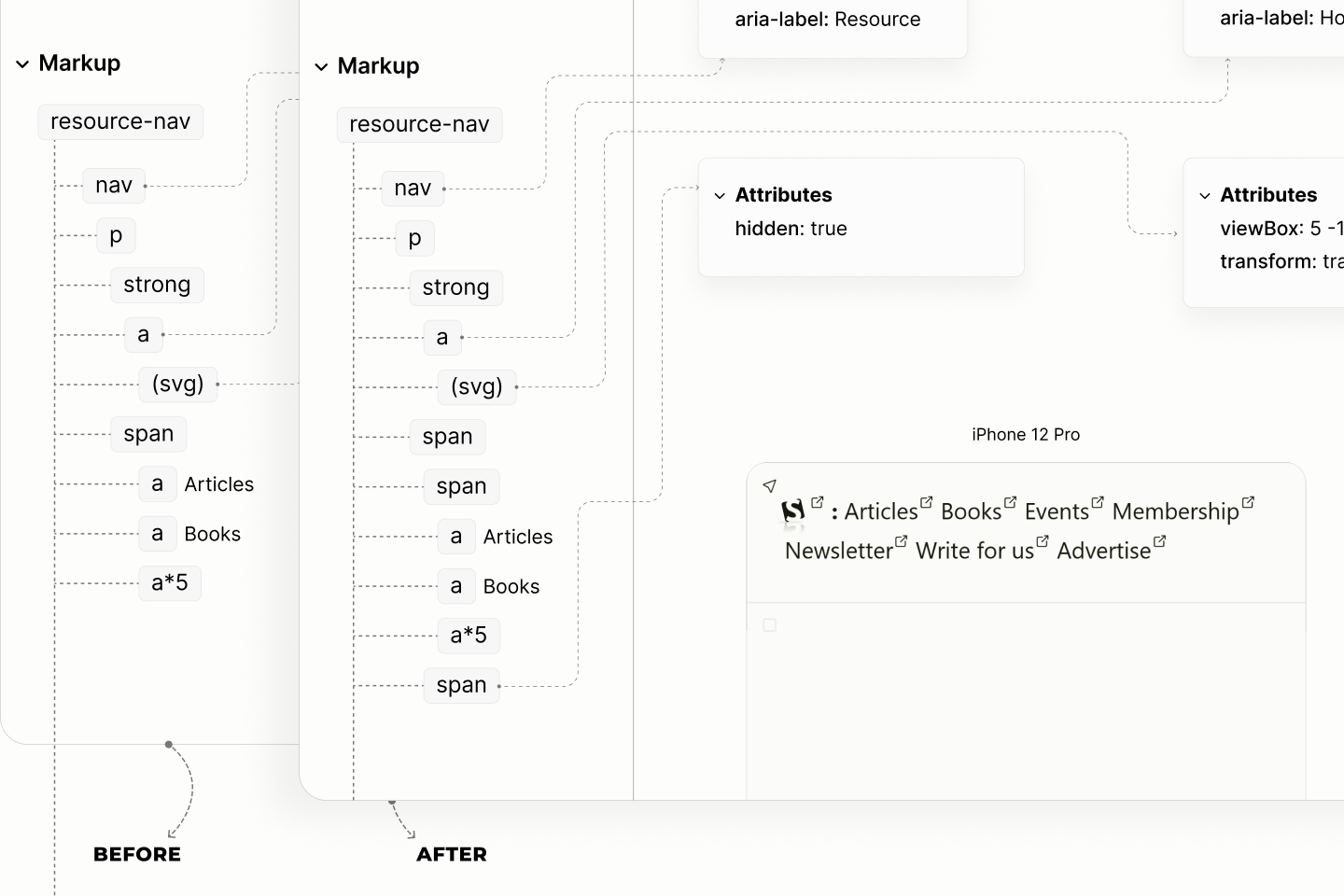
Highlighting the addition of a container in the structure to welcome the progressive functionality.
Hiding the span guarantees that the content enabling that functionality are only going to be available when the functionality is in effect.
This means there will be no redundant content, at any point in time, like it is in the Legacy Site. 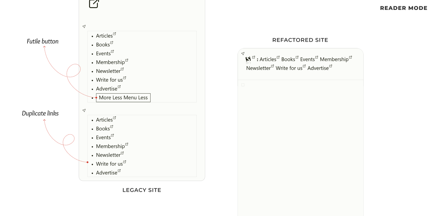
In hindsight, that hidden span contains a button called More Toggle, and a container called More Menu.
The toggle, which controls the display of the More Menu, hints at the state of the More Menu with 3 variants of content:
When the More Menu is opened, the content of the toggle is "Less" and two icons, hinting at the next action: closing the menu. Conversely, when the More Menu is closed, the toggle is one of two scenarios. If the More Menu contains all links, the content of the toggle is "Menu" and an icon, otherwise, it is "More" and same icon. 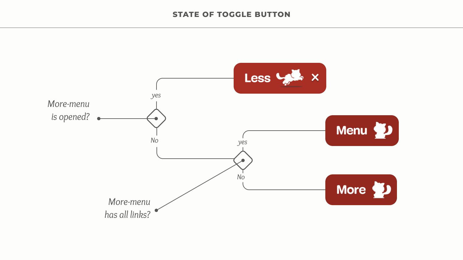
The More Menu starts out empty. The number of links it will contain depends on the no of links that can fit into the viewport beyond the first breakpoint.
If there is deficit in the More Menu, the equivalent number of links at the end of the Main Menu is moved to the start of the More Menu. Else, if there is excess, the equivalent number of links at the start of the More Menu is moved to the end of the Main Menu. 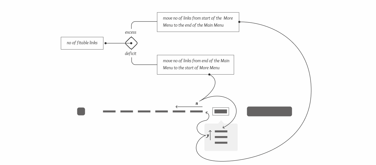
To avoid redundant elements, especially a useless toggle when there is no links in the More Menu, the display of the menu depends on the availability of links.
Whenever Main Menu is empty, it is hidden, else displayed. However, whenever the More Menu is empty, it the More Part that is hidden to also hide the toggle, else it is displayed.
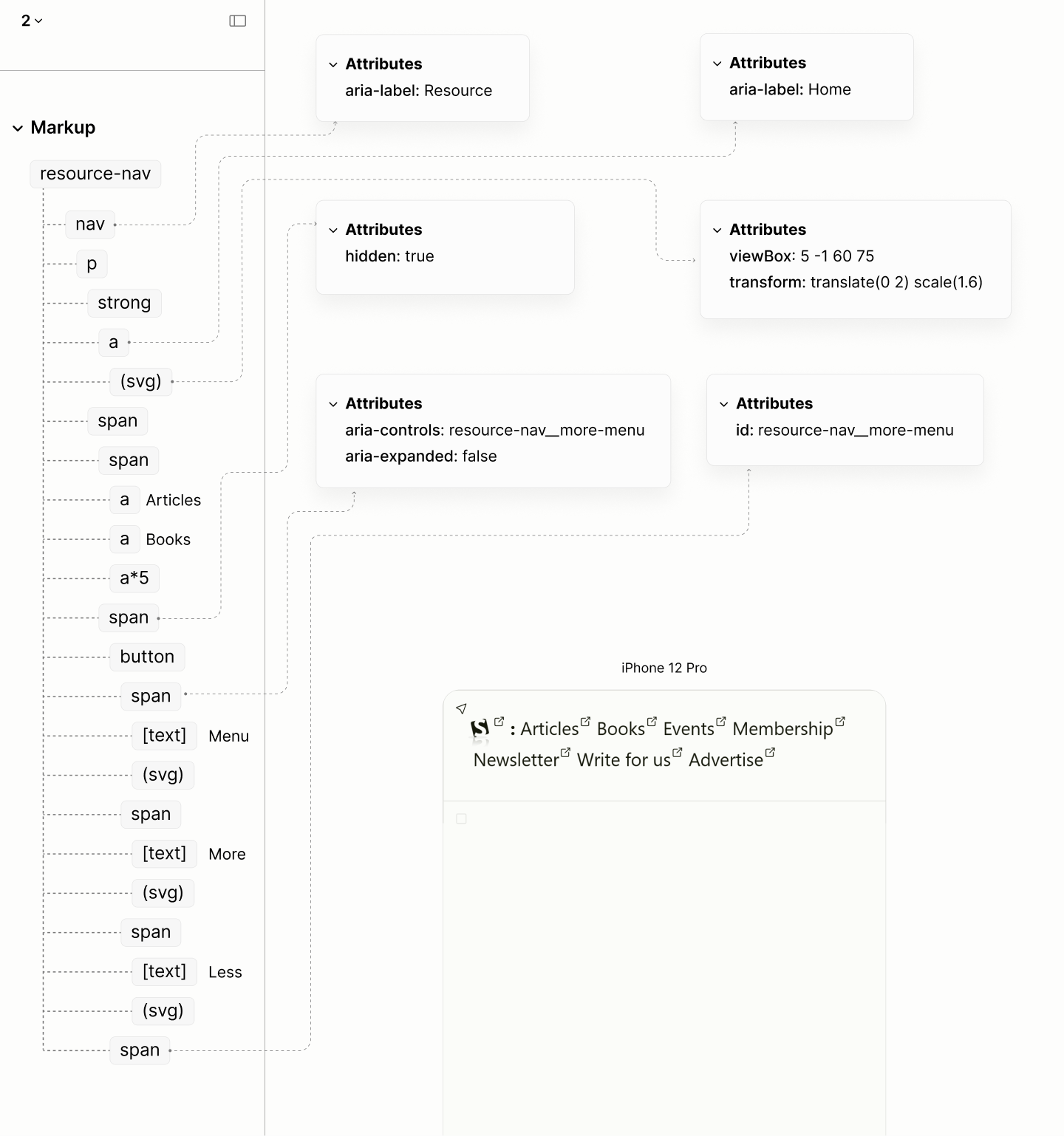
The structure and reader mode of the refactored site, now with elements for extensibility.
Composition of the Resource Navigation in reader modes of the Legacy Site vs the Refactored Site.
Article Search
Like the Jump Links, the Search Form within the reddish banner can't be reached with a landmark navigation.
Exposing the disregard of Search Form components, between the two mentioned landmarks, when navigating by landmarks in author and reader modes of the Legacy Site.
By its function, searching articles across the site, its container, rather than being an ordinary general container, should actually be a search landmark.
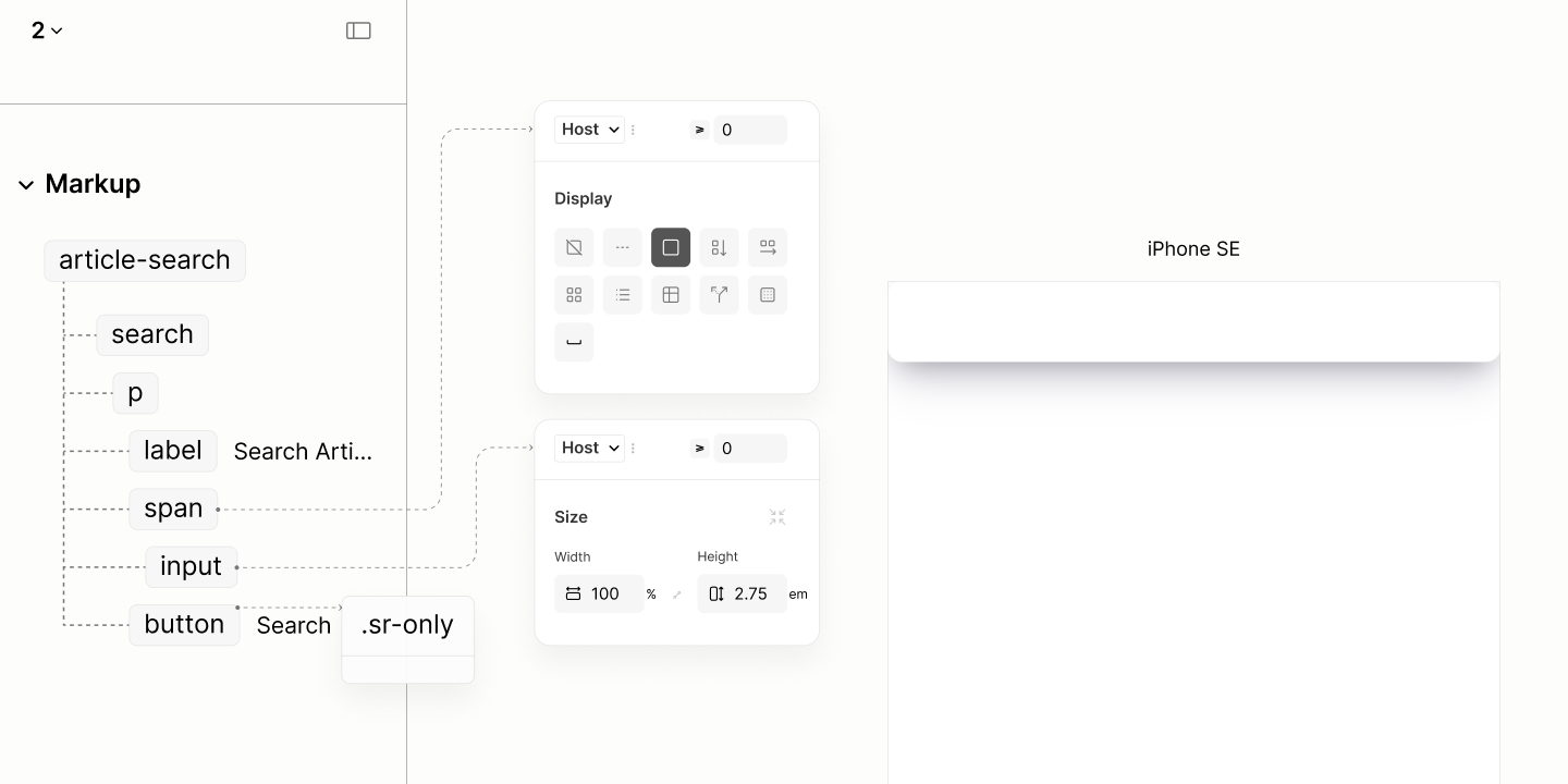
The search landmark contains a plain paragraph that contains 3 items: a search input, its respective label, and a submit button.
Placeholder have no place in the search input, like it does in the legacy site, since they are not translatable. The form label takes its place.
Unlike the Jump Links Navigation, this paragraph doesn't need a title. It already has a form label that names its primary content the search input.
The content of the form label, termed "Search Articles", would have doubled as the landmark label if it did not contain the "search" keyword, a repetition of the landmark name.
Instead, the landmark label is simply "Article". Screen Readers will append "Search Landmark" to make it "Article Search Landmark". This way, no repetition of keyword.
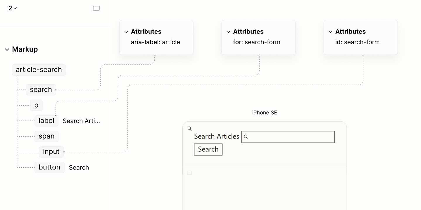
The structure and reader mode of the Article Search Landmark.
Checking the acknowledgement of the Search Form when navigating by landmarks in reader modes of the Legacy vs the Refactored Sites.
Following the Search Landmark, in production, will be a Region Landmark for the search results. A region landmark because none of the other 7 landmarks is a more specific landmark.
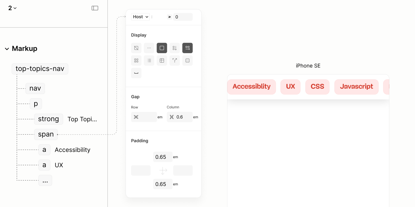
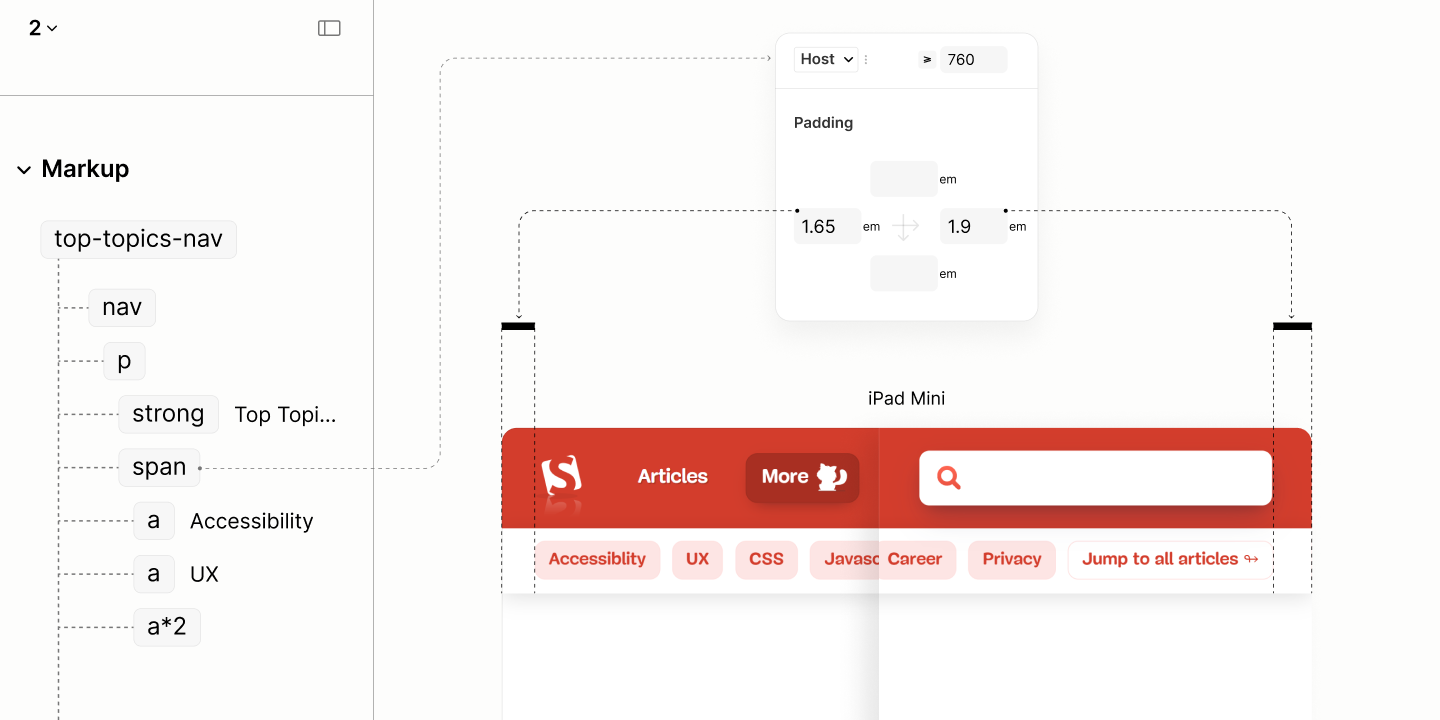
Top Topics
Like the red banner that wraps the Resource Navigation landmark, the white banner with drop shadow that follows, which wraps the landmark for Top Topics is redundant. Same reason: the content it contains is not for notification purposes.
Composition of the Top-Topics Component in author and reader modes of the Legacy Site, mentioning only the first link.
The structure is like that of Skip Links Navigation Landmark, but with a title of Top Topics.
This title doubles as the label of the landmark rather than the generic "secondary" term.
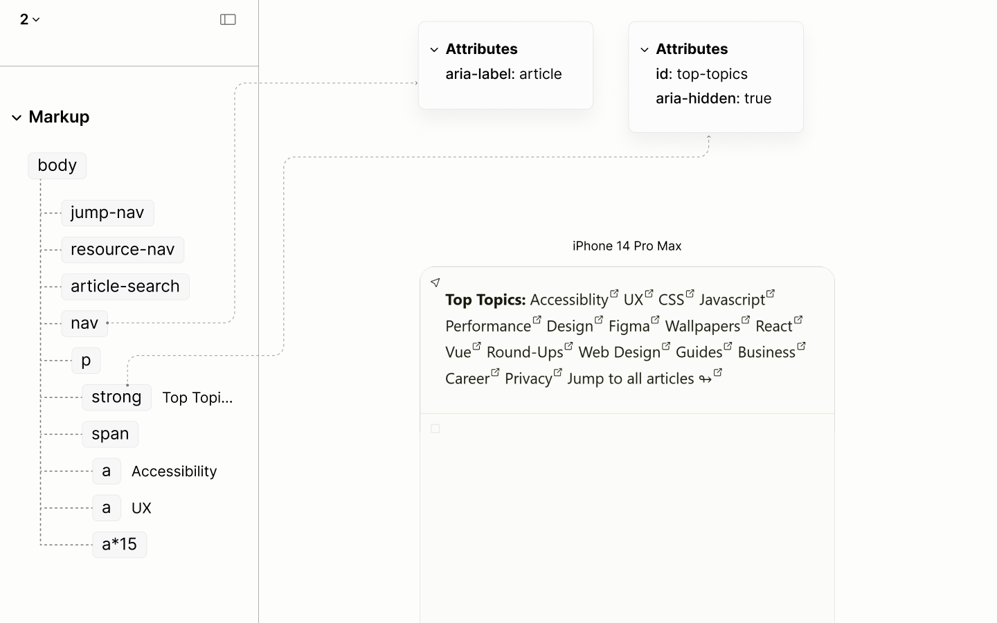
The structure and reader mode of the Top Topics Navigation landmark.
Composition of the Top-Topics Component in reader modes of the Legacy and Refactored Sites, mentioning only the first link.
Main Landmark
The Main landmark, which essentially functions as the document itself, lacks a root heading in the legacy site. What was supposed to be is declared in the banner landmark for all pages across the site.
Despite the lack of the root heading and, of course, its root section, the main landmark has 28 sub headings, most of which — roughly 74% — are false headings, creating false sub sections.
Showing the heading structure of Main Landmark in reader and author modes of the Legacy Site.
In the Refactored Site, the Main Landmark establishes a root heading with an appropriate content, and, of course, its section.
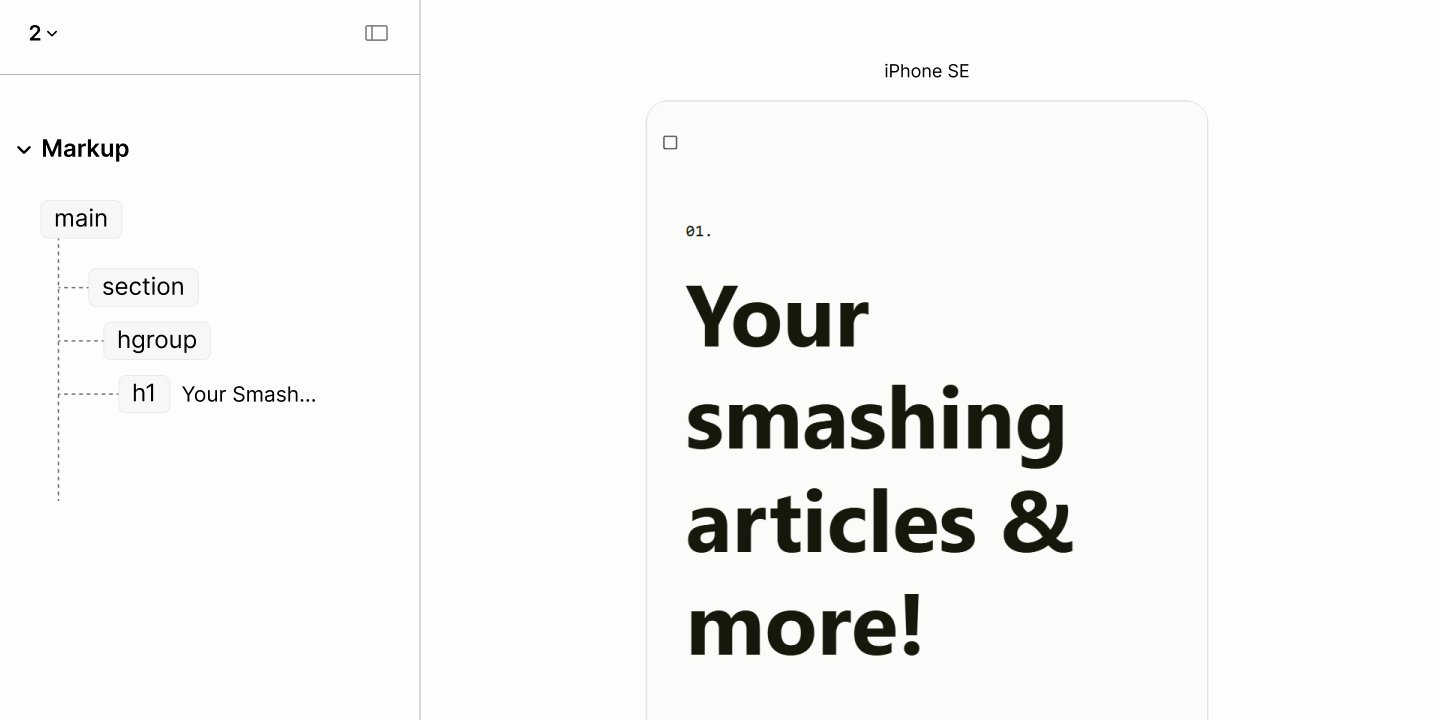
The structure and reader mode of the main landmark and the root heading.
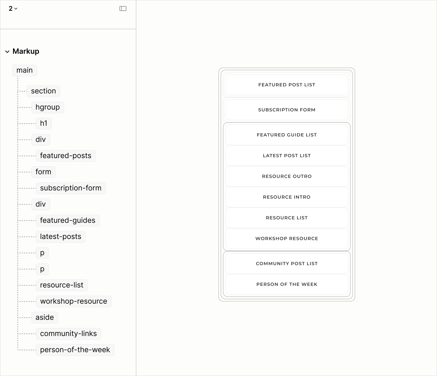
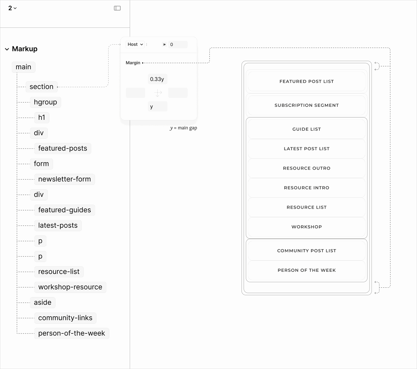
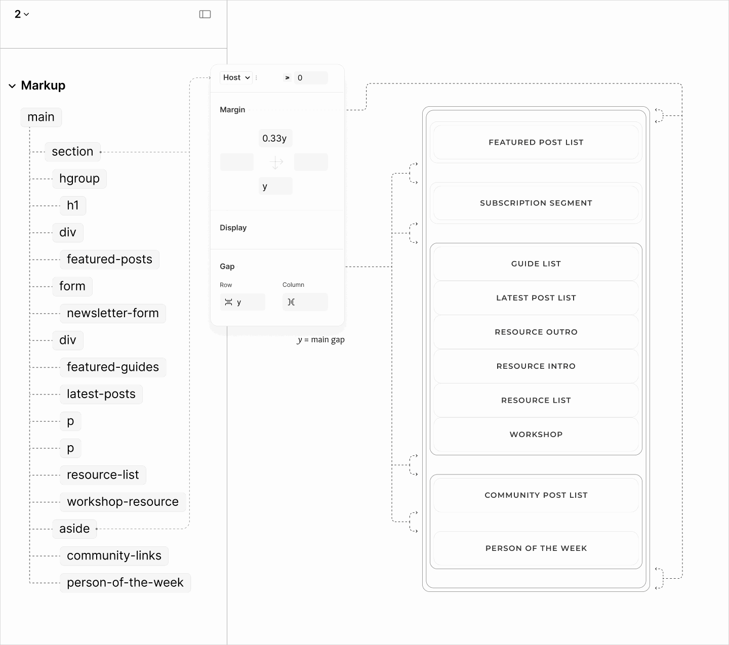
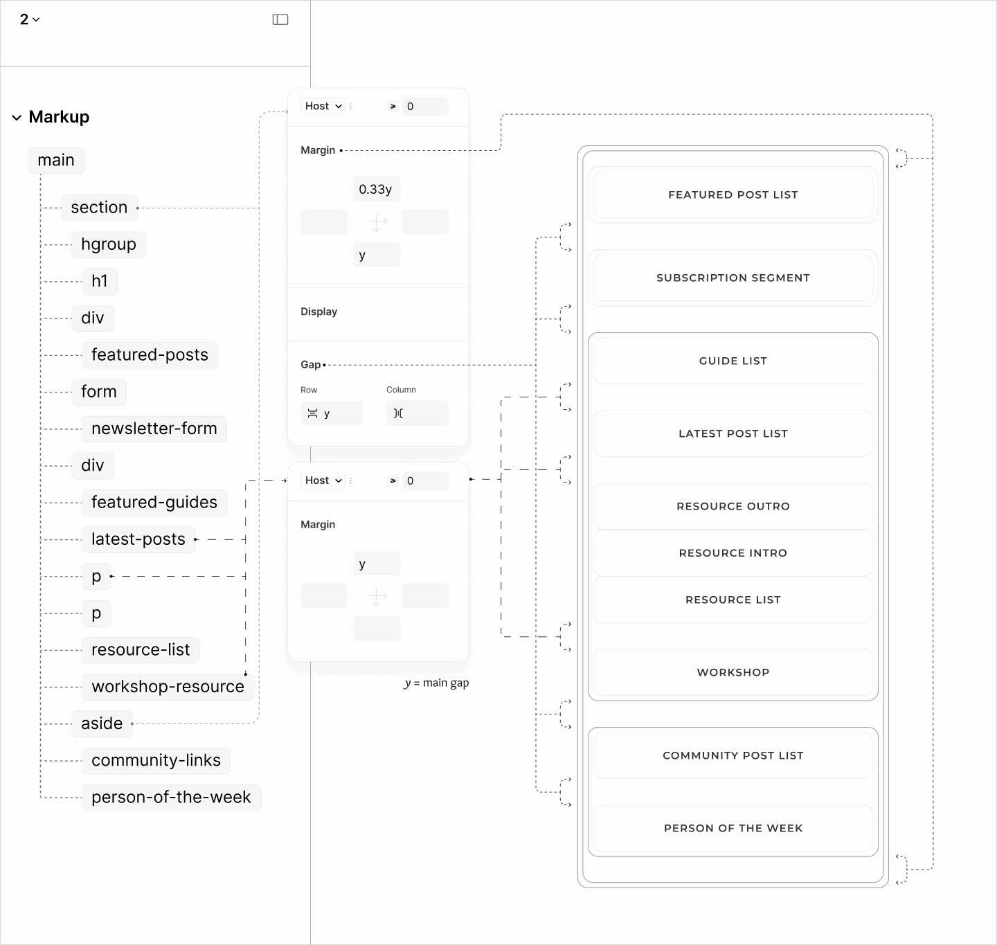
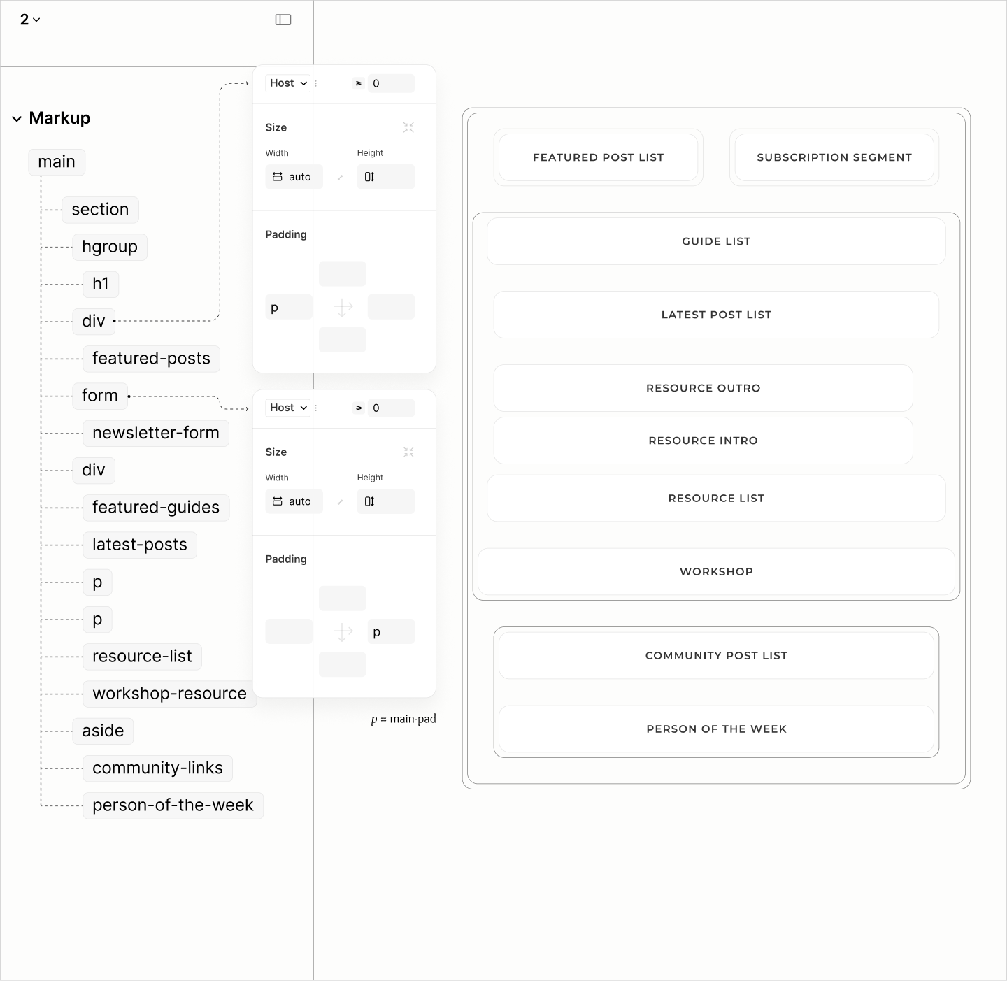
Following the heading group, a careful study of the document reveals the structure of the main landmark: 8 parts spread across 4 segments.
A breakdown of the Main landmark by segments and components
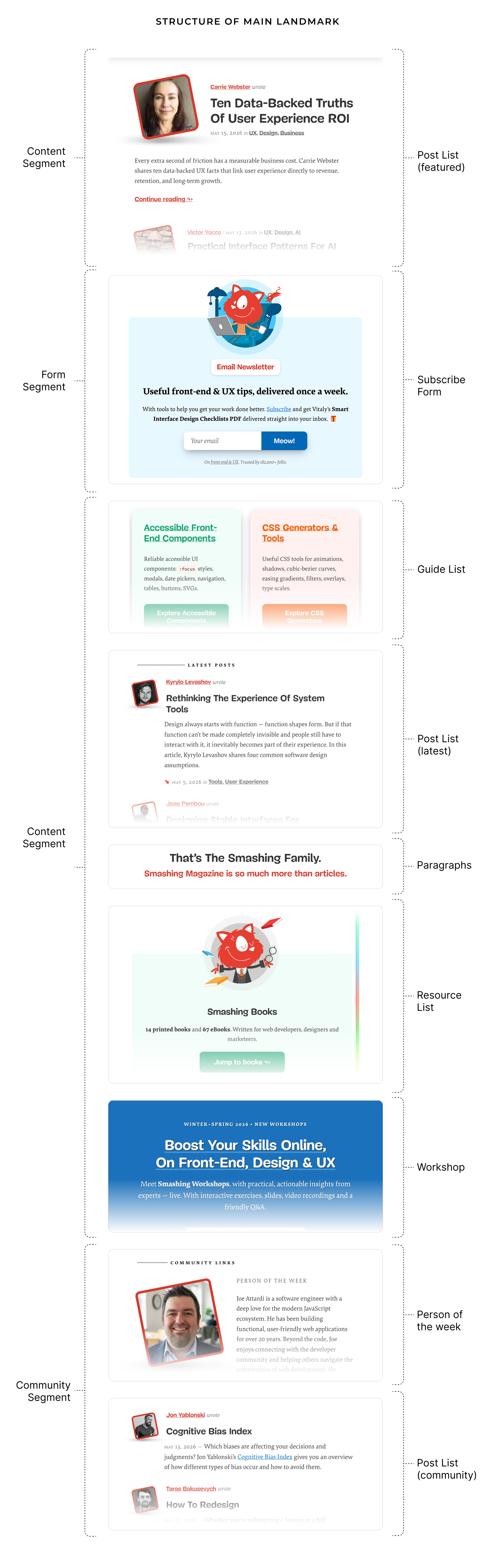
First, noticeably, is a form segment for newsletter subscription. Second, by third-party content, is a complementary segment for both Community posts and Person of the Week. Third, by first-party content, is a content segment which splits into two around the form segment.
The content segment before the form segment contains only Featured posts; while, within the second content segment is Latest posts.
Before the Latest Posts is Featured Guides; after are two paragraphs, a set of Resources and a Workshop.
The two paragraphs, which looked like a heading and a subheading, are actually sentences — not phrases, that creates an outro for preceding content, and an intro for succeeding content, respectively.
The structure and outline of the Content of the root section in the main landmark.
Post Lists
One of the issues across the three Post Lists is that all 17 post titles, marked as headings, are false headings. These are headings of different documents paraded as headings of the current document.
Navigating elements of distinct post items. In the Featured Posts that begins the page, the distinct items are the first two items. In other Post types, it is the first item. Beside, the others include the first element of the second item.
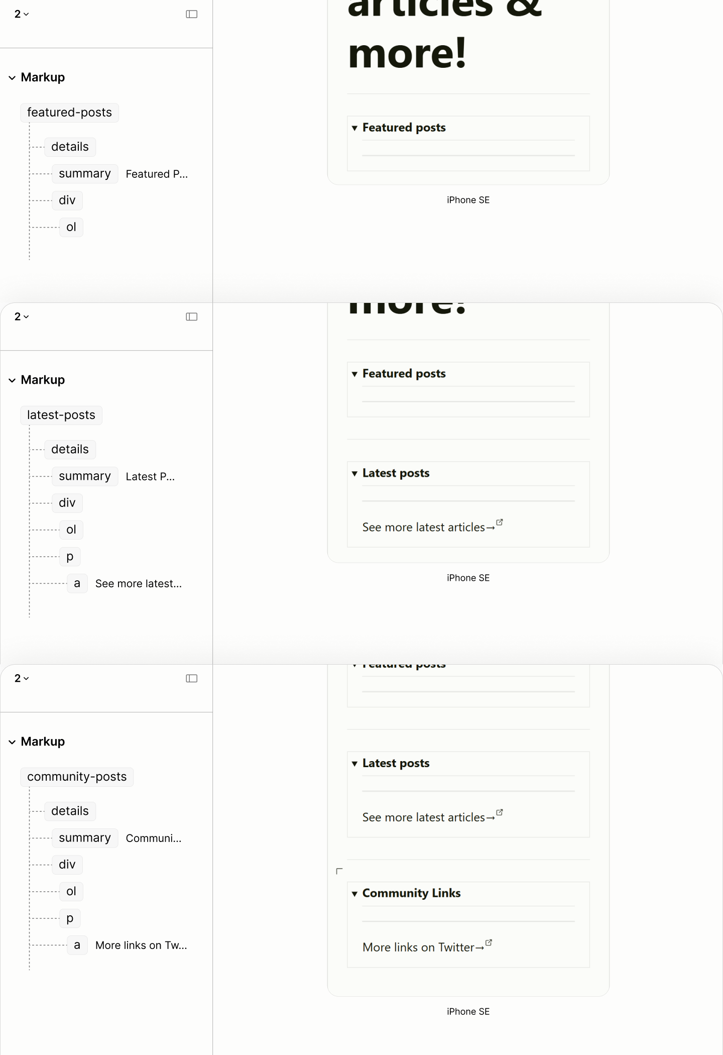
In the absence of an introductory paragraph, rather than using a heading to label each Post List, as it is in the Legacy Site, the Refactored Site simply uses the title of a disclosure widget. 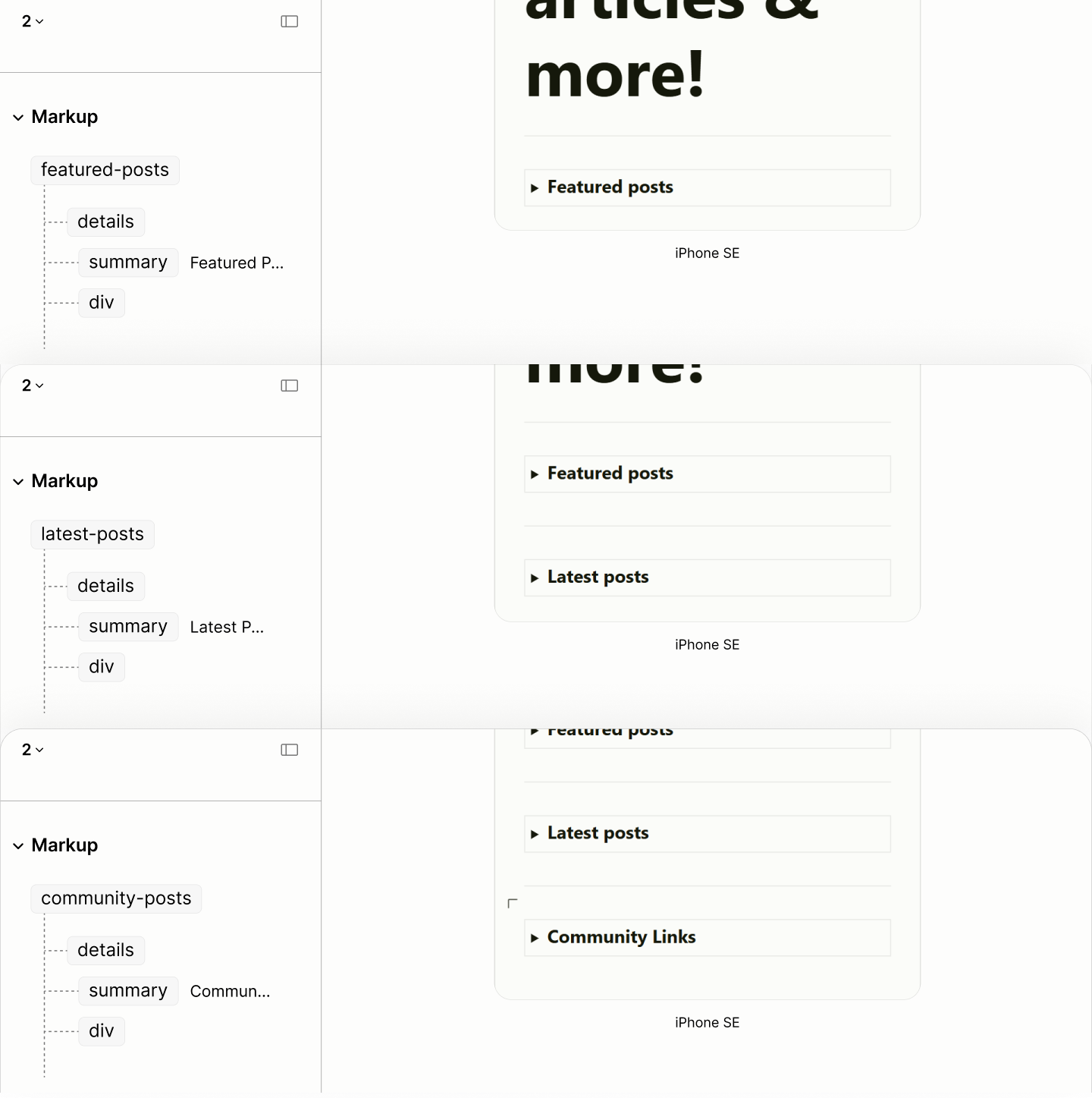
Within the Content following that Title are two things:
-
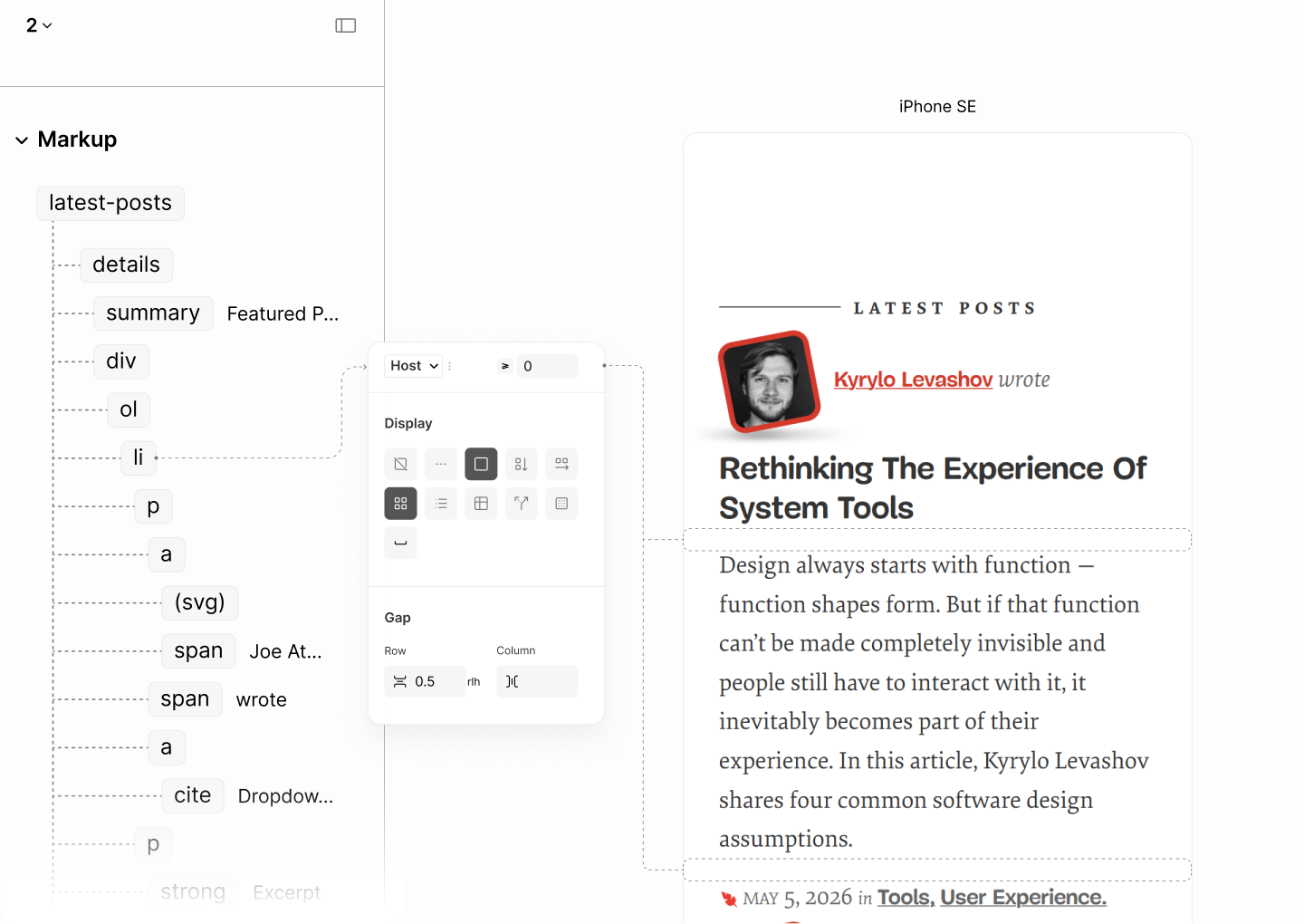
Post List, an ordered list since posts are in reverse chronological order, as the publishing date tells.
-
second, More Component, a plain paragraph containing a link to a page with more posts.
However, Featured Posts, in the name of features, have no need for a More component.
The structure and reader mode of each post list type with their empty list.
Each item of the Post List contains two paragraphs: one for post metadata, and the other for post summary.
Each Post Summary of Featured and Latest Posts, being that of Smashing posts, is a paragraph whose title is "Excerpt", followed by the Content area containing a quote from the post. In contrast, each Post Summary of Community Posts, being that of an external resource, uses a title of "Teaser", followed by the Content containing a span of text about the post.
Meanwhile, Post Meta is composed from a set of Author, Title, Date, Category, and Prepositions.
Date is an instance of a time element; Category of link; Preps, being a grammatical construct, are of span elements. Title is an instance of a link element which, to reference the title of a post, contains an instance of a cite element, not a heading element as it is in the legacy site. Author is an instance of a link element which contains two instances: one, an SVG element for the avatar, and two, a span element for the name.
The choice of SVG for the avatar, rather than simply using the element for an image, is to help with their hover behaviour.
The SVG implementation leverages its viewbox to create a viewport that lets the image within continue to stay upright while its frame is tilted on hover.
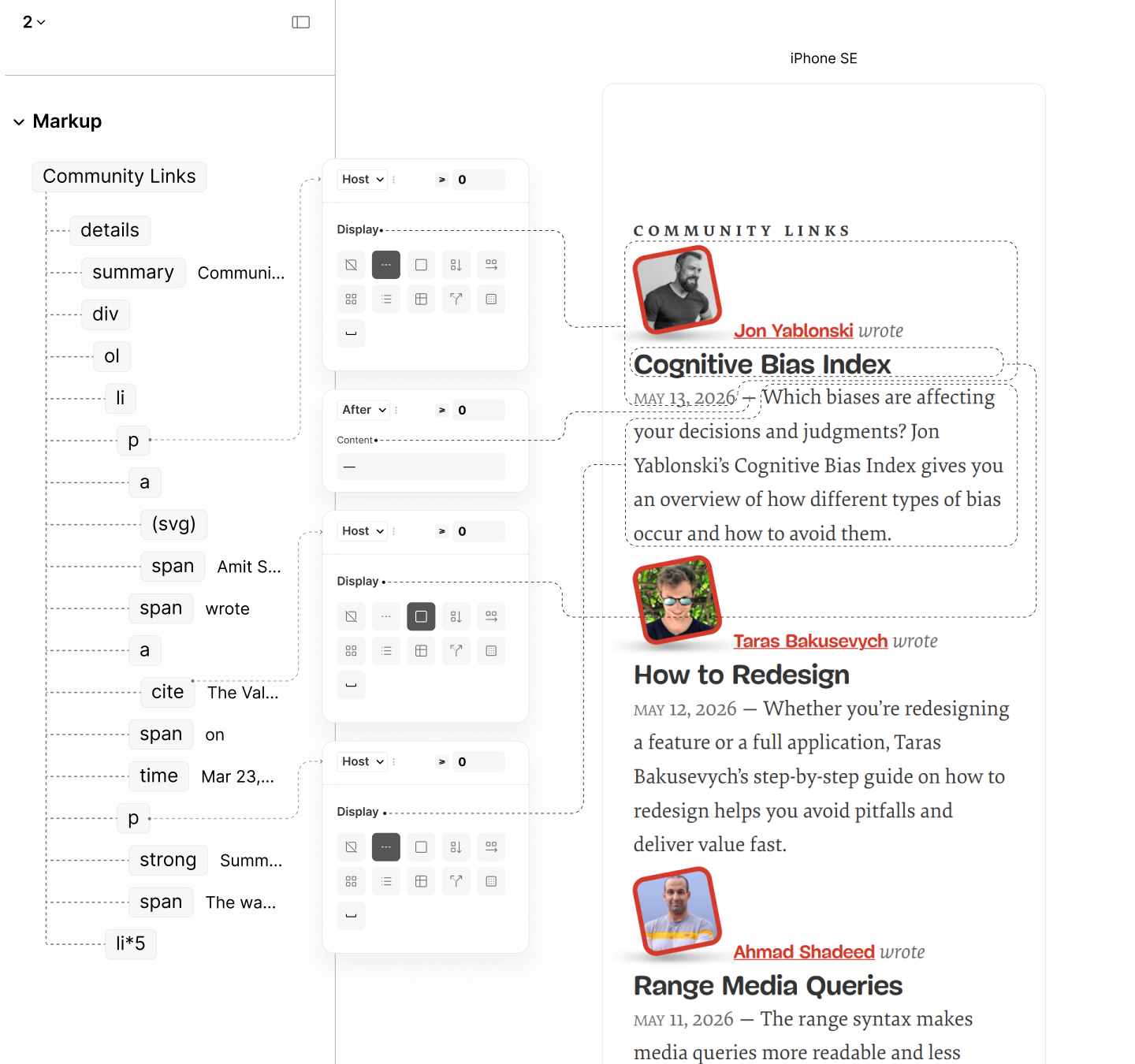
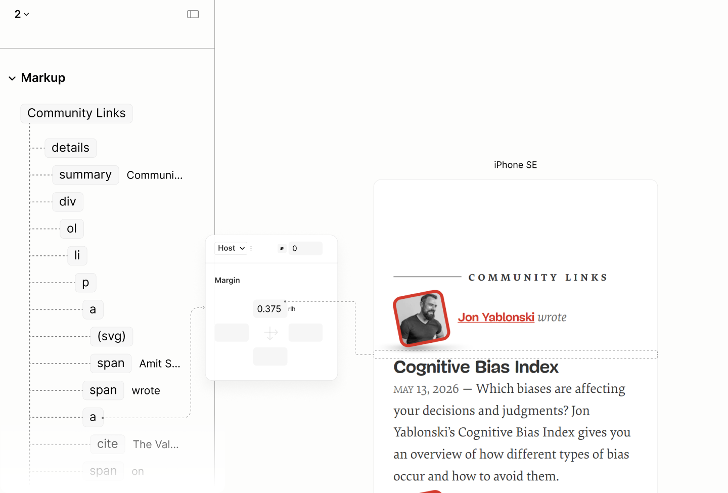
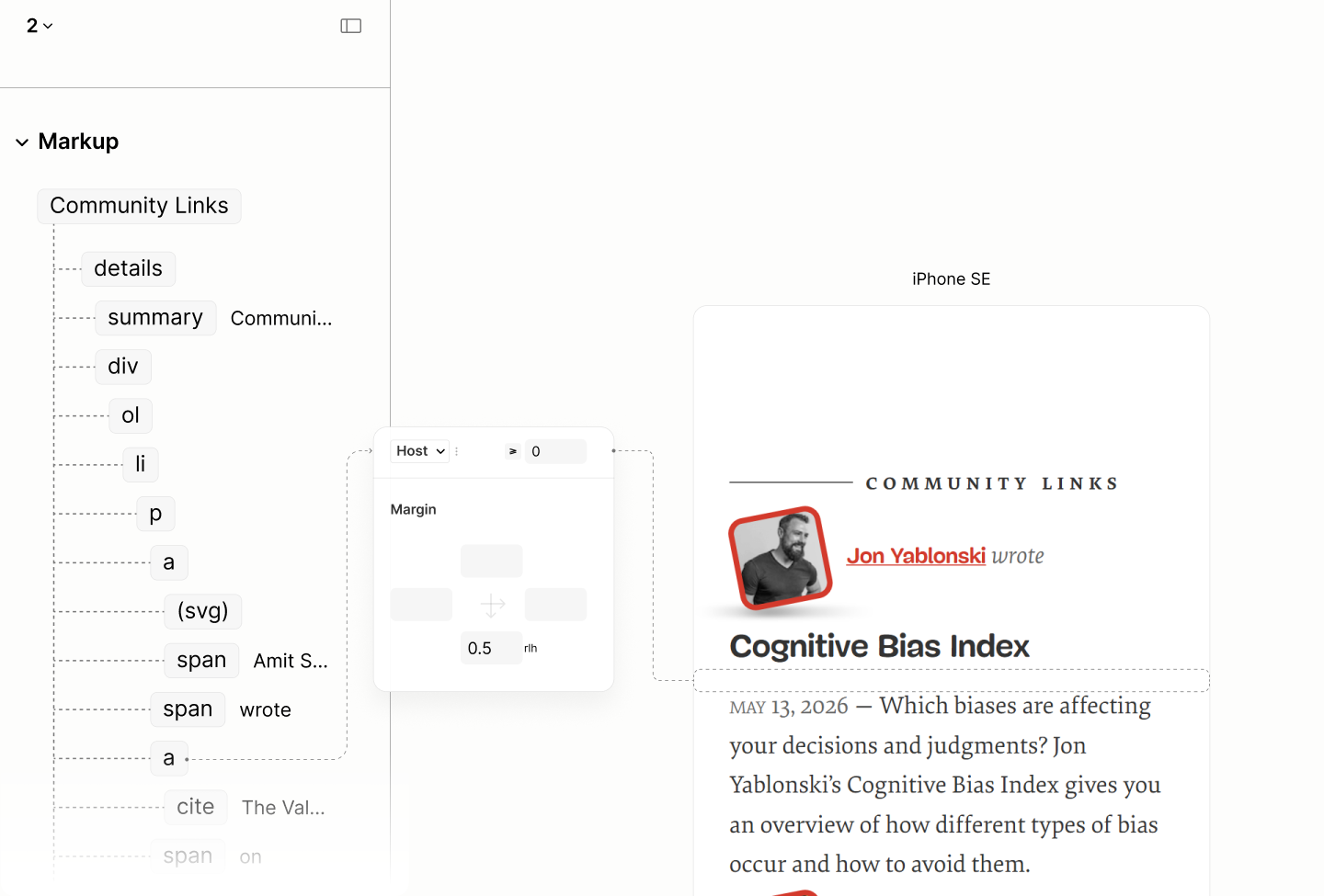
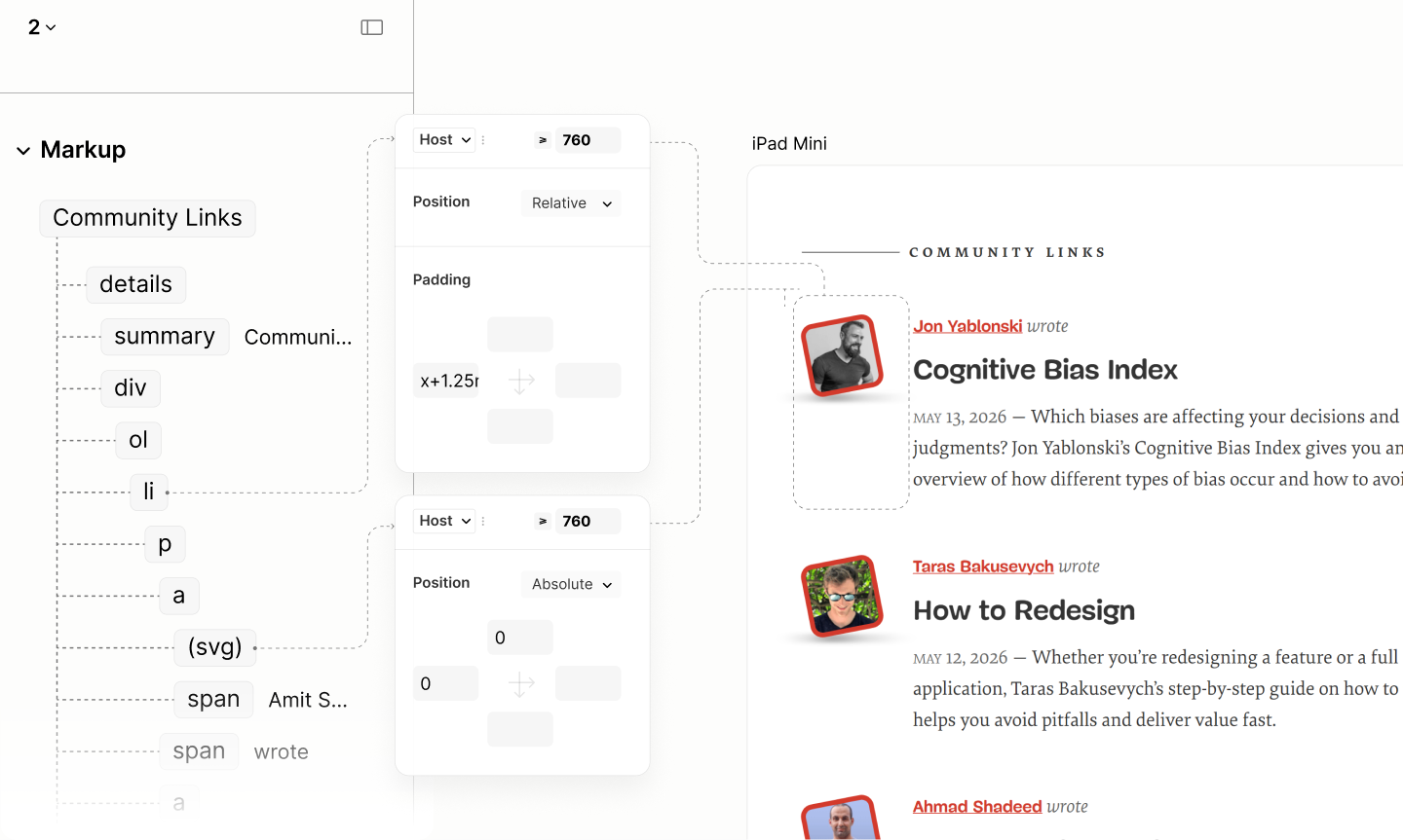
For Community Posts, Post Meta has the format "[Author] wrote [title] on [date]".
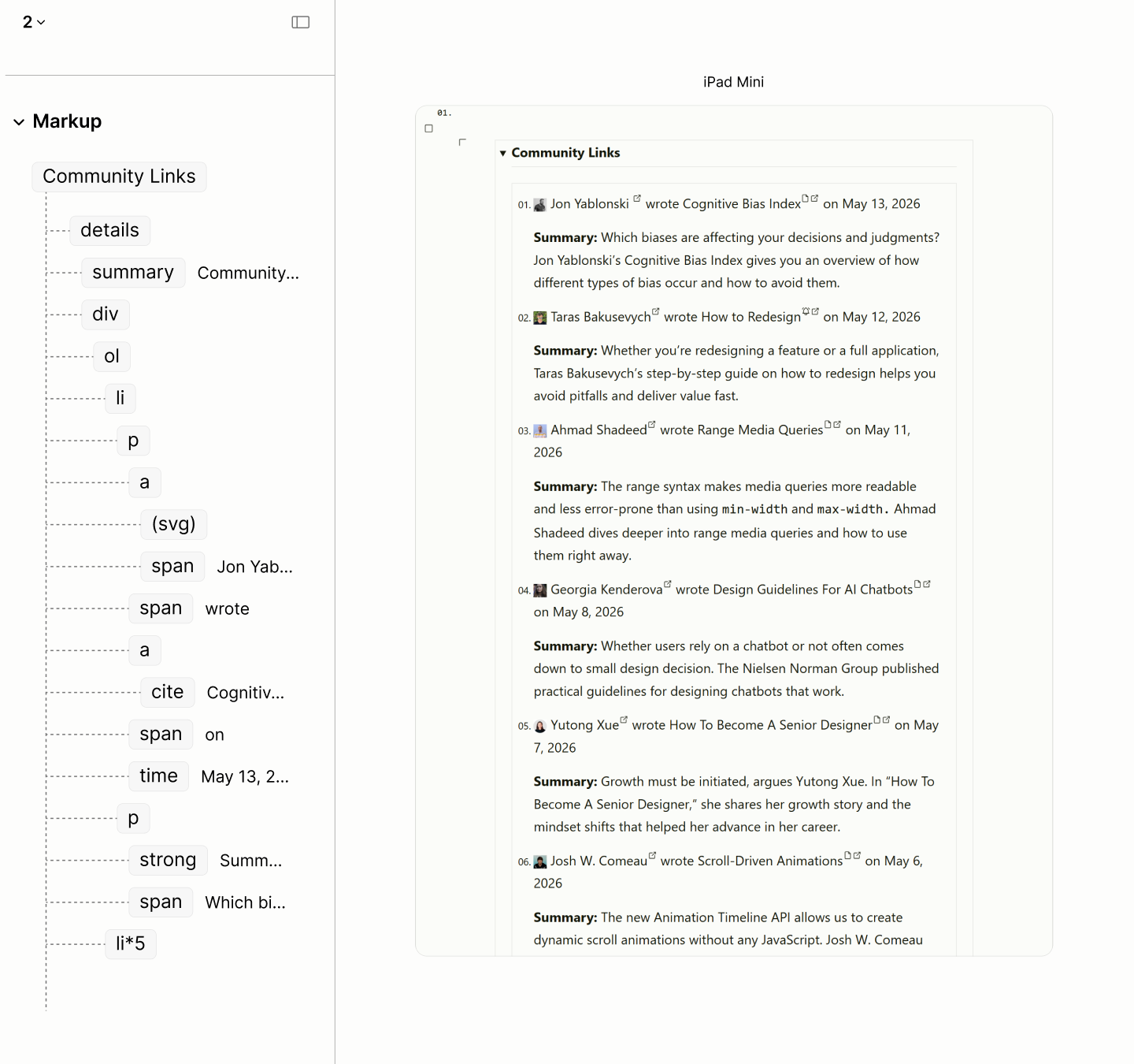
The structure and reader mode of the Community Posts.
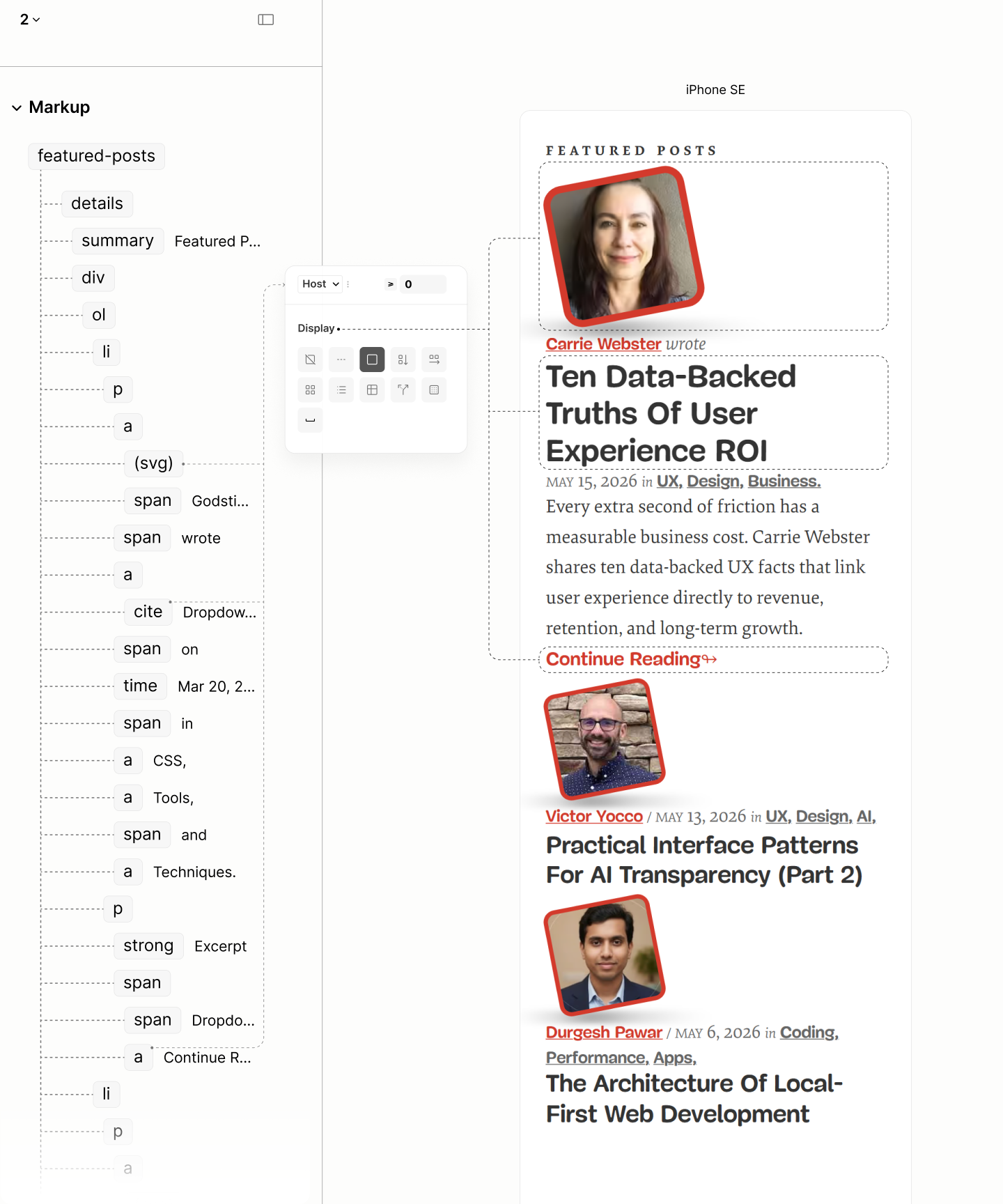
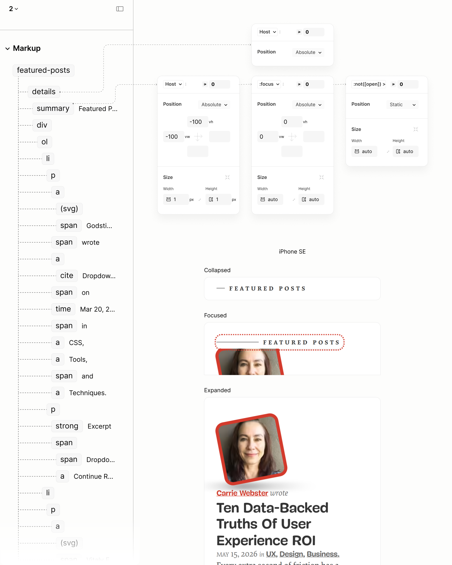
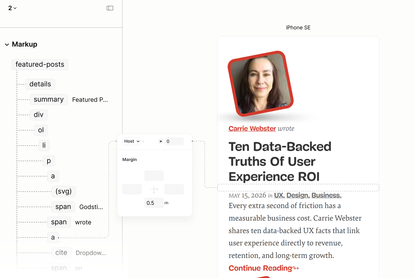
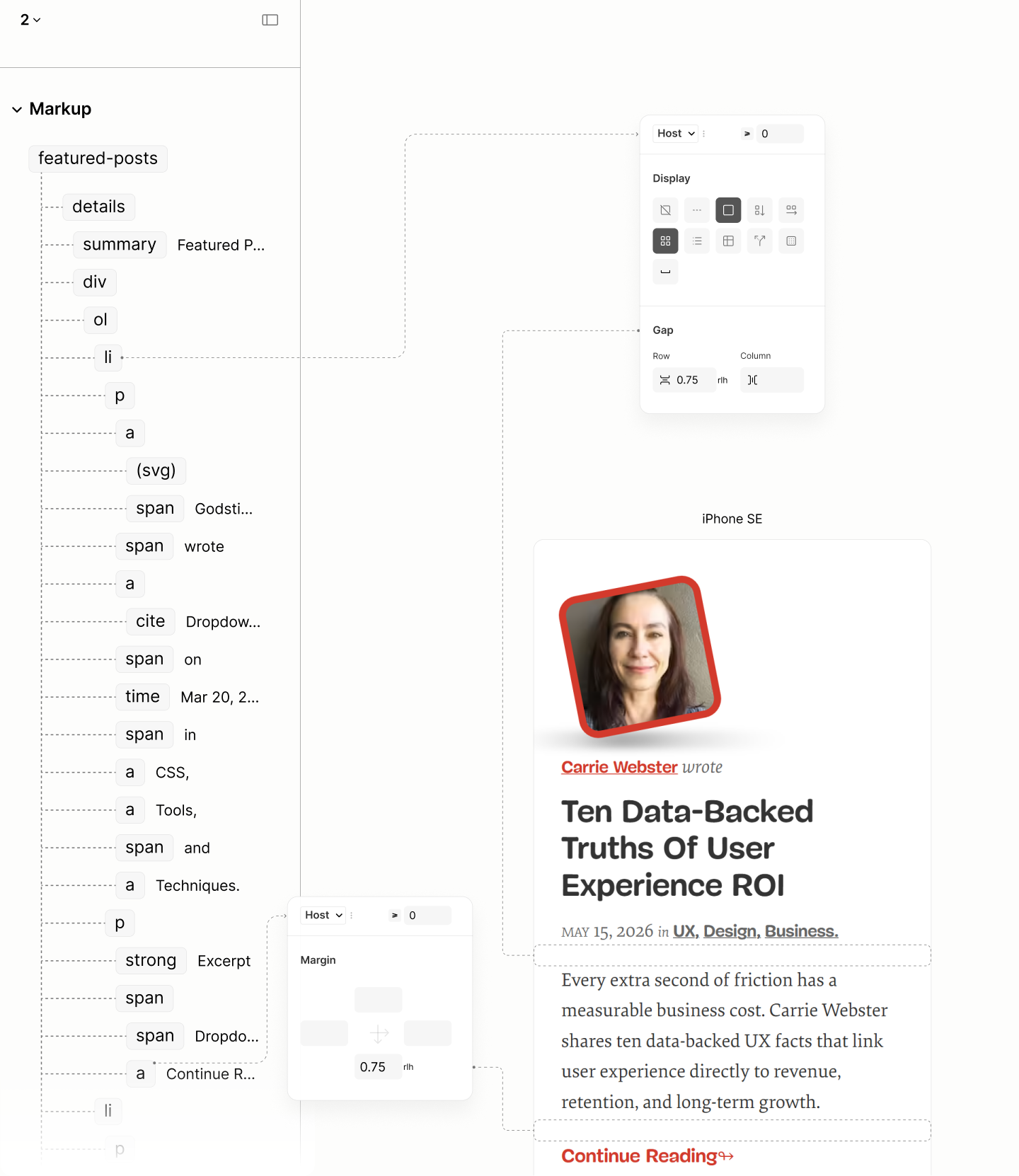
For Featured Posts, there are two variants. It is "[Author] wrote [title] on [date], in [category]." for the lead, and "[Author] on [date], in [category], wrote [title]." for others.
While the Author Mode enforces the use of a slash over the "on" preposition, an abstract sign, the Refactored Site maintains the grammatical value of "on" for screen readers to maintain the preposition function.
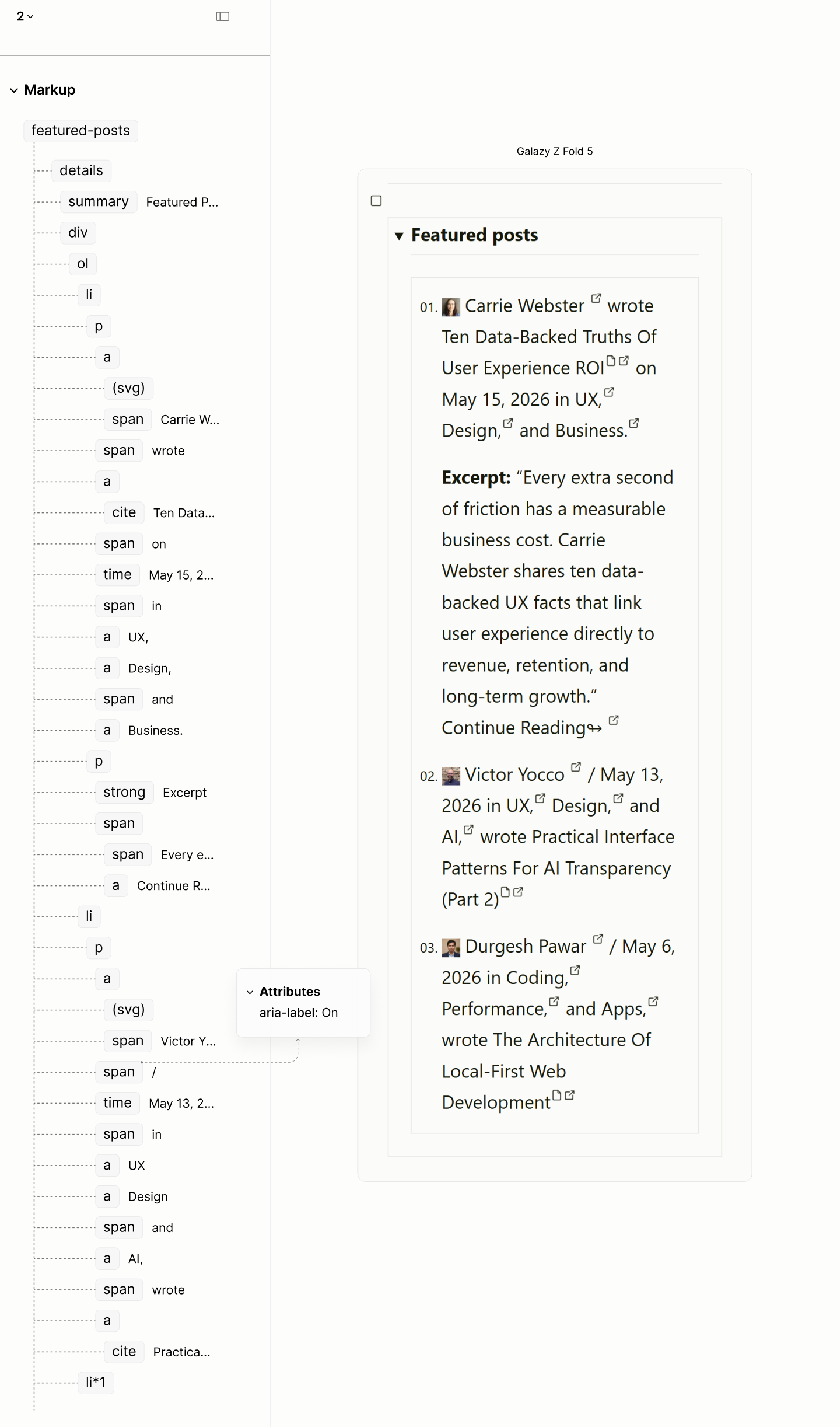
The structure and reader mode of the Featured Posts
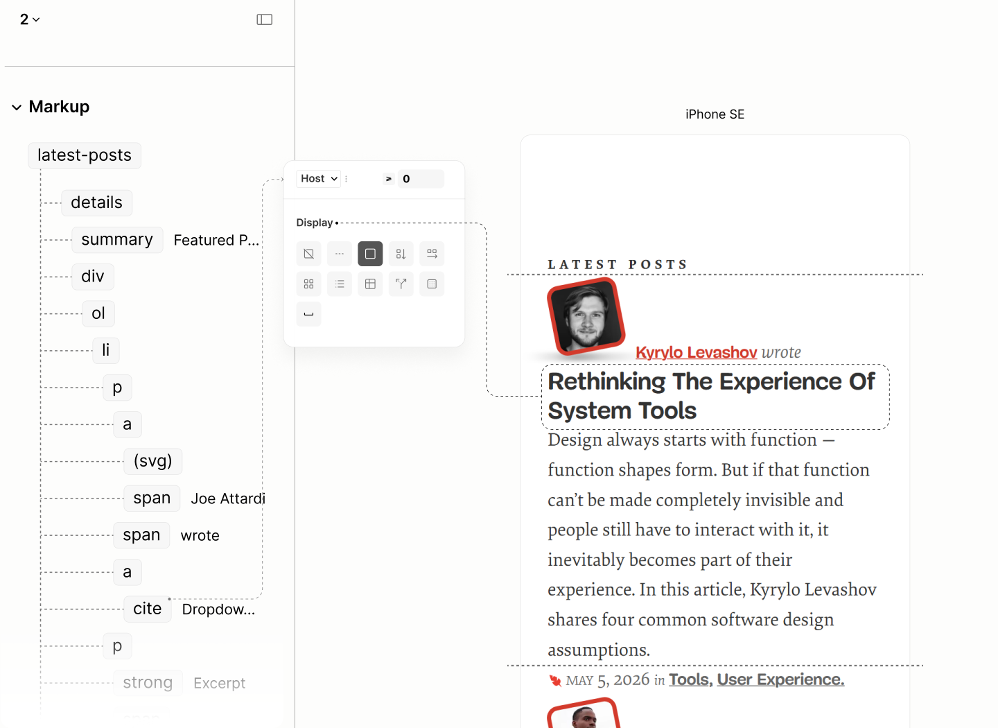
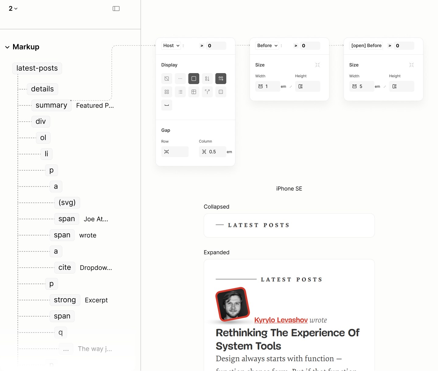
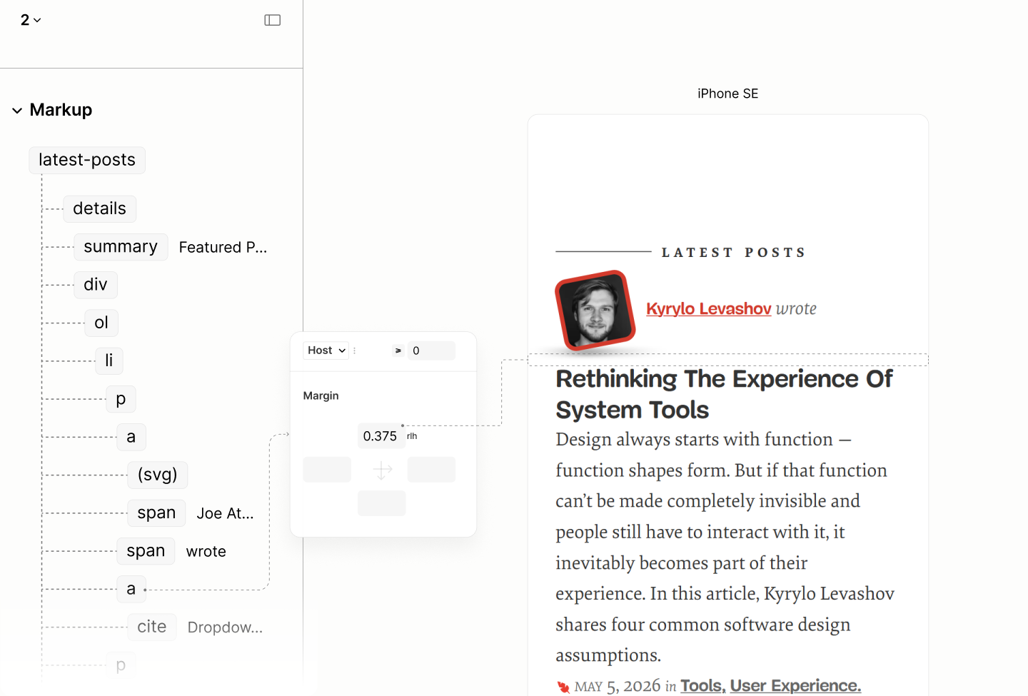
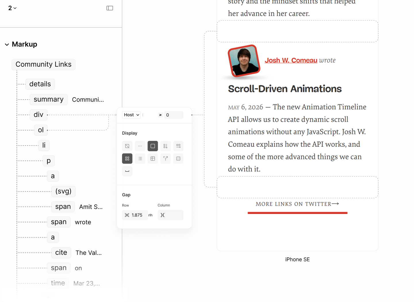
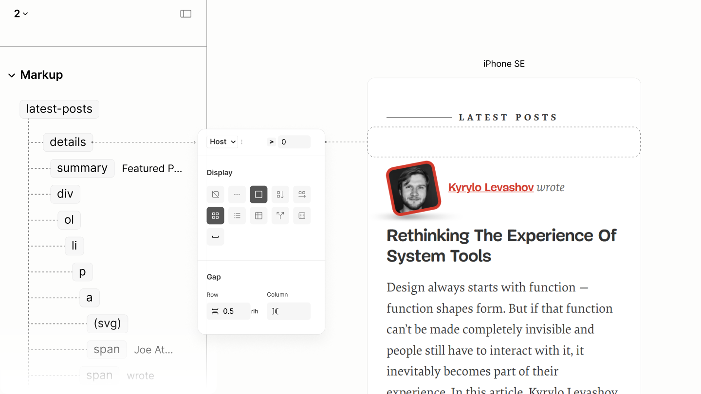
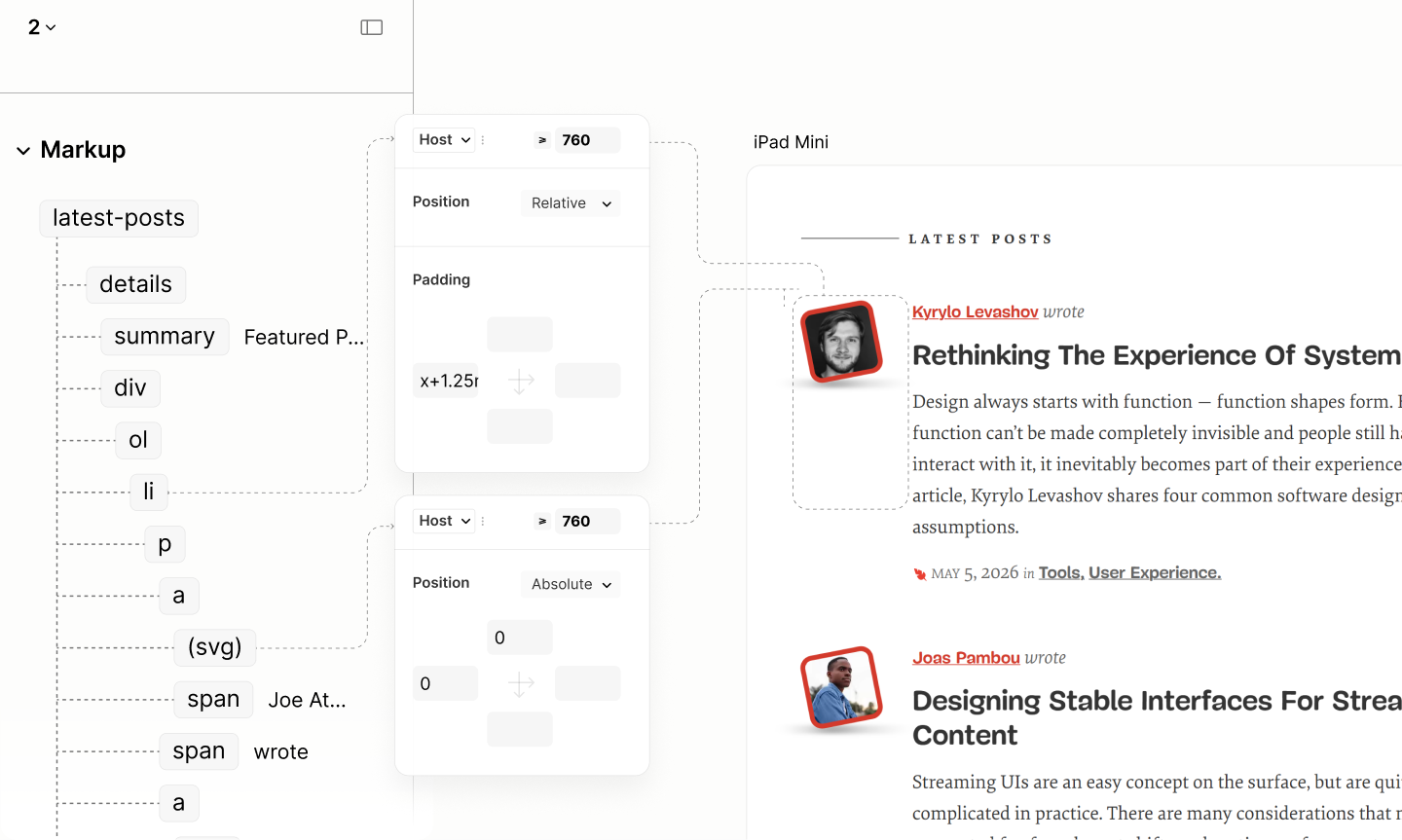
For Latest Posts, per design, the Post Meta splits into two paragraphs around the Post Info. The first follows the format: "[Author] wrote [title]", while the second follows "Written on [date] in [category]".
That "Written on" is implemented as a label for an icon, since the design uses a leaf icon before the date.
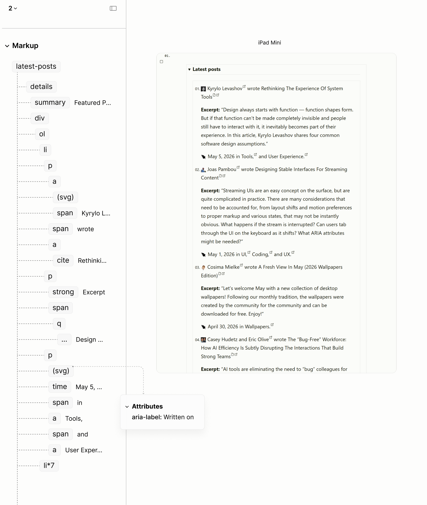
The structure and reader mode of the Latest Posts.
A comparison of the Featured, Latest, and Community Posts in the Legacy and Refactored Site.
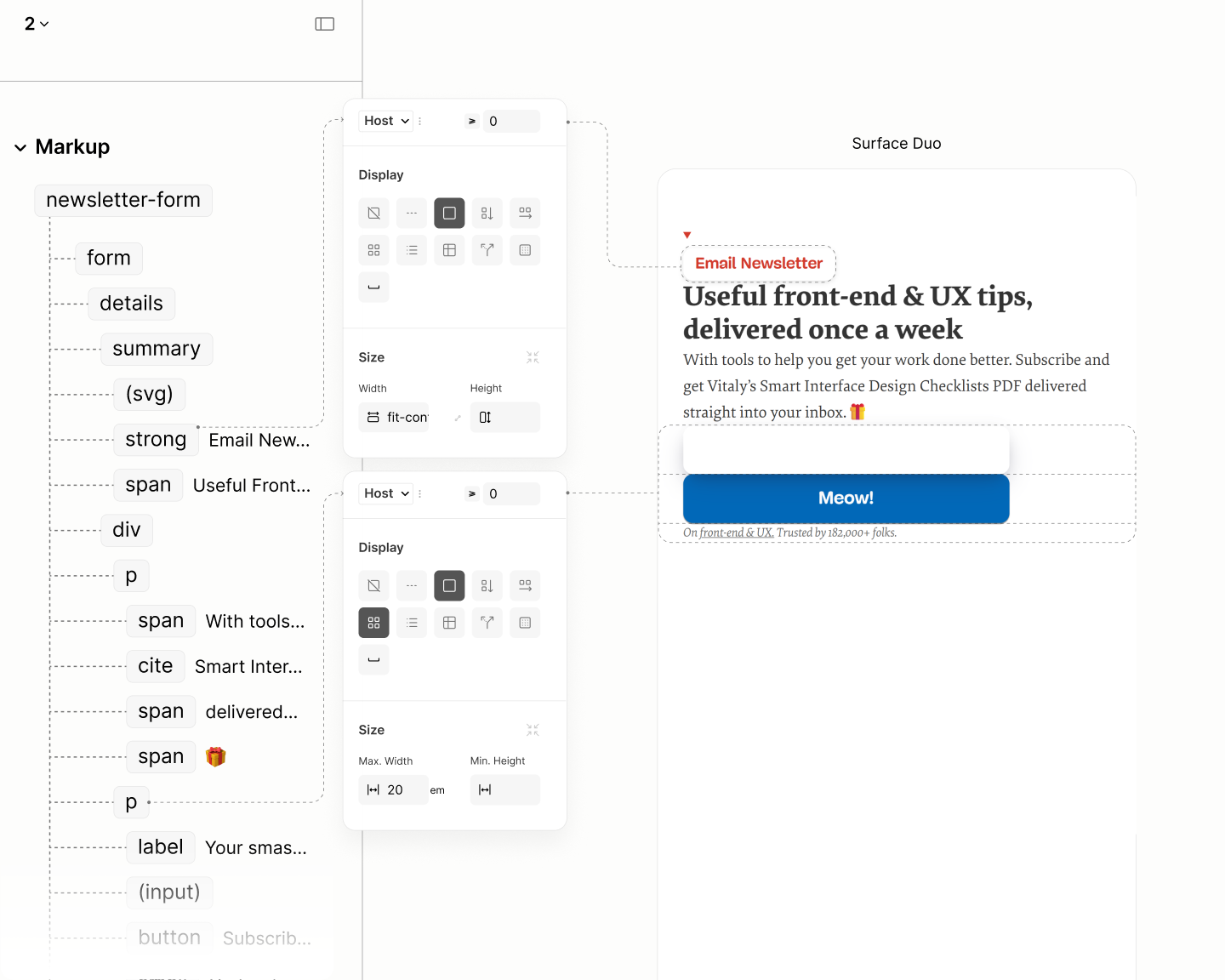
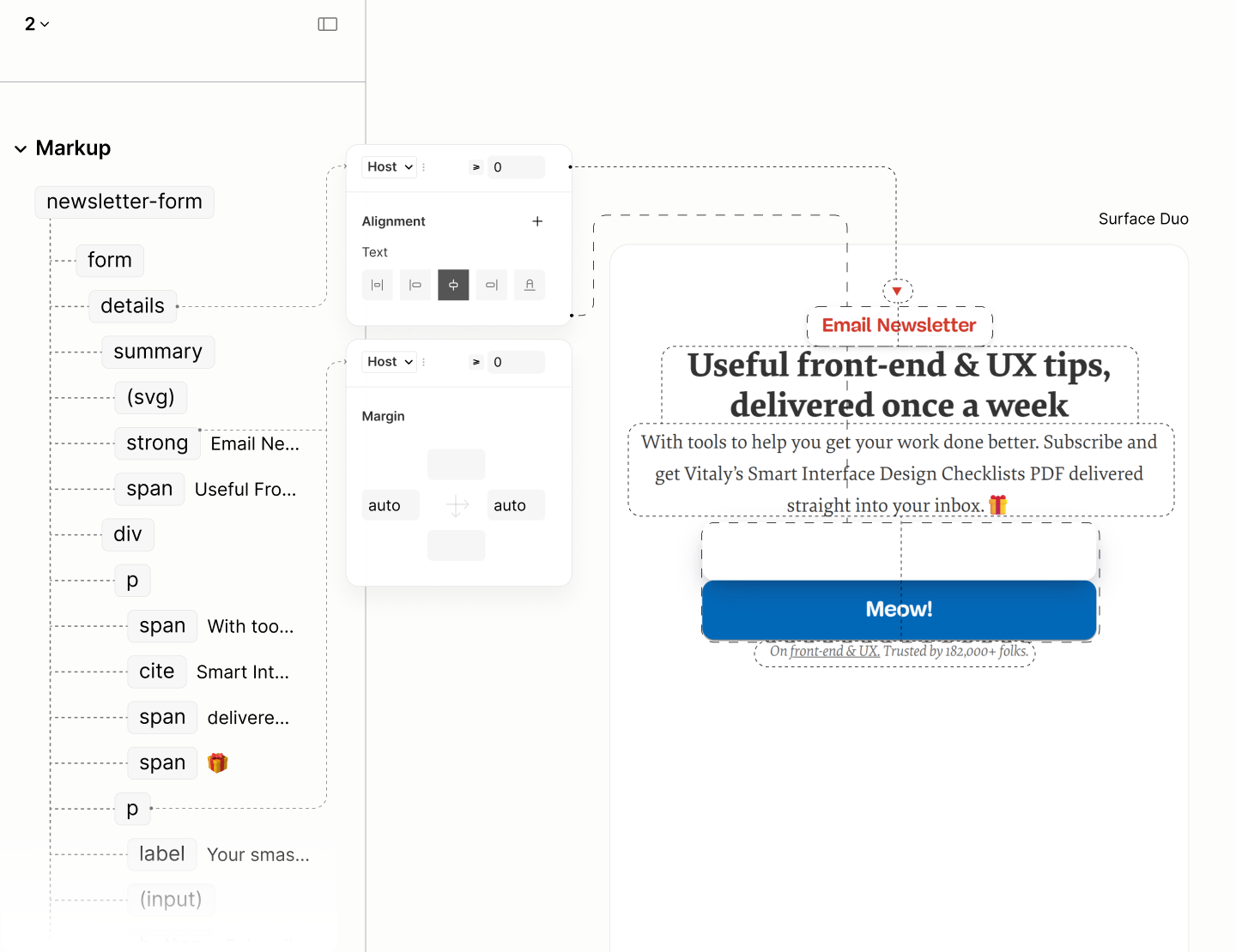
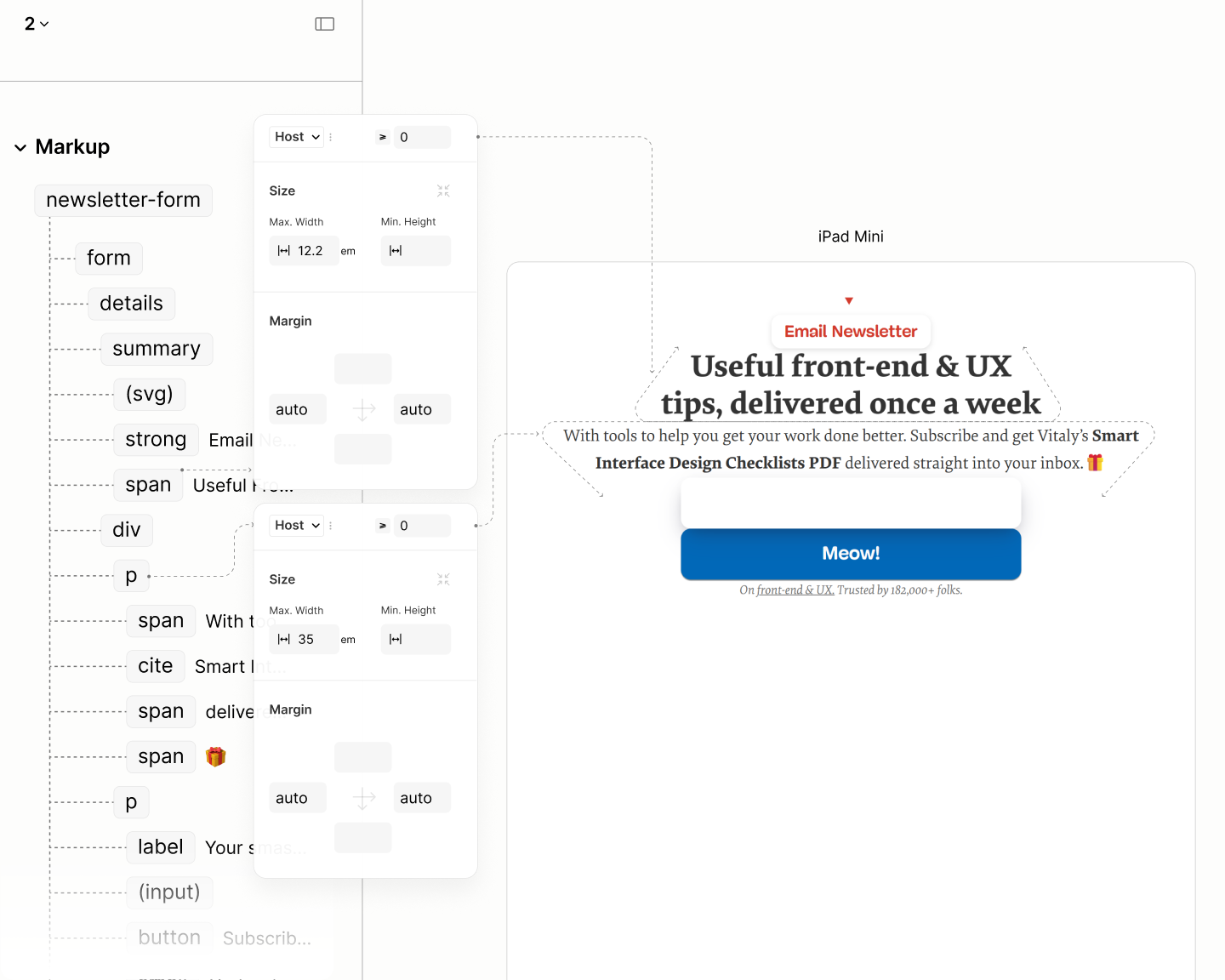
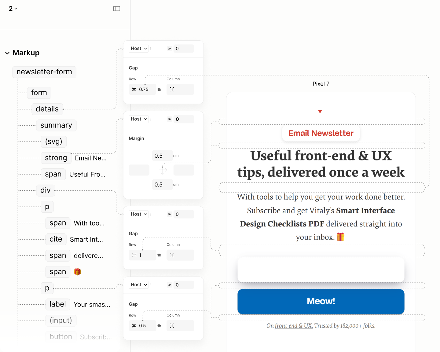
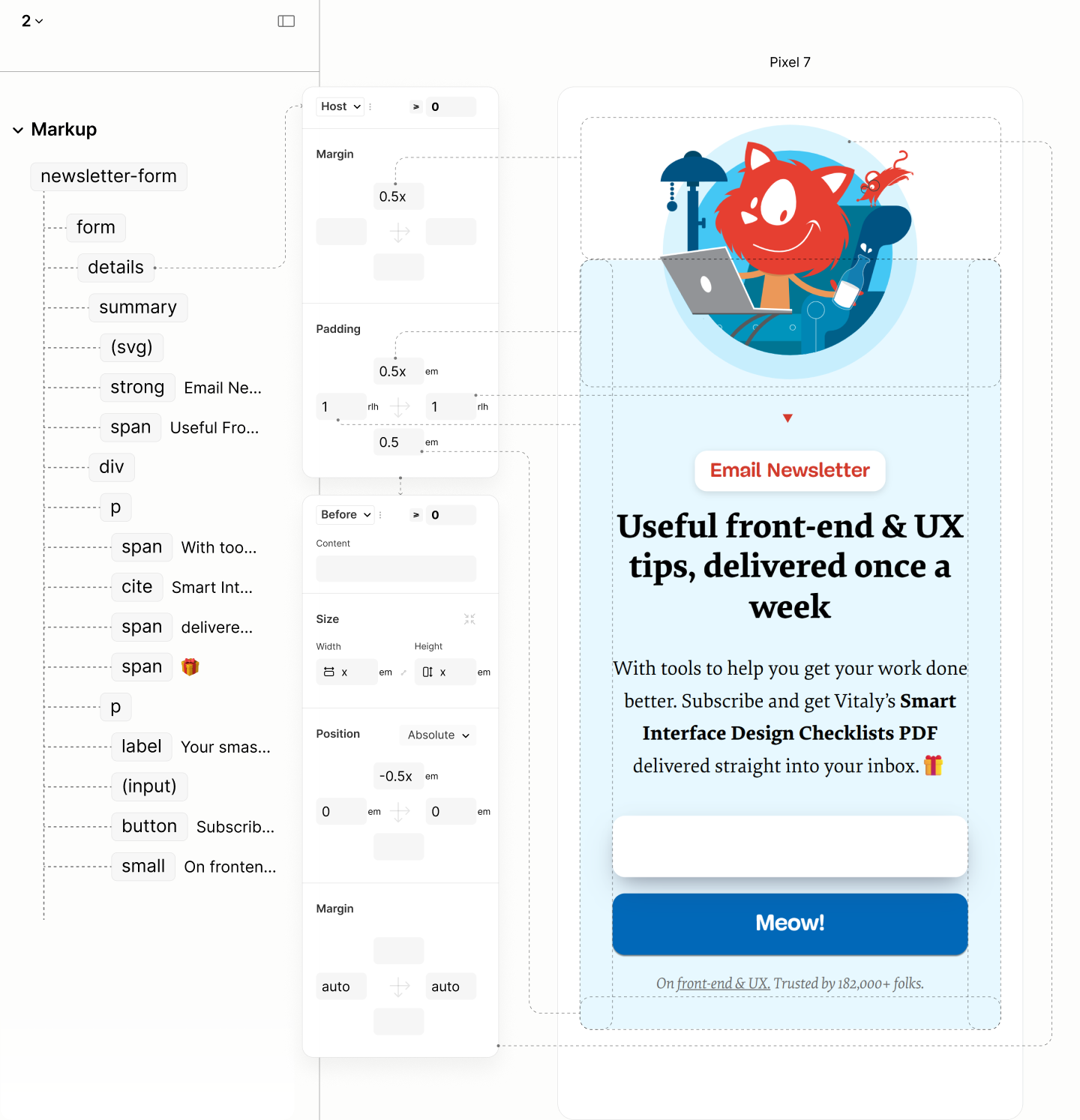
Subscription Form
Not only does the legacy site include four links to redirect the user to an off-page action that is already available on the page, it also present most of these links with vague labels. Still, the issues doesn't stop at the links.
Navigating elements of the Subscription Form in author and reader modes of the Legacy Site.
To start with, the first component, a link whose content is an illustration with the label Smashing Cat exploring new insight at smashing workshop, of course
, a completely unrelated label to a subscription page, or the surrounding content, is removed. The graphic, being a visual entity, shall be added via CSS.
As the design includes two forms, not one, both forms — an email input and a submit button — and their note, take on a new paragraph.
The label for the email input, Your Smashing Email
, doesn't need to introduce pauses between the words as it is in the legacy site. A plain, non-connotated text works better.
While the label of the submit button, "Meow", is a creative label from the brand story, by itself, it doesn't really tell if the button is for subscribing the email; however, appending "subscribe" works better especially for screen reader users.
Only the note maintains a link to an external page about the newsletter. Because, the link, which comes after the subscription forms, has a label Front-end & UX
that hints at more information about the newsletter than directing the user to an action they can perform above.
The introductory block preceding these forms is also implemented as a paragraph, but it excludes the emoji within 🎁 from screen readers who reads it out as Wrap gift
— a term that does not flow with the preceding content.
In addition, it removes the link on the "subscribe" keyword since the widget for subscription is just below. Now, it focuses on its primary purpose: to create a condition for the incentive.
Before the introduction block, two blocks containing noun phrases passes as a title and a subtitle; together as a lead.
Because this lead is followed by two paragraphs, it is implemented as the title of a disclosure widget.
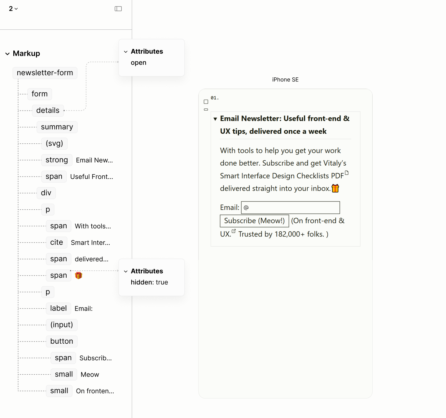
The structure and reader mode of the Subscription Form
Navigating elements of the Subscription Form in reader modes of the Legacy and the Refactored Sites.
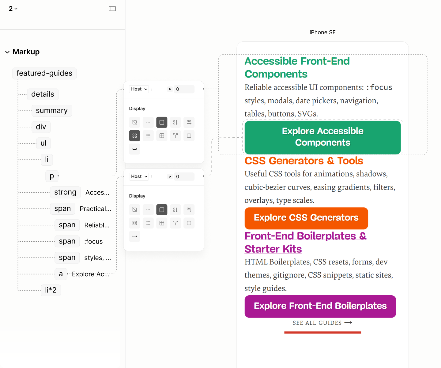
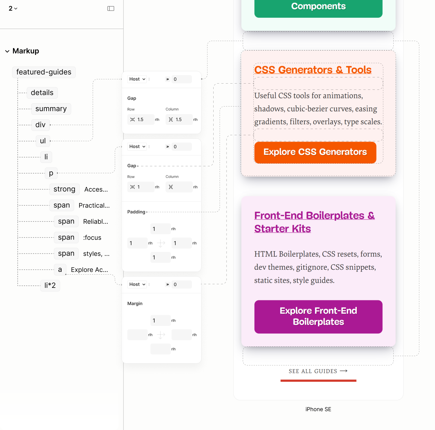
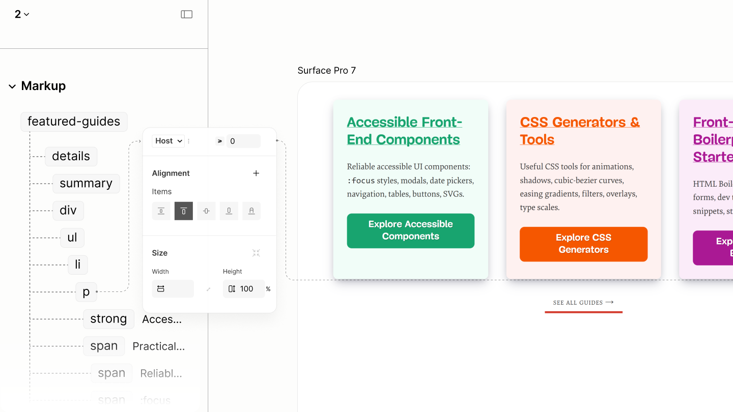
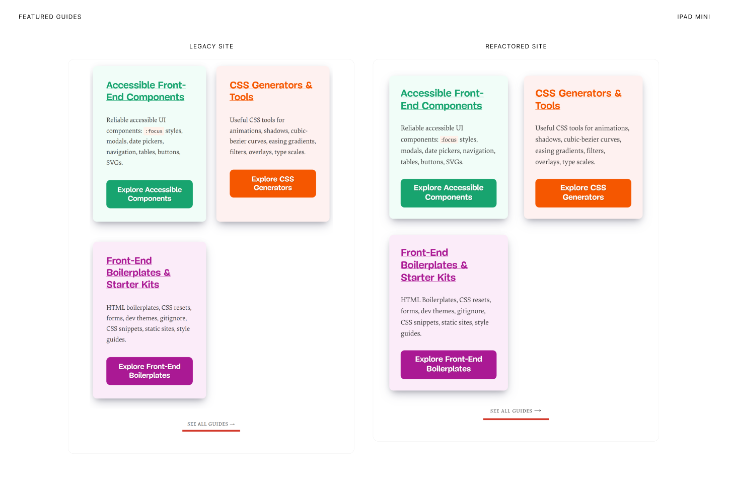
Featured Guides
In addition to the misuse of headings, each guide is better represented as a list item.
Navigating the elements of the first Guide Item, including the first element of the second item, in the author and reader modes of the Legacy Site.
Like Posts, Guides use a titled list.However, unlike Posts, which are in a timeline, Guides are not time-bound, lacking an implicit chronological order. To reflect this, the collection is an unordered list.
Each Guide Item contains a titled paragraph. Their Content contains a description of the guide and a link to the guide.
Following the Guide List is the More Link.
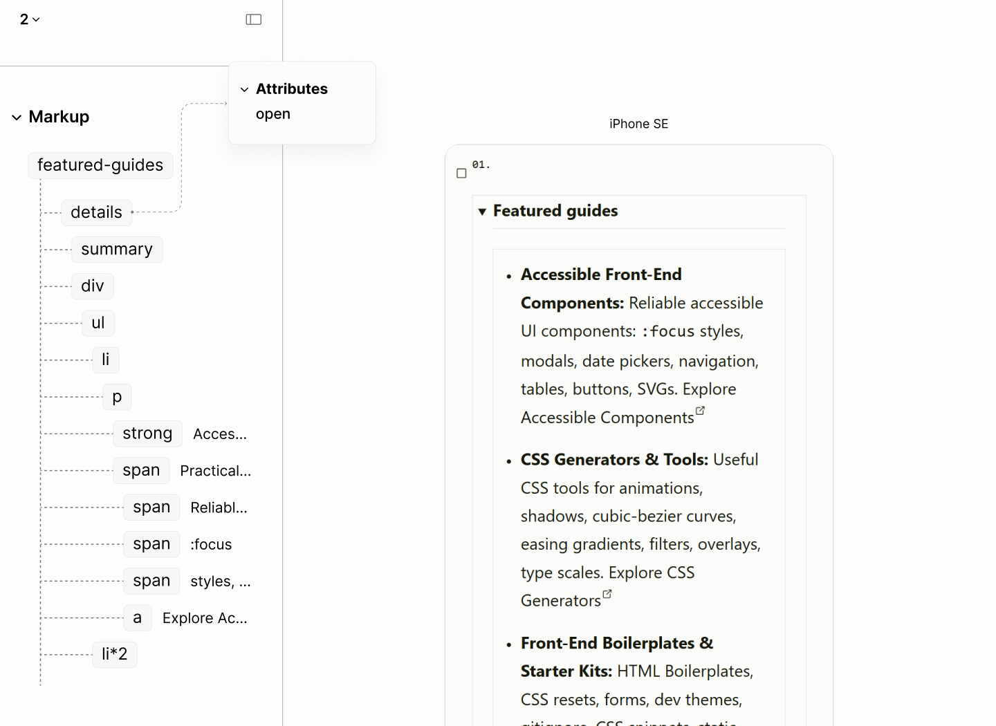
The structure and reader mode of the Featured Guides.
Navigating the elements of the first Guide Item, including the first element of the second item, in reader modes of the Legacy and Refactored Sites.
Resource List
Same calamity with the illustration that starts the Subscription Form befalls each item in the Resource List: brand story becomes a noise. While the first creates an extra naration that complement the resource, the others, same as that of the newsletter, do not.
Navigating the elements of the first Resource Item, including the first element of the second item, in author and reader modes of the Legacy Site.
Resource List are structured like Featured Guides.
Like the Subscription Form, the illustration of each resource item shall be added via CSS.
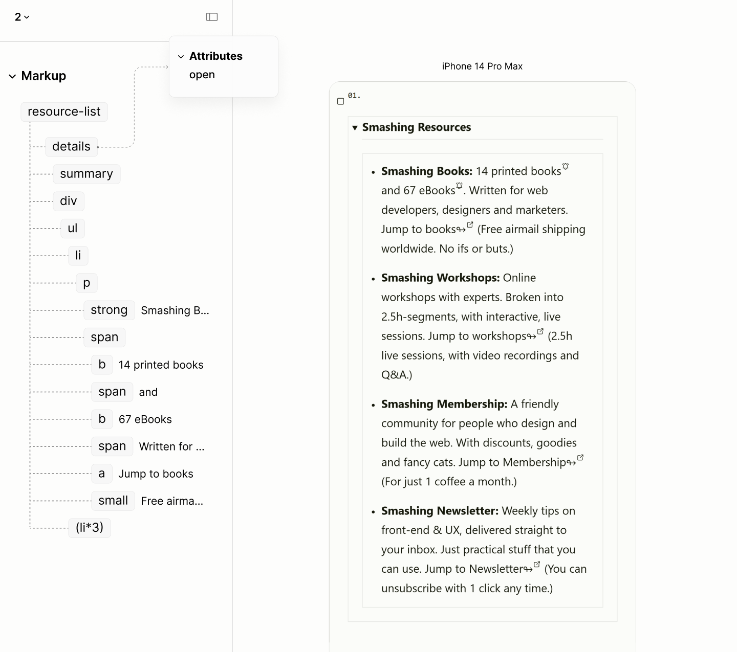
The structure and reader mode of the Resource List.
Navigating the elements of the first Resource Item, including the first element of the second item, in author and reader modes of the Legacy Site.
Workshop Component
Beside misusing the heading and line break elements, there are mentions and description of visual objects. There are multiple links with the same destination, but with different labels — sometimes, completely unrelated label.
Navigating elements of the Workshop Component in author and reader modes of the Legacy Site.
Out of the five visual blocks on the page, the offer, the intro, and the CTA, being sentences, takes on a paragraph each.
To avoid tabbing through neighbouring links with the same destination, the Offer Block maintains its link address to the start of its destination, the CTA block, because of its content, links to the speakers' section of the page, while the illustration block, parented by a link, being a graphic element, is removed entirely to be appended via CSS.
With 3 paragraphs, the first block, a phrase, passes not only as a title, but as the title of a disclosure widget for the multi-paragraph blocks.
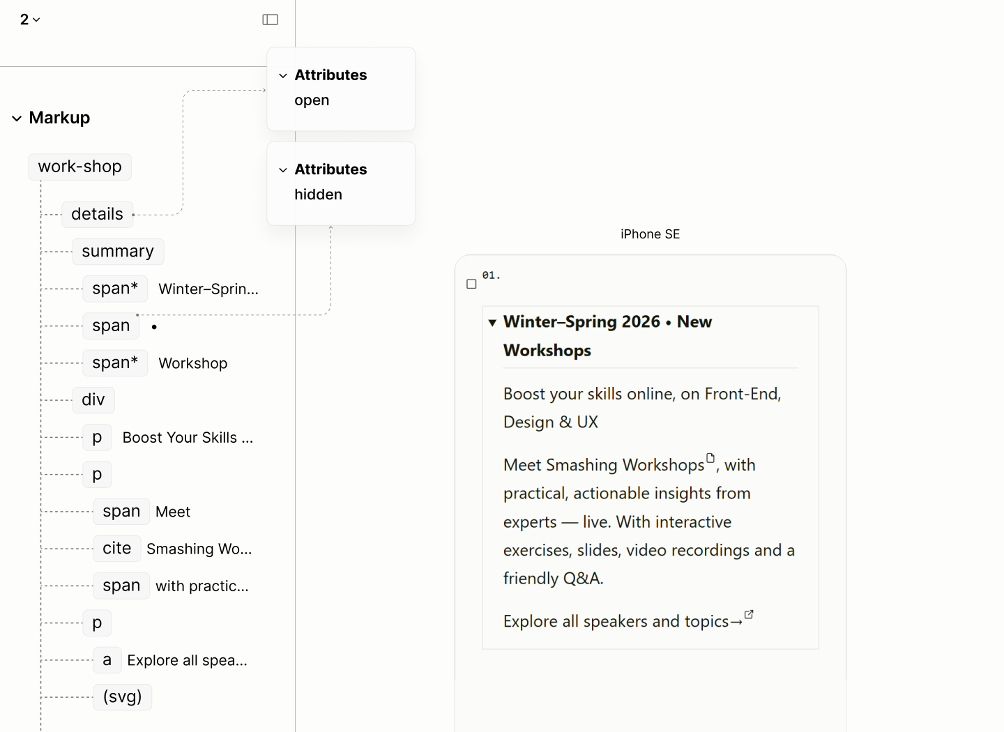
The structure and reader mode of the Workshop Component.
Navigating elements of the Workshop Component in reader modes of the Legacy and the Refactored Sites.
POTW Component
The Reader Mode of the Legacy Site, the plain structure of the site, revealed a fake relationship in the Author Mode. It revealed that the avatar of the person of the Week does not fall under the scope of the person of the week. It actually falls under the scope of the Community Links.
Navigating elements of the POTW Component in author and reader modes of the Legacy Site.
The Refactored Site maintains the use of a figure to introduce the image of the Person of the Week; an image wrapped in a link to learn more about them.
Following the figure is a paragraph for a summary about them.
With these two components, a figure and a paragraph, their title is the title of a disclosure widget.
Rather than placing this component before the Community Posts, as it is in the Legacy Site, it is placed after, letting Community Posts, an offshoot of Smashing Post, stays closer in proximity.
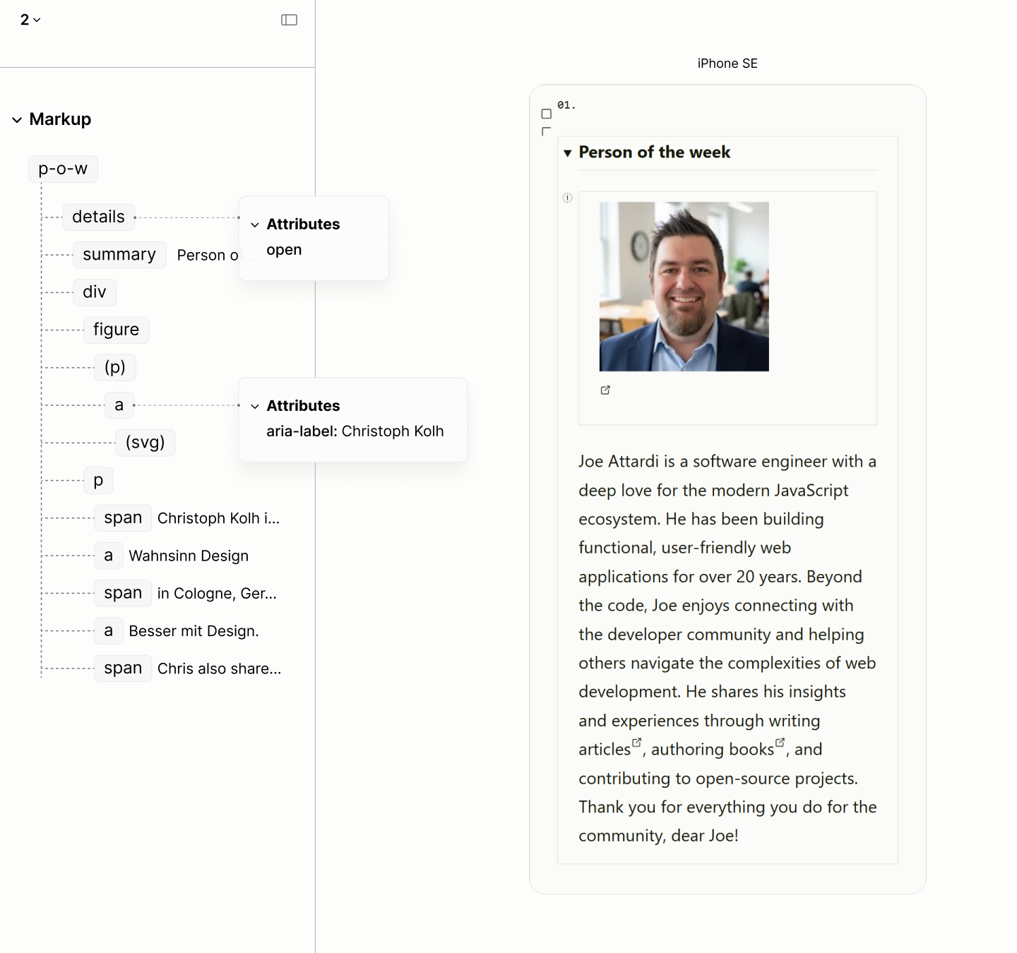
The structure and reader mode of the Person of the Week Component.
Navigating elements of the POTW Component in reader modes of the Legacy and the Refactored Sites.
All Topics Navigation
Like the reddish banner, this navigation contains a heading element that implies a section outside of the main landmark of the document. It is like putting an heading alongside the page numbers of a book.
Composition of the All-Topics Navigation component in author and reader modes of the Legacy Site, navigating the first four elements.
All-topics navigation uses the same structure as the Top-topics navigation landmark. No list.
This time, because of the title — a long open-ended sentence — the landmark uses a short label "All Topics".
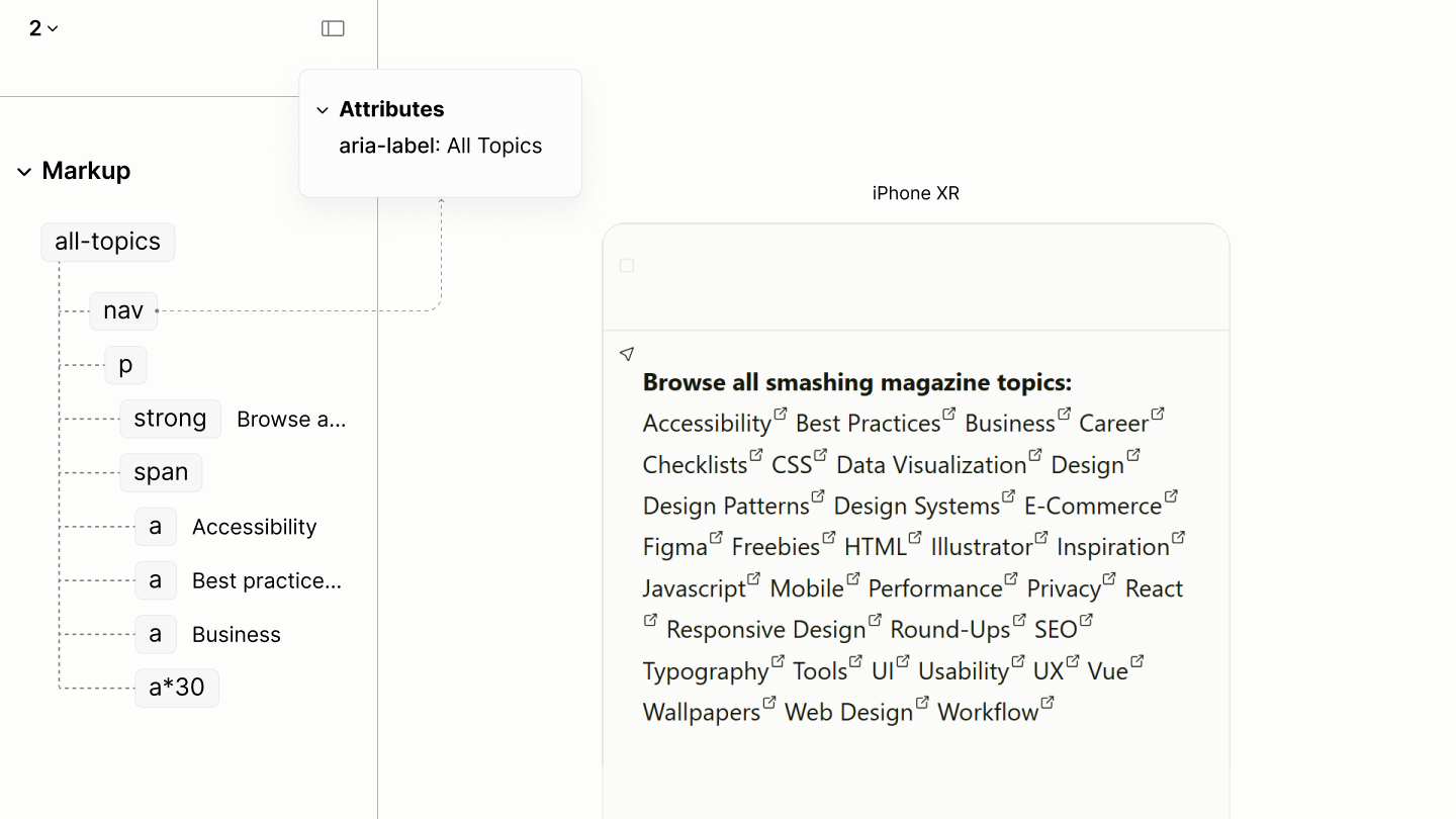
The structure and reader mode of the All-topics navigation.
A comparison of the document view of the All-topics navigation in the legacy and refactored sites.
Composition of the All-Topics Navigation component in reader modes of the Legacy and the Refactored Sites, navigating the first four elements each.
Colophon Landmark
The Reader Mode of the Legacy Site revealed four paragraphs mark up the colophon. However, the first shouldn't be a paragraph, as it is a prepositional phrase, aiming to modify another construct.
Navigating the elements of the Colophon Component in author and reader modes of the Legacy Site.
Because these content provides information about the production of the site, it is implemented as an Info Landmark, rather than with an ordinary container.
While the content was distributed across four paragraphs, it is implemented in the refactored site as a single paragraph. This consolidation is not because they appear as one, but because of their grammatical structure.
What was the first paragraph is a sentence fragment. Not a noun; not a verb; not a complete sentence. It is an incomplete thought, a prepositional phrase that needs to modify something. This something should not be cut off into another paragraph.
While succeeding blocks can stand alone, the implied subject of the first, second, and fourth blocks could use the explicit mention of the subject in the third block, making them one paragraph.
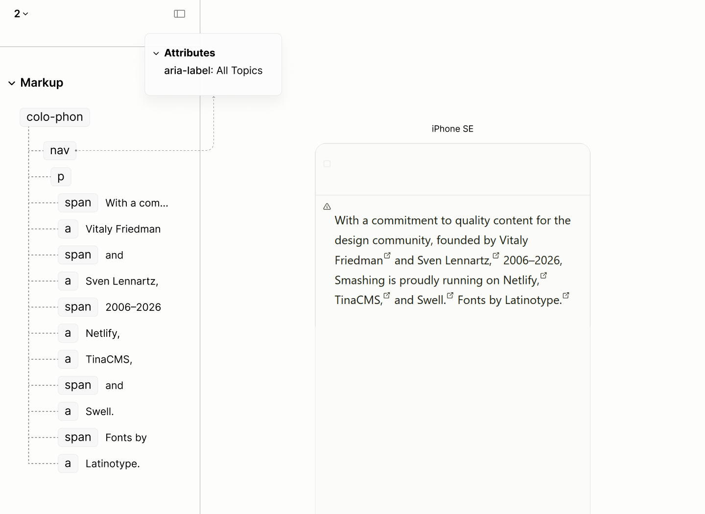
The structure and reader mode of the Colophon.
A comparison of the Colophon in the legacy and refactored sites.
Navigating the elements of the Colophon Component in reader modes of the Legacy and the Refactored Sites.
Business Links
Like the navigation landmarks in the legacy site, this, though not a nav, is also faced with each link in a list item. As such, it occupies more space for display, and uses more words for narration.
Navigating the first 3 items of the Business Navigation Component in author and reader modes of the Legacy Site.
With the neighbours to these links now landmarks, these links also employ the use of a navigation landmark.
It follows the same structure like the previous navigation: a titled paragraph whose content are a set of links.
Moreover, there's an additional paragraph to contain the "Back to top link.
The illustrations that follows in the legacy site, motifs for brand storytelling, which are for beautification purposes, are to be added via CSS.
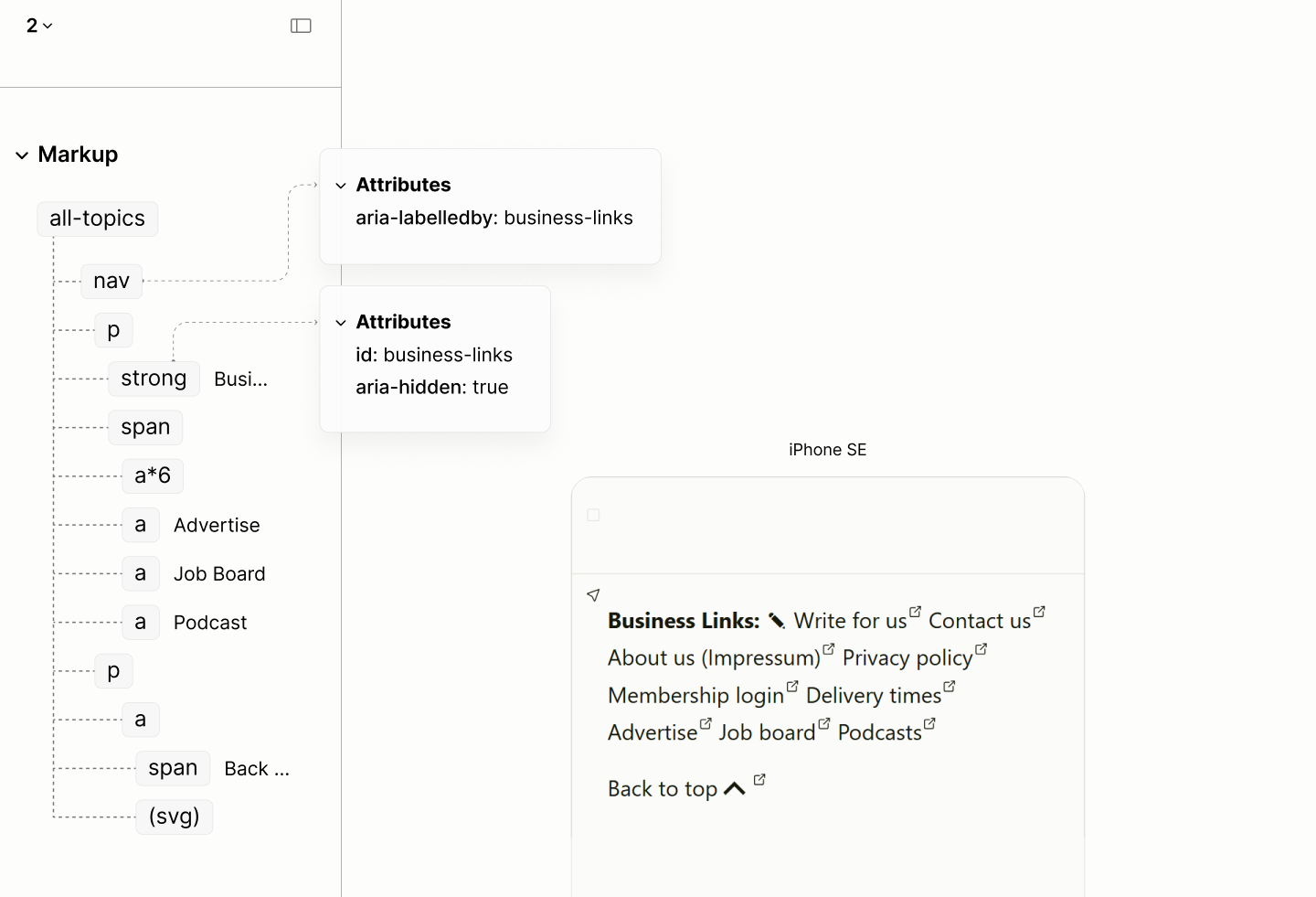
The structure and reader mode of the Business Links navigation landmark.
Navigating the first 3 items of the Business Navigation Component in reader modes of the Legacy and the Refactored Sites.
Design
With the markup done right, the doc-first way, without extra elements born of visual requirements, there comes the design challenges. Afterall, the markup stopped dancing to the whimps of a particular design.
To prepare the document for Author Mode, some styles of Reader Mode, such as demarcations, markers, spacings, and pads, are removed.0.1
In addition, content like the root heading, not meant to be seen in Author Mode, per design, are displayed only to screen reader users only.0.2
Reader mode and its reset state, side by side.
In view of the design, only the font system is rebuilt for a more harmonious design. Color systems, and design effects are same, or near same, as they are in the legacy site.
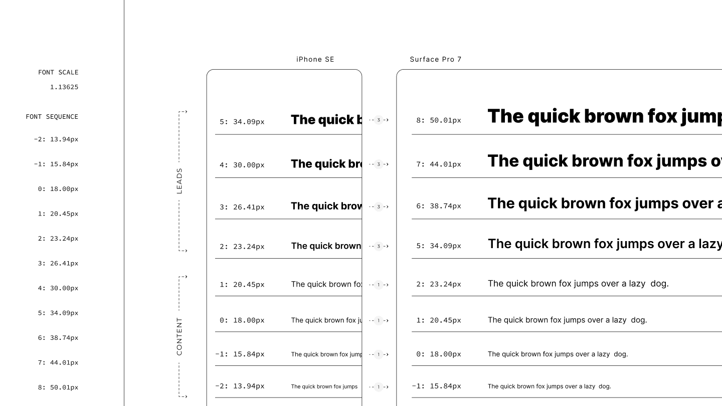
To reverse engineer the interpolations of values, especially for the font system, two target viewports of the legacy site, 375px e.g. of iPhone SE and 1368px e.g. of Surface Pro 7, are chosen for their device popularity.
Font System
While the disconnect is subtle, the fluid Post Titles, semi-fluid body text, and static Top Topic Navigation of the Legacy Site are like three different voices singing at different tempos, breaking the rhythm of the experience.
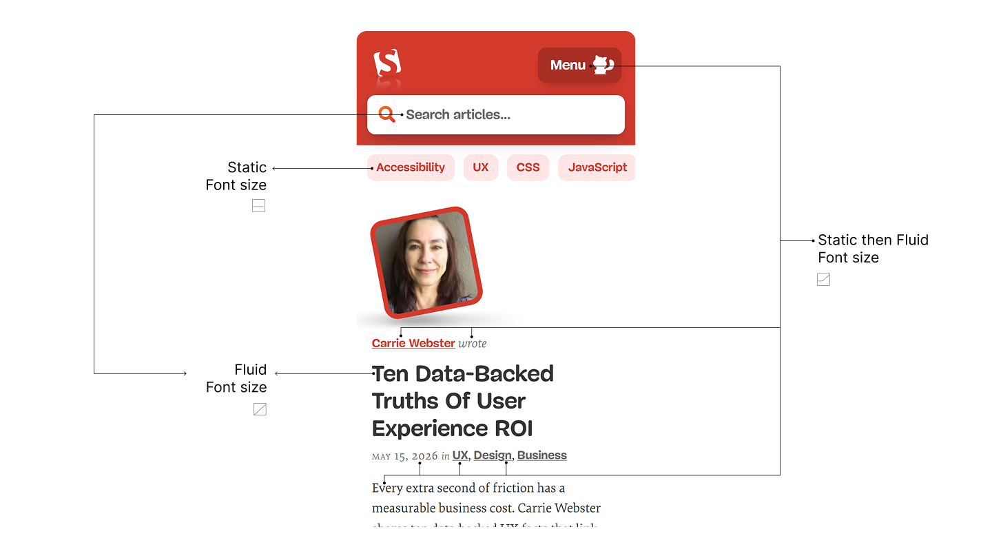
Highlighting components in the first fold of the legacy site with static size, static then fluid size, and fluid size.
For a more harmonious design, while still matching the Legacy Site as best as possible, a modular scale builds on two values: an 18px font size, culled from the Legacy Site; and a 1.13625 scale, one percent more than a Major Second ratio. Both values are for a sequence whose terms are within a ±1px variance of those at the two target viewports of the legacy site.
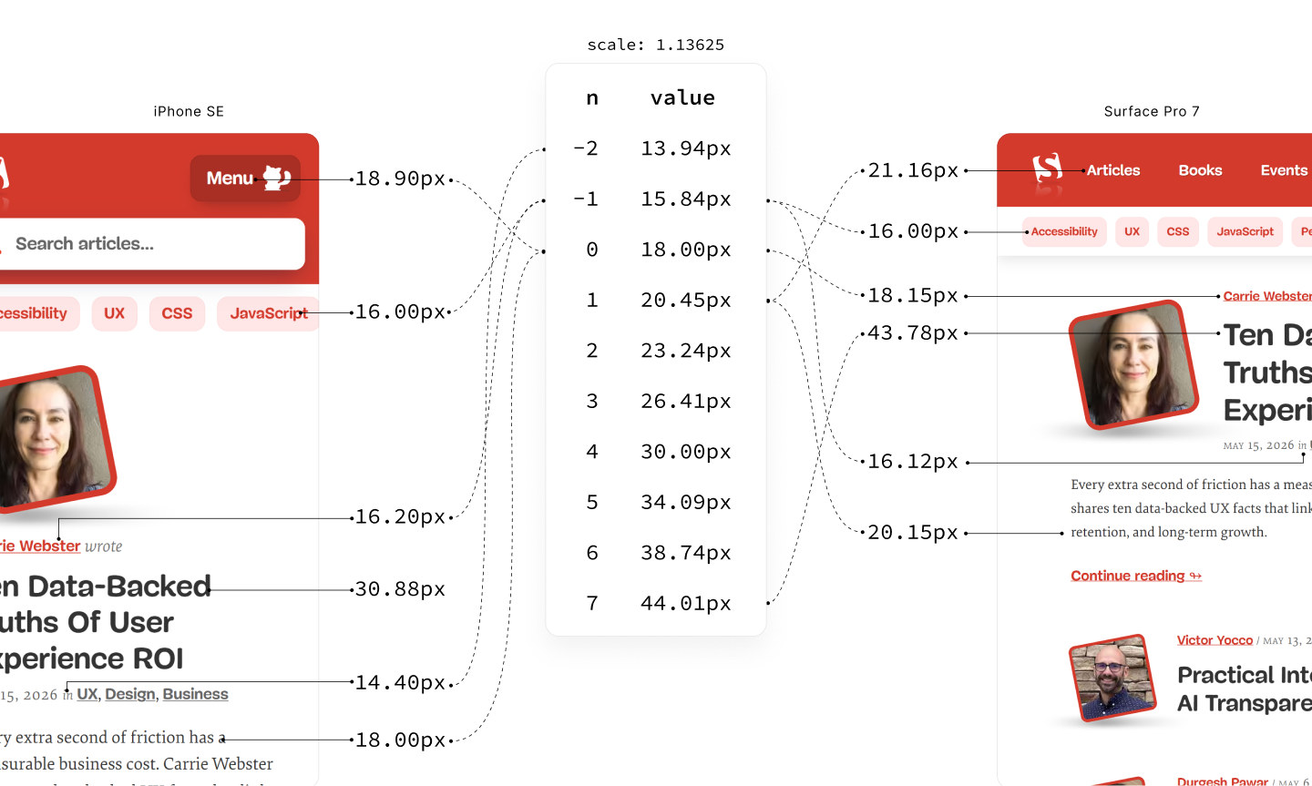
Font sizes in the first fold of those 2 target viewports of the legacy site differs by ±1px to sizes in the new font sequence
Two things can be observed:
-
Font sizes of non-leading content moved in one-step progression.
Post Author Name moved from 16.20px, roughly the first sub-step, to 18.15px, roughly the zeroth term.
More Menu Button and Post Excerpt moved from 18.90px and 18.00px, both roughly the zeroth term, to 21.16px and 20.15px, respectively, now roughly the first term.
-
Font sizes of leading content moved in three-step progressions.
Post Title moved from 30.88px, roughly the fourth term, to 43.78px, roughly the seventh term.
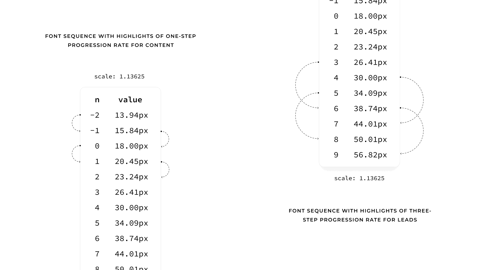
Font Sequence with highlights of one-step progression for non-leading content, and three-step progression for leading content.
To make these modular font sizes responsive, not adaptive, to hundreds of viewports — from smartwatches, through smartphones, tablets, PCs, to ultra-wide TVs — it takes a fluid formula.
The fluid formula to make a term at 375px viewport, the first target viewport, become the next term at 1368px, the second target viewport, making a one-step progression, is derived from solving simultaneously the following linear equations representing those two viewports:
In these equations: n is the term index, s is the font scale, b is the scaler value of the base font size in rem unit, m is the slope in viewport vw units, and c is the intercept in the unit of the base font size.
The resulting solution takes the form :
This formula generates the first four steps of the fluid system. 0.3
These steps are sufficient to handle non-leading content sizes on the page.
The line-height for these fluid steps — tightening the leading as the font size increases, matching the Legacy Site as closely as possible — requires to isolate the fractional part of the base line-height (h), scale this part inversely by the growth rate of the current step, then, finally, add the result back to the integer part.
This formula generates the respective line heights for the first four fluid sizes. 0.4
Similarly, the equations for a term to become the third term, for leading content, are as follows:
And its solution is as follows:
This formula generates the last four steps of the fluid system. 0.5
These steps are sufficient to handle the content sizes on the page.
The line-height for these leads mirrors the logic used for those non-leads, but the growth rate uses a term that is offset by double the progression step . 0.6
Lead and Content progressions in 375px and 1368px viewports.
In practice, the general framework for using these values are as follows.
These 8 fluid terms applies to the body and its components, but not the document root.
If the font size at the document root were fluid, it would create a moving-goalpost effect; calculating fluid scales, which are in rems, against a shifting base goes beyond the linear interpolation a CSS value can do.
Instead, the document root maintains the static version of the base font size, but as a relative unit so it's responsive to the user's font size in the browser settings. 0.7
Meanwhile, the zeroth fluid term, the fluid version of the base size, applies on the Body to restore the fluidity of content, sizing components without an explicit size. 0.8
Body
By default, the Body, which is the root of all components, stacks its children — the landmarks.
The structure and layout of the refactored body and its landmarks.
It has no need for a grid layout or a vertical flow, because, at the very least, gap is not needed between these landmarks, especially not when multiple landmarks share the same background to act as one unit.
The structure and layout of the landmarks, and their background colors.
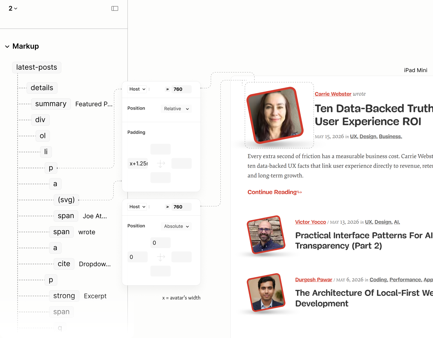
For some landmarks that needs to align content horizontally, their horizontal padding is declared as a token on the body, for them to inherit. 1.1
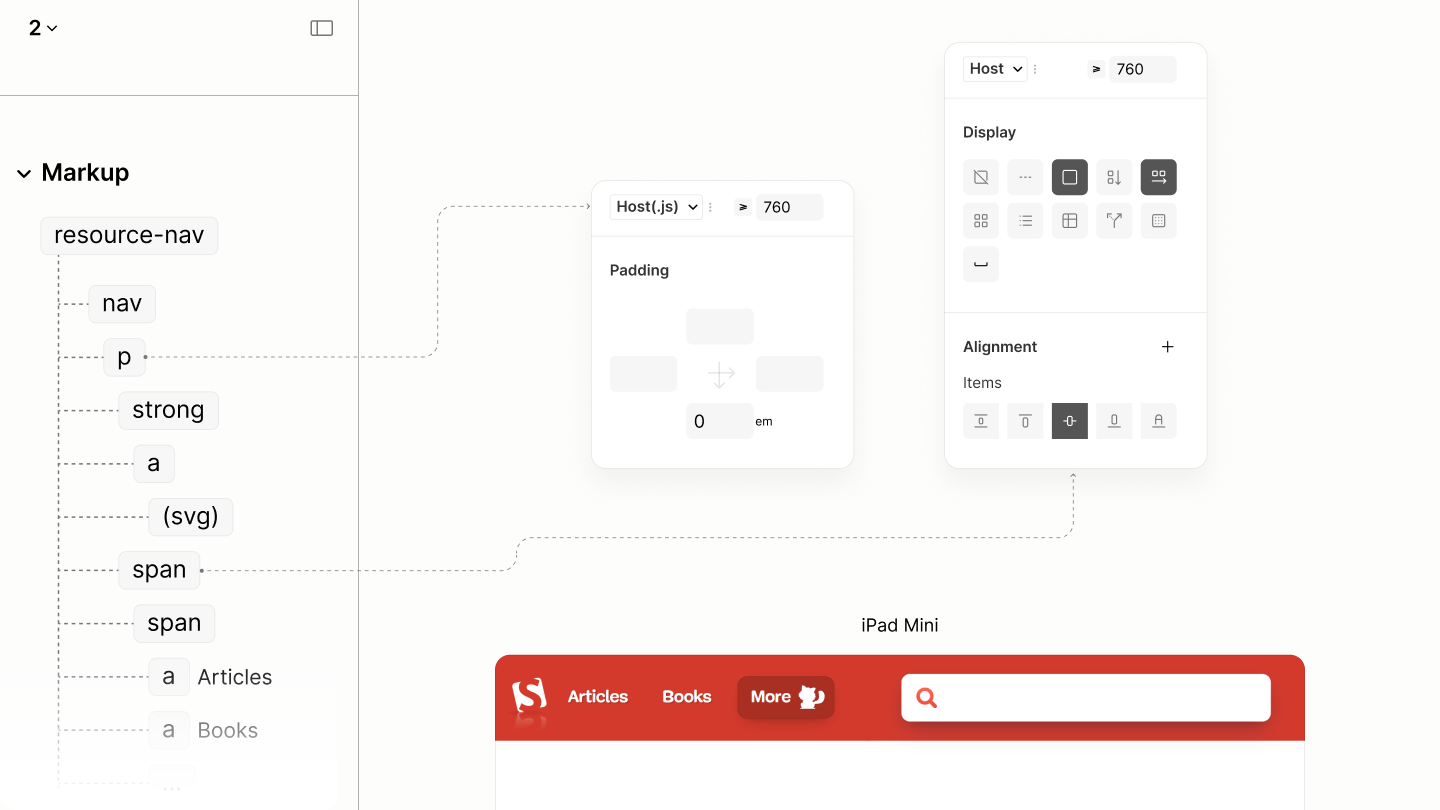
After the first breakpoint, rather than using an extra wrapper to place the Resource Nav and Article Search landmarks side-by-side, as it is in the legacy sit, the Body employs a two-column grid, aligned at tops. 1.2
While this places all landmarks into two columns, targeting those two landmarks, all other landmarks span both columns to simulate a single column, leaving only those two side-by-side. 1.3
The structure and mixed-column layout of the landmarks.
The first column, targeting Resource Nav, occupies only the space required for the dynamic links in the Main Menu.
The second column, targeting Article Search, consumes all remaining space to prevent orphaned whitespace across all viewports.
Jump Links
Reset state of the Jump-links
Each jump-link, colored and padded, uses the first fluid step size to get hierarchical lift, since they will be positioned on top of other components. 2.1
That positioning relaxes the need of a new display model on each link. A model that avoids any link's box from breaking like the second link in the illustration below.
Jump-links with their skin styles.
Like the Document Reset had certain components like the Root Heading from the Author Mode, this component had each of its already styled link out of view, until a keyboard focus from the user. 2.2
Upon keyboard focus, a Jump Link appears at the top corner of the viewport, awaiting a click to jump to its designated part. 2.3
Each Jump-link called to view upon focus.
Search Landmark

Reset State of Article Search Landmark.
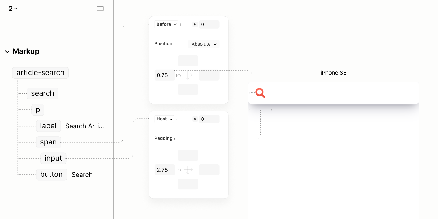
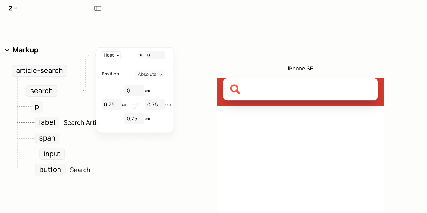
The search form uses a height 2.75 times the em-box of its text. With this value, 2.75em, the height becomes a fluid dimension because em unit is relative to the fluid font size. 3.1
With this fluid height, the implicit vertical space within becomes responsive. This is unlike that of the Legacy Site, where vertical space remains unresponsive despite the font size being responsive.
Its other dimension, width, uses a 100% value so that it can be the viewport width, then, later on, after the first breakpoint, it can become a column width without having to make any modification. 3.2
However, for the width to take effect, its wrapper, being an inline-level element, must become a block-level element. 3.3
Search form with dimension style and skin effects.
Since search forms are replaced elements, they can't contain icons.
However, with an appropriate left padding, they can reserve the space for the form's wrapper to inject the icon on top. 3.4
Because the wrapper, or any other element, injects icons as images via a pseudo element, they cannot inherit colors, they remain uncolorable.
The technique to make icons responsive to user's color is to color the background of their container with that user's color, then apply the icon as a mask over that background. 3.5
The icon builds on the absolute position style from the base stylesheet with a left inset of 0.75em to keep itself away from the left edge of the box, towards the center of the space reserved at the start of the search form. 3.6
Icon injected on Search Input via a pseudo element of its parent, a wrapper.
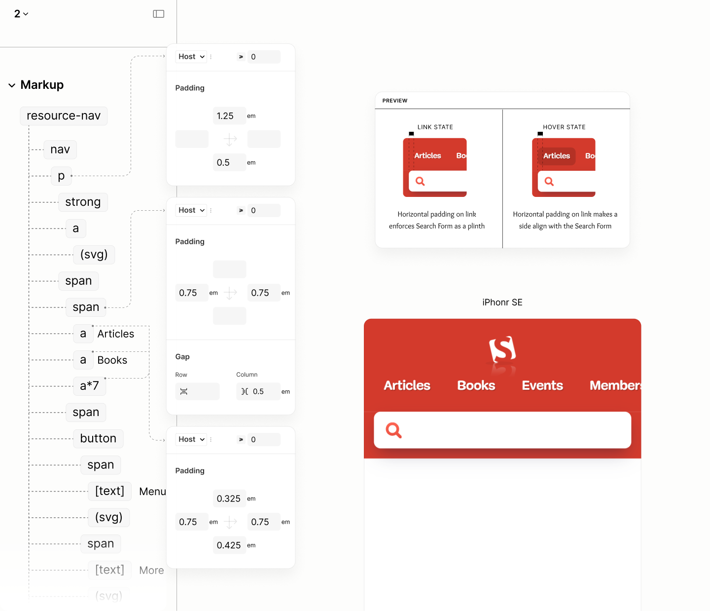
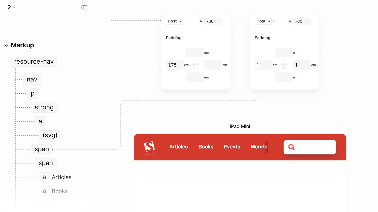
For visual stability, this landmark, through the solid shaped search form, acts as a plinth for Resource Navigation Landmark. It uses 0.75em horizontal padding to make the form wider, in anticipation of 1em horizontal padding on Resource Nav to make their content narrower. 3.7
Same 0.75em applies on the bottom padding. Since this landmark has a flat top, it leaves the top spacing to be managed by the Resource Nav landmark above it, because it may contain irregular spacing from its descenders. 3.8
Spacing set on the landmark, with additional fill properties.
Comparing the Search Landmark of the Legacy Site vs the Refactored Site in iPhone SE

After the first breakpoint, in anticipation of being beside the Resource Nav in a two-column grid flow of the body element, this landmark no longer needs the bottom padding it used to build up vertical spacing across both stacked landmarks in the previous breakpoint. 3.9
Besides, the right padding of the Legacy Site, an approximate of 2em, inspires the horizontal padding on that of the Refactored Site. 3.10
Since this landmark, being a plinth, influences the Resource Nav landmark, it also sets a height of 5em to influence their column height. 3.11
Because of that height, it requires a grid layout to center the content. 3.12
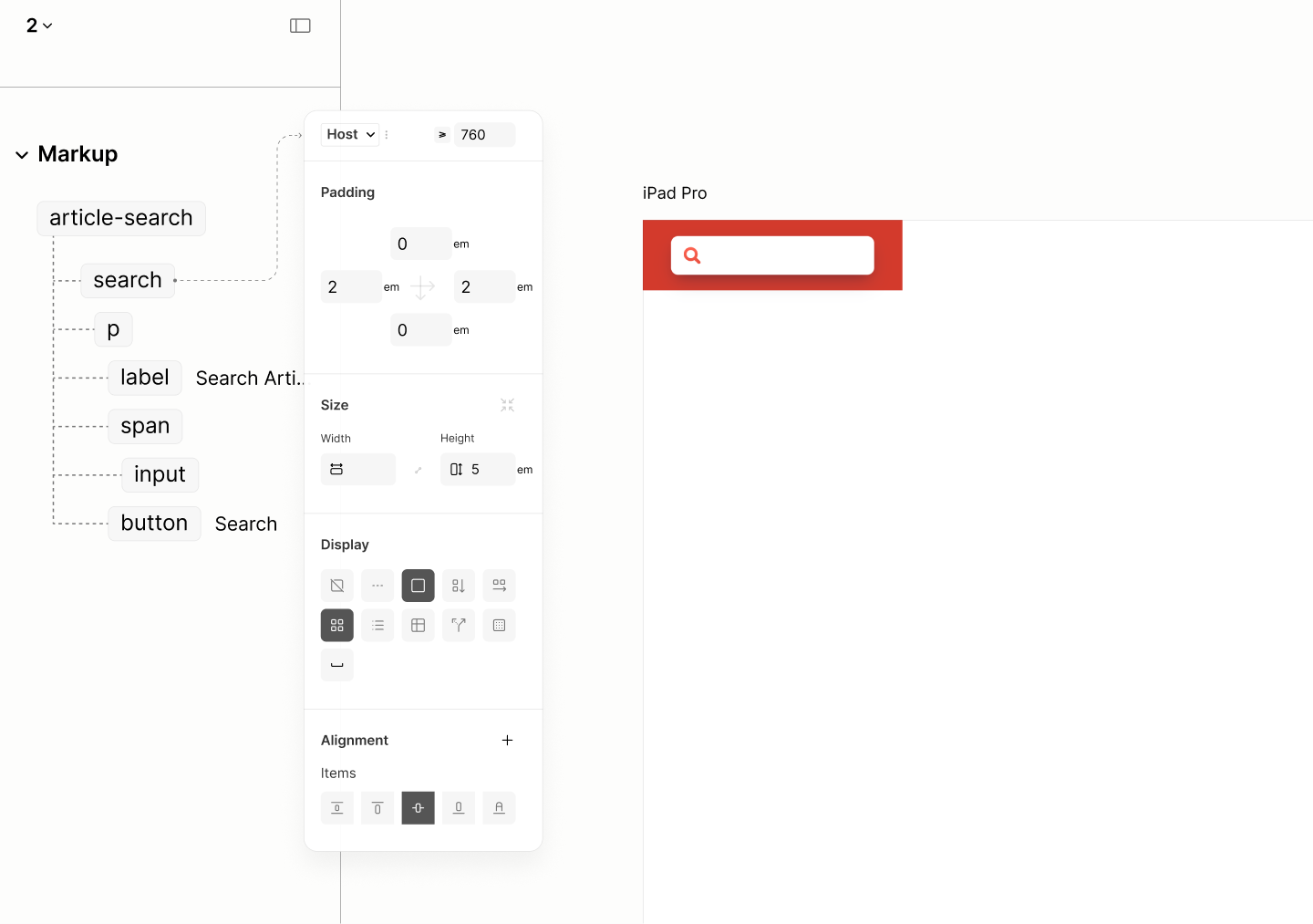
Styles for Article Search Landmark at a mininum width of 760px
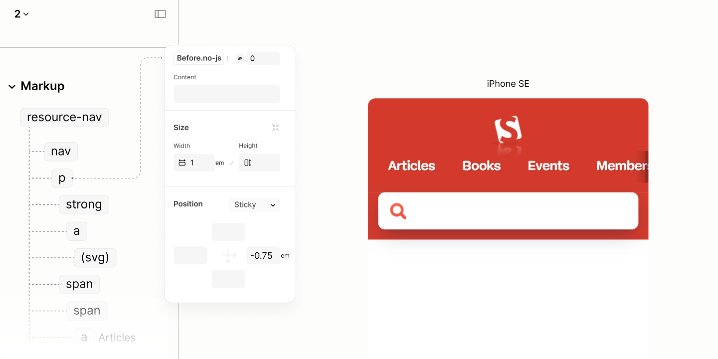
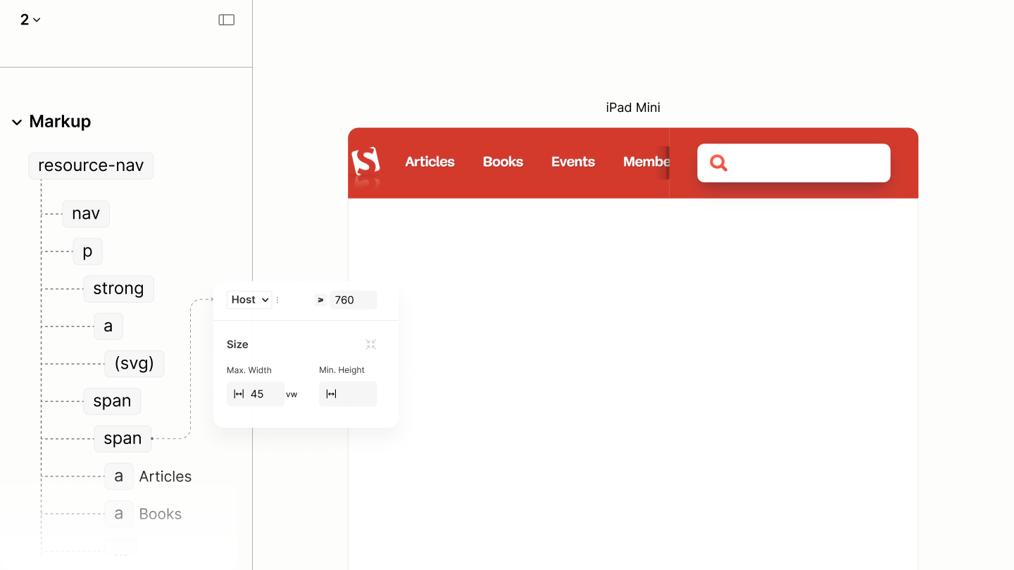
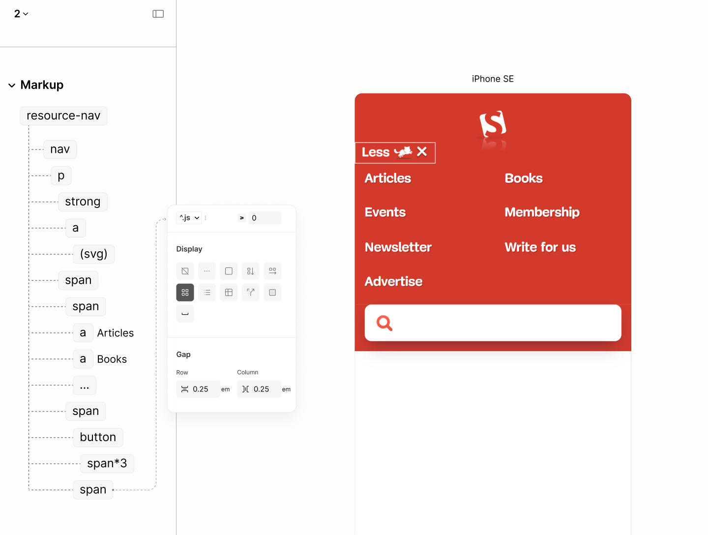
Resource Nav
Reset state of the Resource Nav. Landmark
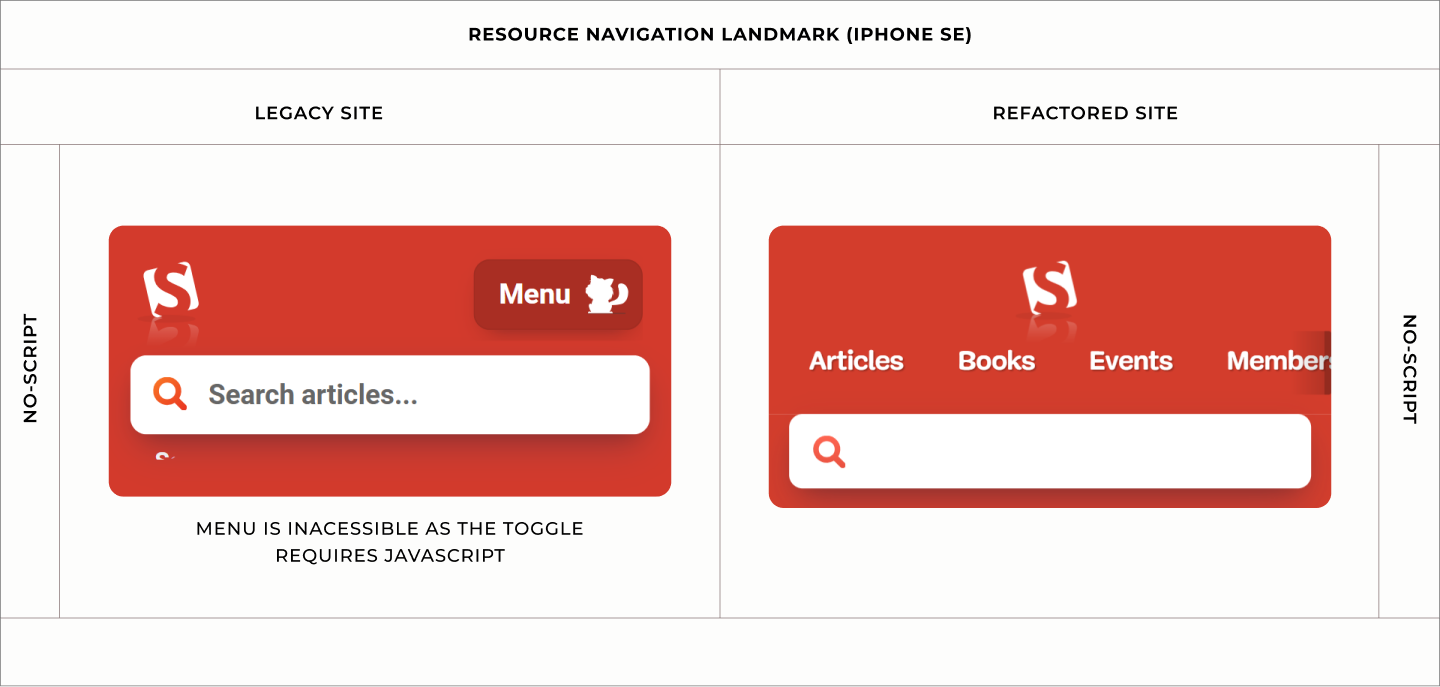
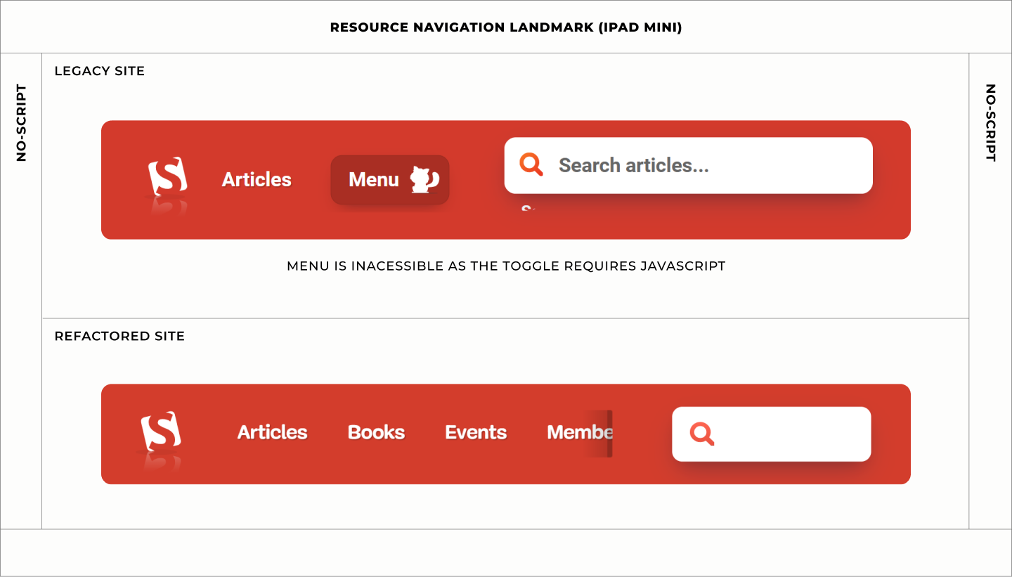
If the browser has javascript disabled, for whatever reasons, be it by users or by extension, the styles on the legacy site displays the toggle, yet hides the menus. Toggle becomes useless. Menu becomes inaccessible.
This fate did not befall the Refactored Site. Not a bit.
The good fate starts with the Block laying its children on a vertical flow. These children are the Title containing the Logo, and the Content containing the Main Menu.4.1
That act, taking Title out for Content to have the whole floor, provides room with a full width for what's to come for Main Menu within the Content.
For balance, the Title, because of the logo it contains,aligns itself to the center of the Block since it is a flex item. 4.2
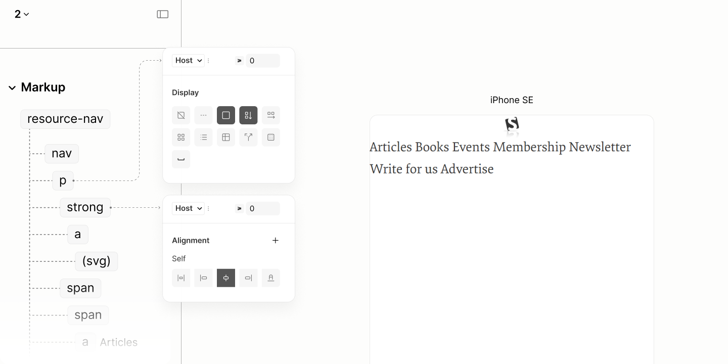
Placing the components of the nav on their own level.
Down in the Title is the Logo via a Link.
This Logo, having removed the transformation attributes that targets the reader mode,4.3 sets a height to match that of the Legacy Site.4.4
Since the Logo has a reflection which shouldn't be a part of the focus area of the Link, the Link sets a height that excludes the reflection area. For the height to work on this inline element, it needs a touch of block display model.4.5
Structure and styles for the logo's dimension.
As for the Main Menu within the Content, their style when javascript is available, or not available, is like that of the legacy site when javascript is available.
It lays its links on a horizontal flow, no wrapping. 4.6
This flow, which will make the element visible always, applies only when the element is not hidden, when javascript has not hide it because the user toggled it.
To avoid page overflow because of those links when viewport width is smaller, Main Menu is made scrollable. 4.7
Main Menu with links in a single, scrollable row, and no scrollbar.
That scrollability effect on the menu has one side effect: vertical outlines of links in a focus state are clipped off.
To make these outlines show, it takes a vertical padding on Main Menu with a value greater than the outline offset, say a quarter em.4.8
Layout Styles for the Main Menu of Resource Nav. Landmark with auto scroll and no scrollbar.
That quarter em, for its simplicity in declaration, is maintained as a base value to space this landmark. The result of which still matches the legacy site.
To the sides of the Main Menu is a horizontal padding whose value is the same as that of Article Search Landmark: a three-quarter ems. 4.9
This value, together with the left padding of the first link, and the right padding of the last link, makes either side looks narrower to the Search Form below it, thus, playing to our Plinth Script.
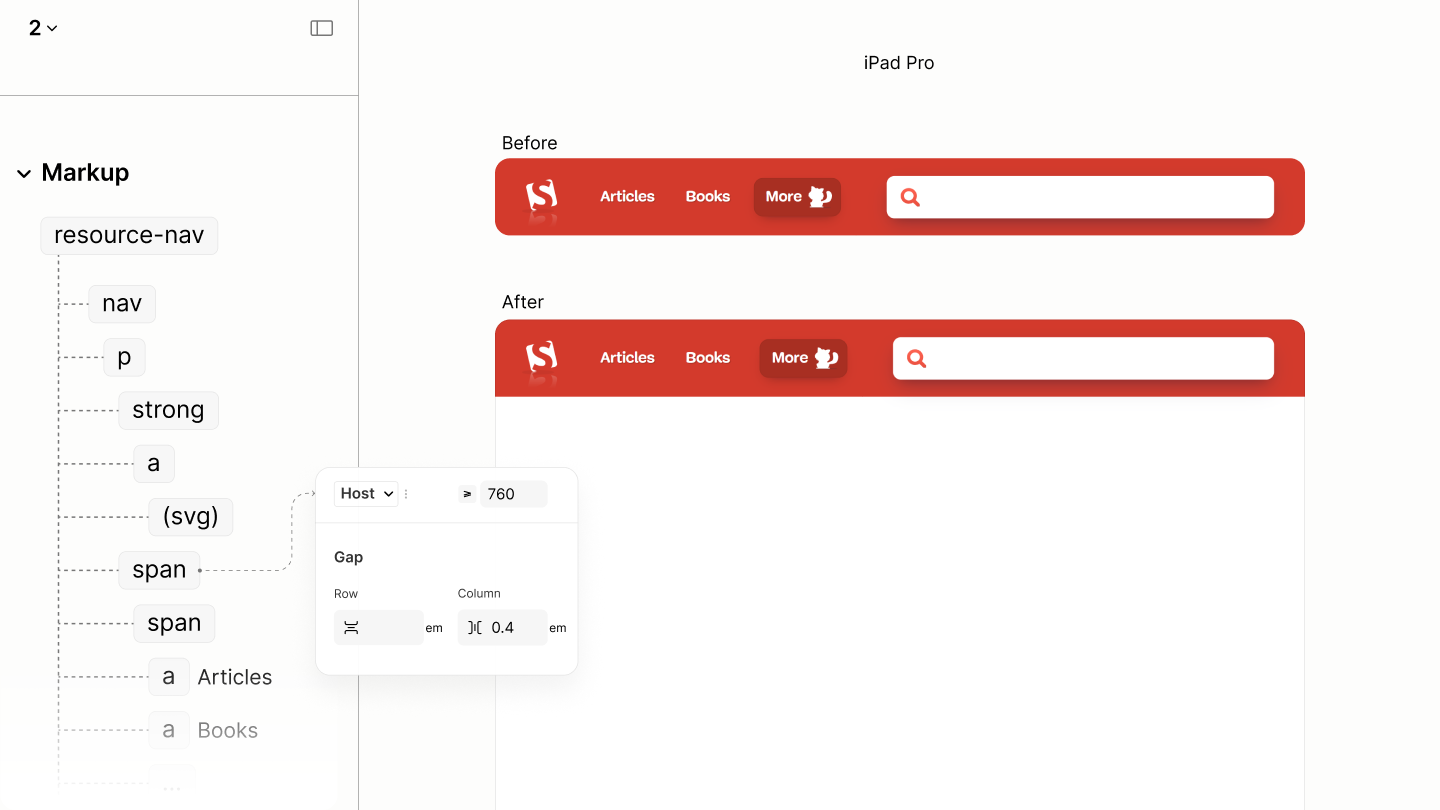
Between the Main Menu, separating the links, is a column gap of two-quarter ems. A gap to enforce a change of cursor, hinting at a change between two adjacent links. 4.10
Each link, not only in the Main Menu but also in the More Menu, have horizontal padding of three-quarters em.4.11 Same value spreads around the vertical padding.4.12
To wrap up the spacing, the Block uses a top padding of five-quarters ems, and a bottom padding of two-quarters em, making the resource navigation landmarks sits on the Article Search Landmark, following the Plinth Story. 4.13
Spacing the landmark
Despite the Main Menu occupying the whole floor, showing at least one link even in a narrow viewport, there's still a need to hint at scrollability, especially when it will share a row with another component after the first breakpoint.
To hint for scrollability, Main Menu adopts a visual indicator, added via a pseudo element, a ghost element. An ::after pseudo, not ::before, that places the indicator after the last link, at the end of the container. A position closer to the viewport end, the target position.
Since this indicator is only meant for no-javascript state, it style declarations are tied to this state.
Being a flex item without content, it needs not shrink to have dimensions.4.14
It uses a width of 1em so that the Hold part of its Fade-in-then-hold background takes 0.25em width while the remaining 0.75em is like the left padding of its siblings. 4.15
To make the indicator always stay at the viewport end, not the container end, it uses a sticky position. Because the container has a horizontal padding that makes its follow the Plinth Script, it has a right position whose value is the negative of that padding.4.16
For this to work, for the Indicator to stick to viewport end at the device edge, there hasn't been, and never should be, horizontal space on any ancestor element.
Design that sticks a scroll indicator to the viewport end.
That completes the mobile view for this landmark, before any breakpoint, when javascript is not available.
Comparing the Resource Navigation of the Legacy Site vs the Refactored Site when Javascript is disabled in iPhone SE
State of this landmark, alongside the search landmark, after the first breakpoint, when javascript is not available
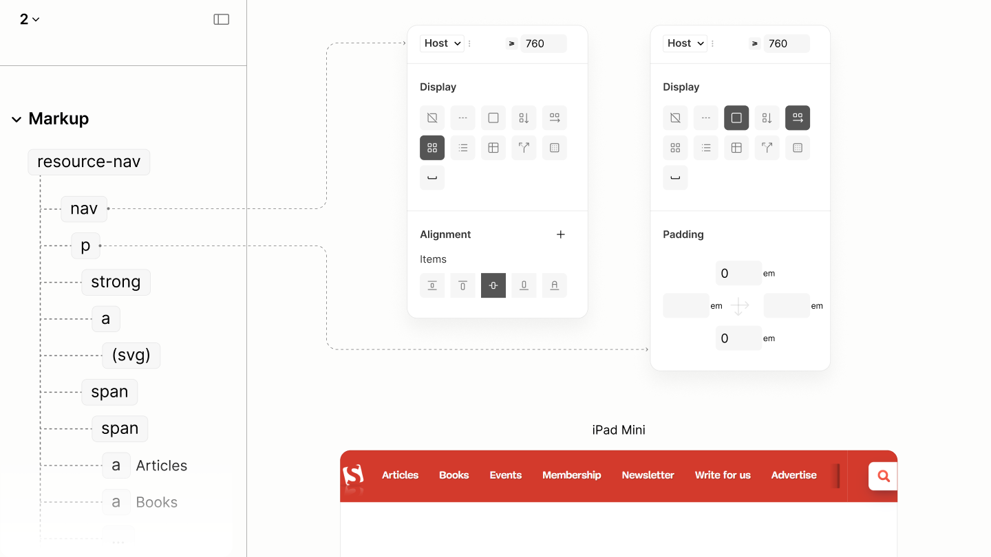
Now that this landmark is sharing the same row with the search landmark, its Block switches from a vertical layout to a horizontal layout, making content across both landmarks be on the same level. 4.17
The Block's vertical padding, influenced by the search landmark when it was below this landmark, is no longer needed now that the search landmark has moved to the right. 4.18
While content across both landmarks are on the same level, it takes the parent of the block to align the block to the center, like the search form, irrespective of the block's height. 4.19
Balancing the vertical space across both landmarks, on the same row.
While the Search landmark is as tiny as it can be to accomodate all links of the main menu, either its horizontal padding, or a smaller viewport, may still cause an overflow.
Capping the Main Menu, with a value that leaves space much more than any horizontal paddings across the two landmarks, creates room for the search form to be reasonably wide, and makes Main Menu not to be unneccessarily wide. A value like 50vw width. 4.20
This cap, constraining the Main Menu when javacript is disabled, is only applied when javascript is disabled, to avoid leaking to the state where javascript is enabled.
Managing widths of content across both landmark
Now, it's left for spacing to further make both landmarks look as though they are a single unit.
The 2em right padding of the Search Landmark is balanced on the left padding of this landmark with 1.75em. 4.20
This 1.7em, when combined with the space at the left of the logo, makes an optical balance of space at the horizontal ends of the row.
To balance Main Menu between the logo in the Resource Landmark, and search form in the Search Landmark, existing horizontal paddings must be considered.
For prominence, the Content uses a horizontal padding of 1em, making, its right padding of 1em together with the 2em left padding of the Search Landmark, a cummulative total of 3em. 4.21
This 3em between those two landmarks is automagically balanced with the cumulative space between the Logo and Main Menu. With the 1em left padding on Content, 0.75em left padding on Main Menu, and another 0.75em left padding on the first link, making 2.5em, along with the right spacing on the logo, and the implicit vertical spacing on the first link.
Balancing the horizontal space across both landmarks, on the same row.
That complete the styles of this landmark when javascript is disabled.
Comparing the Resource Navigation of the Legacy Site vs the Refactored Site when Javascript is disabled in iPad Mini
State of this landmark when javascript is enabled before any breakpoint.
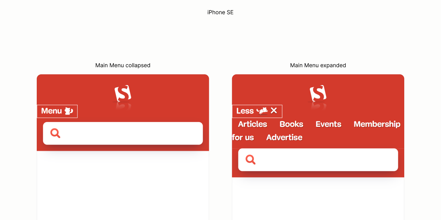
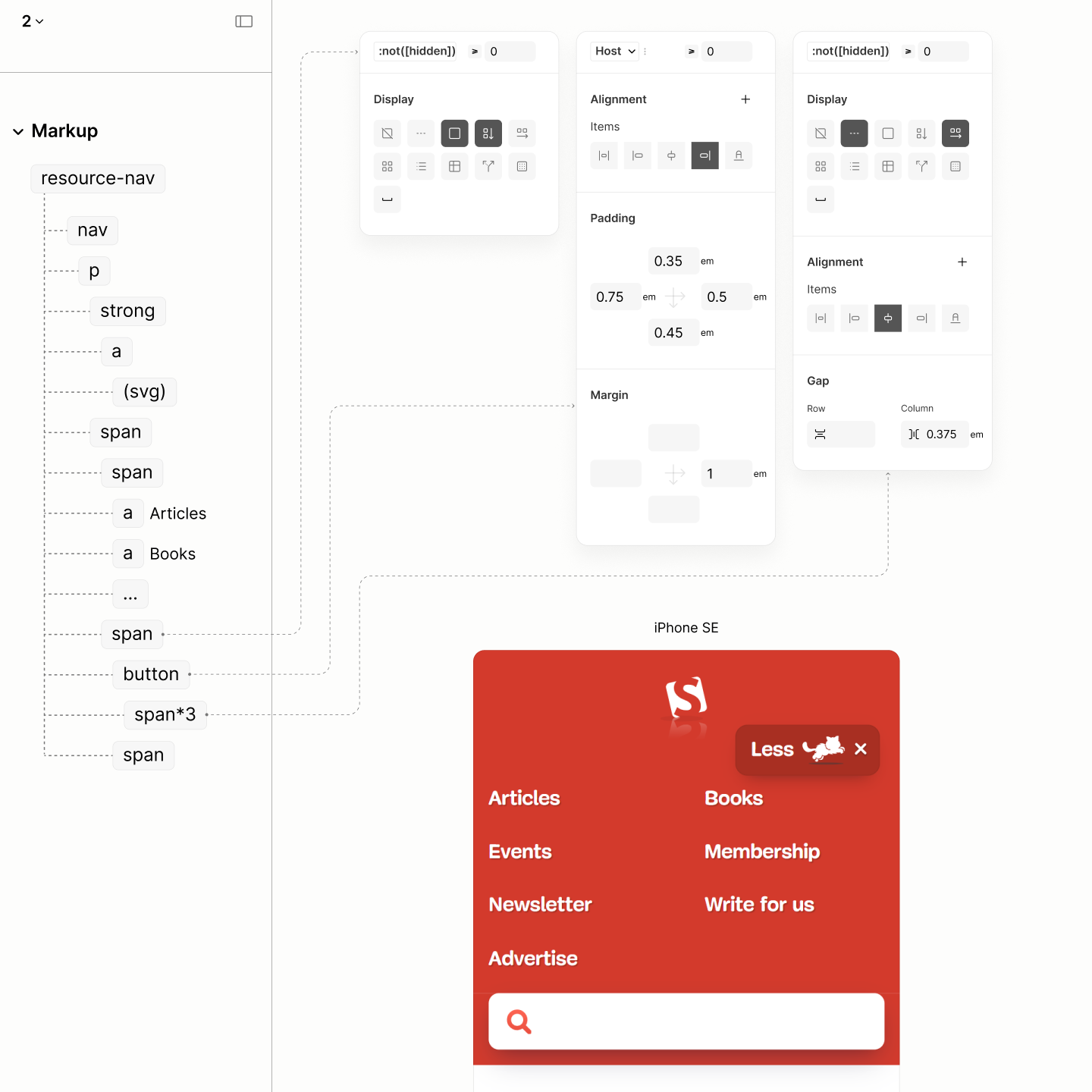
More Menu uses a grid flow to make auto-columns of its links. 4.22
The min-width of each column is the width of the widest link.
That flow must be declared when More Menu is expanded, since it has an implicit visibility and only javascript must have exclusive rights to manage the visibility when the toggle is pressed.
More Toggle uses a similar dimension to that of the links, but with an implied height, via vertical paddings, that is more than the links and less than the form. 4.23
Each of its 3 content, because of their need of a gap to separate their text from set of resized icons, uses a horizontal flow. 4.24
To align the More Toggle to the right of the More Menu, as it is in the legacy site, it requires its parent container, More Part, to use a vertical flow layout 4.25 before it can align itself to the end.4.26
It takes a right margin of 1em to keep the toggle away from the right edge of the viewport. With this value that is a quarter more than the right padding of Search landmark, this side of both landmarks follow the Plint Story. 4.27
To align the Logo and Toggle, vertically, changing the flow direction of their common ancestor to row seem to work until the More Menu is expanded. It isn't really working because More Menu can;t take the full width, like the legacy site, when the Logo shares some part. 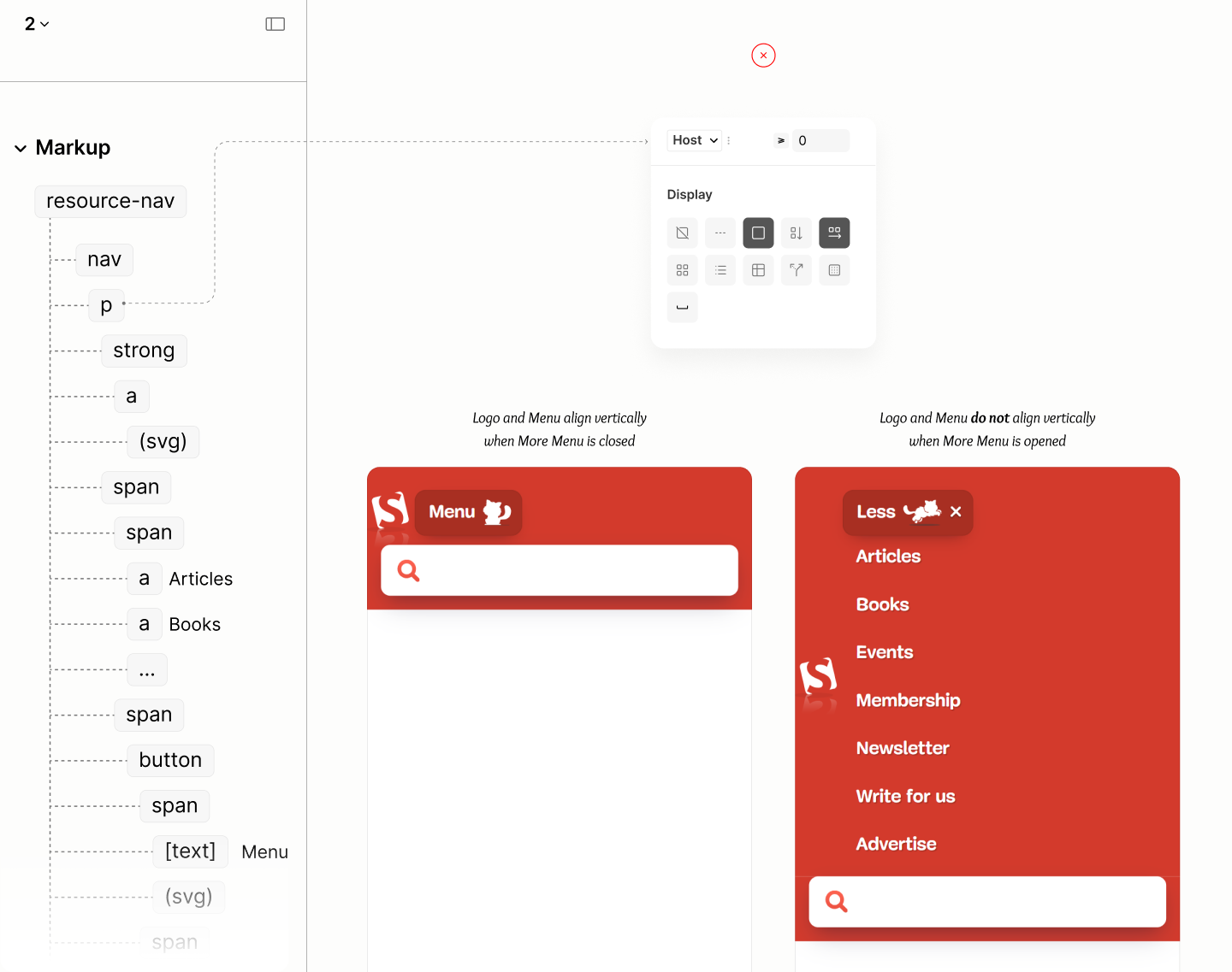
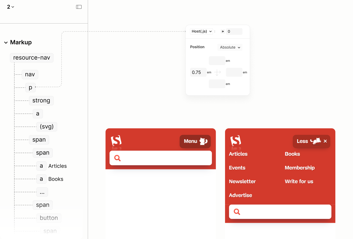
Instead, the Title, the topmost wrapper for only the Logo, is removed from flow with an absolute position style, granting Content, and eventually, the More Menu within, the ability to stretch to full device width. 4.28
Of course, this style is done when javascript is enabled.
With a 0.75em left offset on the Title, same value on the left padding of Article Search Landmark, both components, aligns to their shared left. 4.29
The anti-clockwise tilt of the Logo, creating more inner space at the right, complements the margin right on the Toggle, making the resource navigation maintains the Plinth Story.
Now that both Logo and Toggle align, it takes 1em bottom padding on their common ancestor, the Block, to complete the vertical progression of space when More Menu is closed. 4.30
A quarter-em progression from the 0.75em bottom padding on the Search Landmark, through this new 1em bottom padding on the Block, to the 1.25em top padding on the Resource Landmark. 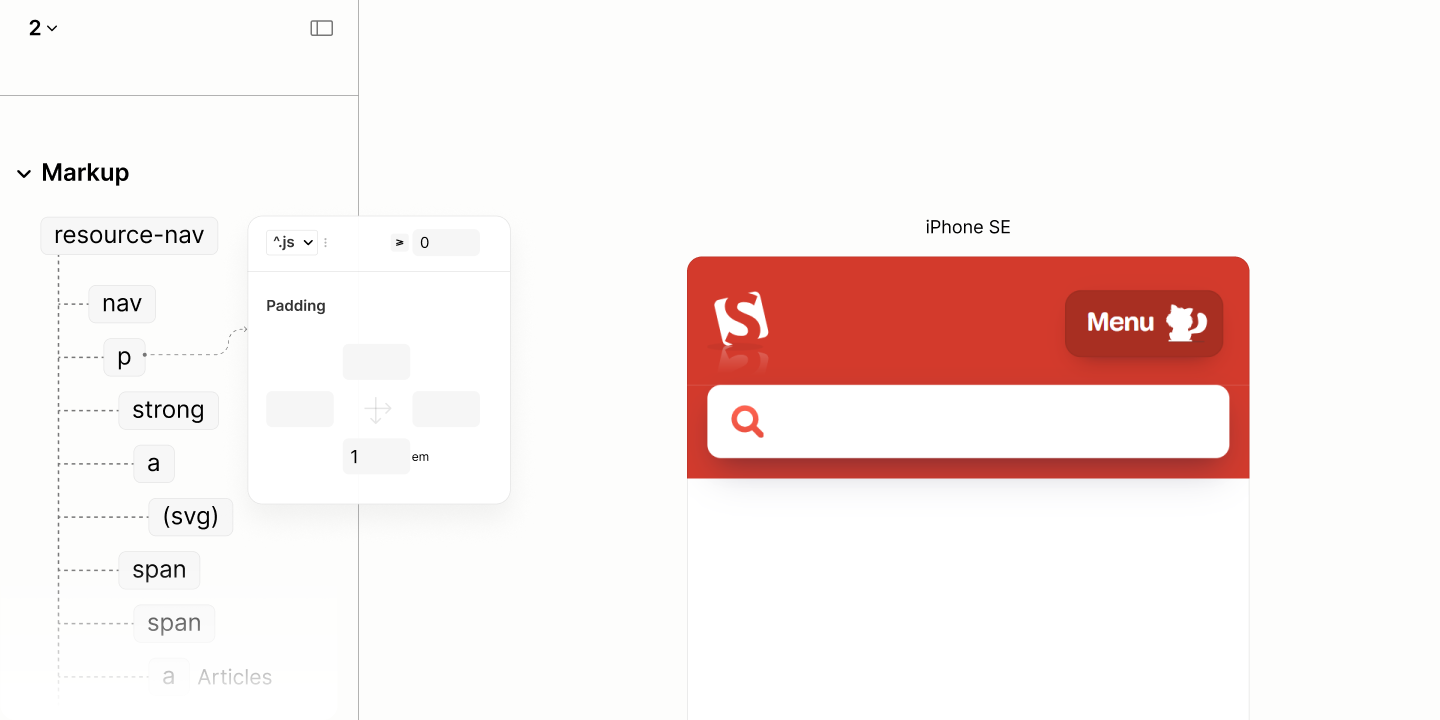
However, when More Menu is opened, it takes that same 1em but as top padding. Then another 1em bottom padding, together with that 1em bottom on the Block, to associate this menu by proximity to the Toggle. 4.31
In addition, a 1em right padding for box container alignment with the end of the Toggle, and a 0.4em left padding for alignment with the start of the logo. 4.32
In hindsight, in viewport of smartwatches, both the logo and toggle overlaps.
A relative position on the toggle, a functional component, makes it stays on top of the logo, a presentation component, for a simple, fair workaround. 4.33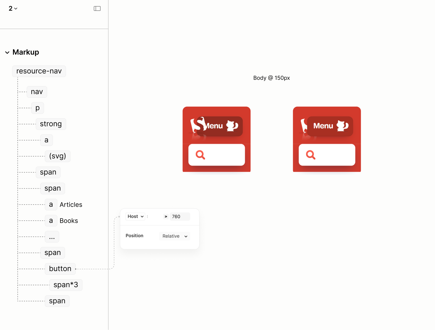
Comparing the Resource Navigation of the Legacy Site vs the Refactored Site when Javascript is enabled in iPhone SE

State of this landmark, when javascript is enabled, and when after the first breakpoint.
After the first breakpoint, when javascript is enabled, when both the Resource Landmark and the Search Landmark, there must be a horizontal flow layout and a center alignment on Content so that those links, and More Toggle of More Part can be on the same level, and the same baseline, like their distant neighbours: the logo, and the search form. 4.34
For the centering to work, the Block must drop the bottom padding it used for separation with the Search Landmark in the previous breakpoint. 4.35
Aligning the logo, links, and toggle of the Resource Landmark to the center, like the search form in the next column.
To restore the horizontal spacing across both landmarks, in this javascript-enabled state, nothing new but two resets are needed.
The More Toggle no longer requires a right margin to align with the Search Landmark, as the two are no longer stacked. 4.36
Also, the Logo, via the Title, no longer needs to be absolutely positioned to be on the same level as More Toggle. 4.37
Restoring the balance of horizontal space across both landmarks.
To make the space between any two links match that between the last link and More Toggle, the Content needs a gap of .5em with a dip. 4.38
A 20% dip removes the optical gap on top and bottom of the last link, induced by the solid dimension of the More Toggle.
That 0.5em, combined with the 0.75em left padding on Main Menu, and 0.75em left padding on the last link, a total of 2em, is equal to the computed space between any two links: a sum of 0.75em right padding at the left link, 0.5em gap between the two links, and a 0.75em left padding at the right link.
With these spaces, unlike the Legacy Site, the Refactored Site gets a progressive, consistent space across two columns. It goes from 1.75em between links, 2em around the two grid columns, to 3em between the optical visual columns.
Balancing the space between the links, and the toggle.
Now, the Resource Nav looks balanced until the More Menu is opened. 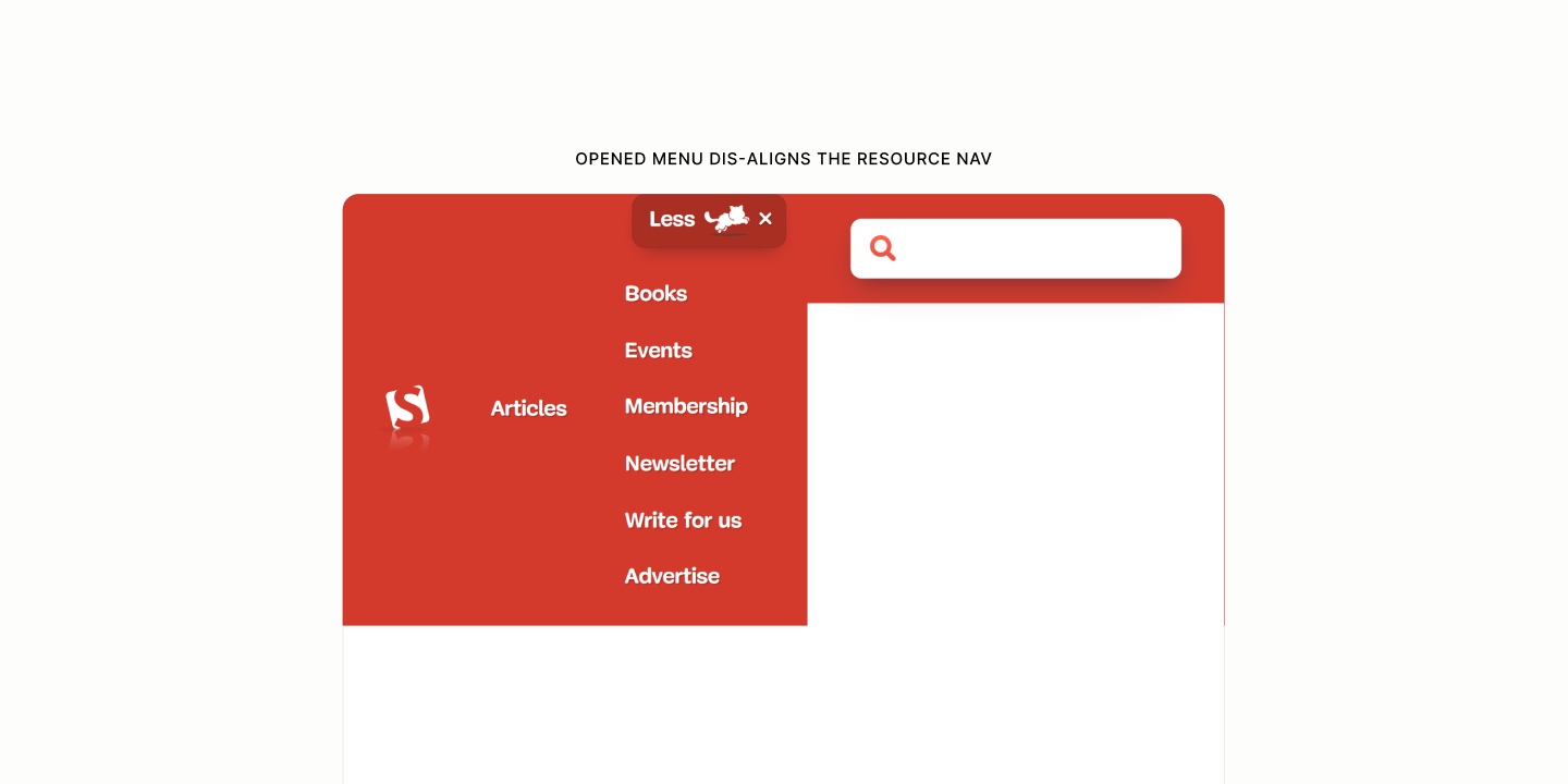
Because the More Toggle shifts dynamically to accommodate the Main Menu's fluid links, it serves as a moving anchor for the More Menu.
However, since More Menu can't be pinned to its sibling, More Toggle, their shared parent, More Part, coordinates the relative positioning. 4.39
More Menu, whose grid flow is now in a single column, is absolutely positioned to More Part, and elevated to ensure it stays above any subsequent components. 4.40
To hang More Menu at the bottom of More Toggle, the menu uses a 100% top offset plus the height of any beak it might have. 4.41
This 100% equals the height of More Toggle, because 100% offset of an absolutely positioned More Menu is equal to the height of its anchor, More Part, which contains only More Toggle.
And, center More Menu, an absolutely positioned component, to the center of More Toggle, the optical anchor, More Menu uses a 50% left offset to push itself towards the center of the anchor, then a -50% horizontal offset to pull its midpoint back to the center of the anchor. 4.42
To create that beak, it takes a triangle made out of borders of a pseudo element. A ::before pseudo, so it is placed at the top-left content edge of the menu, a position closer to the top-center mark outside the menu, the target position. 4.43
This beak is removed out of flow in relative to, the More Part, targeting the center of the More Toggle via being at the center of th More Part. 4.44
The centering needs a 50% left offset to push itself to the center of the menu, a -50% horizontal offset to pull its midpoint back to the center of the menu, then a -100% vertical offset to make itself sit on top of the menu. 4.45
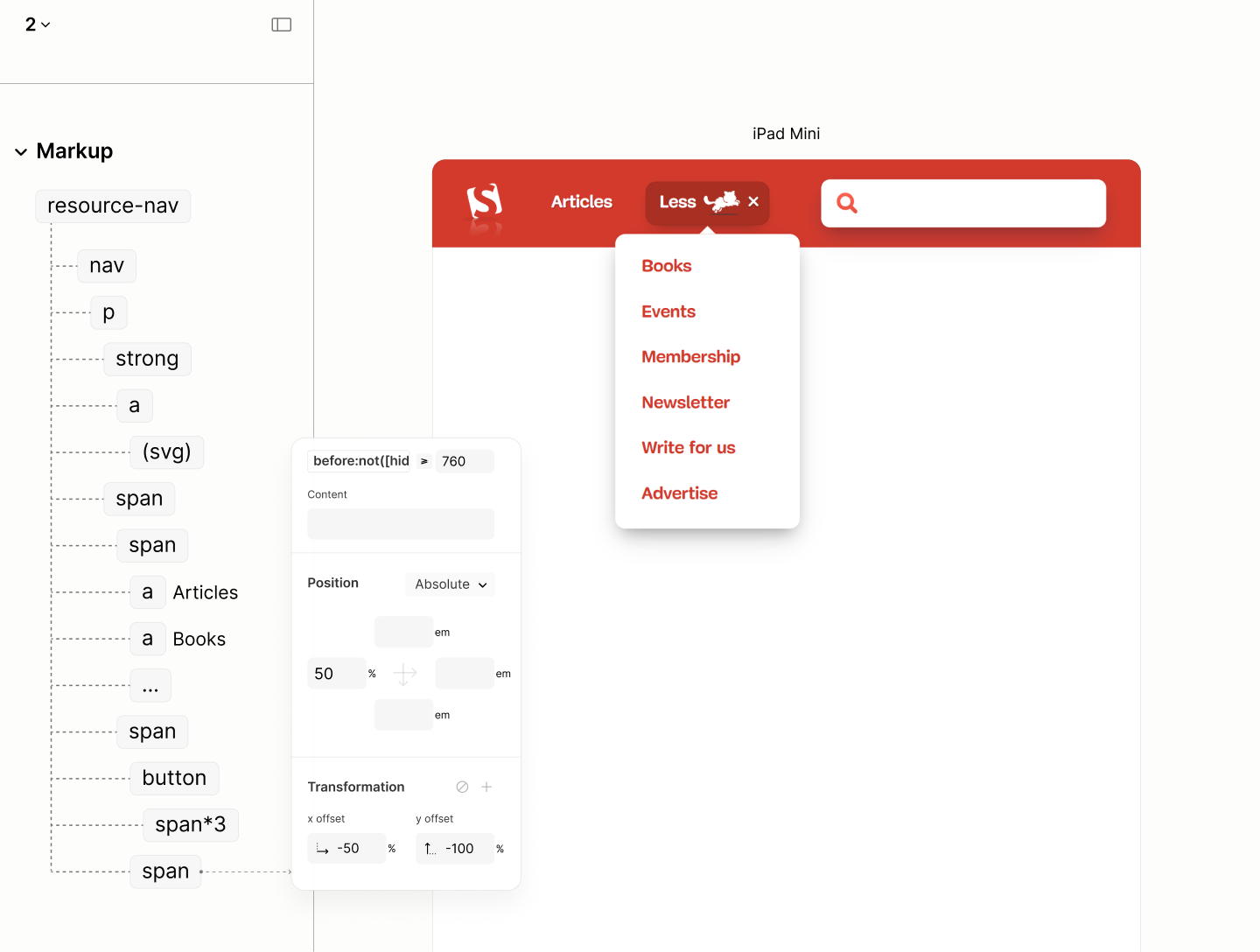
Comparing the Resource Navigation of the Legacy Site vs the Refactored Site when Javascript is enabled in iPad Mini
Top-Topics Nav
Reset state of the Top-Topics Landmark
The Content of Top-Topics Nav, like Main Menu of Resource Nav, uses a horizontal flow layout with a scrollable container for the links, a block padding to reveal the clipped vertical outlines because of the scrollability, and a matching column gap to separate the links.5.1
This time, though, there's no need for a scroll indicator, as the content always trails off to the edge of the viewport rather than running into another element.
Layout of the links with their skin styles.
To reveal the left focus outline of the first link and the right focus outline of the last link, as well as align with the Article Search Form, the Content uses a horizonatal padding of 0.75em like that on Article Search Landmark. This time, though, it's 15% smaller — an optical adjustment ensuring the first and last link of these compact links align with the ends of the form above.5.2
Horizontal alignment of the Top-topics Link to the search form.
Comparing the Top-Topic Navigation of the Legacy Site vs the Refactored Site in iPhone SE
After the first breakpoint, with the two previous landmarks now side-by-side, the Content's left padding increases to match that of the Resource Landmark, while its right padding increases to match that of the Search Landmark. 5.3
Comparing the Top-Topic Navigation of the Legacy Site vs the Refactored Site in iPad Mini
Main Landmark
Like the Body, the root for all landmarks, the Main Section, the root for all sections, with the heading group hidden to all but screen readers only, lays it content in a single file, by default. As such, all components begin after another, in a single file, with no space between them.
Since, by document structure, all components are not direct siblings, it takes different property names to declare same value across the components.
This value, 3rlh, a value more than the largest space within any component, is declared as a token, for those properties to use, to avoid redeclaration of values. 6.1
To start with, the Root Section, which is the sole child of the Main Landmark, uses a vertical margin to separate itself from the landmarks before and after it. 6.2
Structure and outline of the Root section with a third of the token as top margin, and one unit of the token as bottom margin.
Because of direct and indirect, sibling, it takes a two-step implementation for the spacing that separates components.
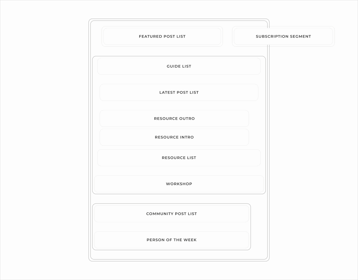
On the Root section, a grid gap separate segments, which in turn, separates Featured Posts, Subscription widget, Guide List, and Community Posts. 6.3
Same grid gap applies on the Complementary Segment to separate Community Post List and POW component.
Structure and outline of the Root Section with a grid gap of the token on the section itself, and on the complementary segment.
As for the remaining components, which are under the second content segments, since three of them — the Guide List, the Resource Intro, and the Resource List — need no space on top, a grid gap that applies space between all components can't be specified on their parent. Instead, a top margin applies individualy on them except on those three. 6.4
Top margin with the token value on Latest Posts, Resource Outro, and Workshop components.
Now, on the resource intro, a margin block separates the Resource Outro, and the Resource List to complete the vertical spacing on mobile. 6.5 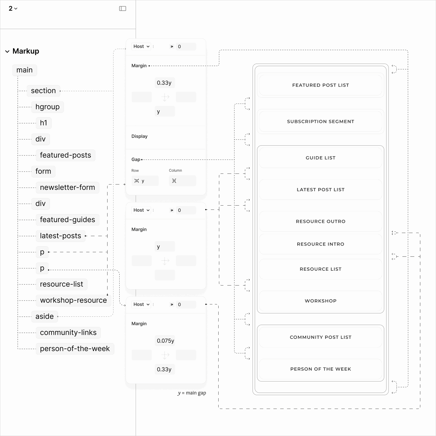
Unlike the body, where all children have full widths, in the Main Section, only one have full width, others do not.
On top of that, within those others, those with solid background like Guide List need to be wider so they don't look smaller to those without backgrounds.
Because of these irregularities, a top-to-bottom approach like setting padding or width on their parent can't work.
Rather, it has to be via set of components, individually.
The Workshop component, being a full-width component, takes no further style. It maintains its implicit 100% width.
Components without a background uses the viewport width short of two pads. With an auto horizontal margin, it makes it look as though one pad is at both sides. 6.6
The three components with background — Subscription Segment, Guide List Component, and Resource List Component — uses same technique but is further shorted by 1em so that their solid background doesn't look smaller to their neighbours. 6.7
Width of different components deduced from reducing the full width by a multiple of the horizontal padding token from the Body
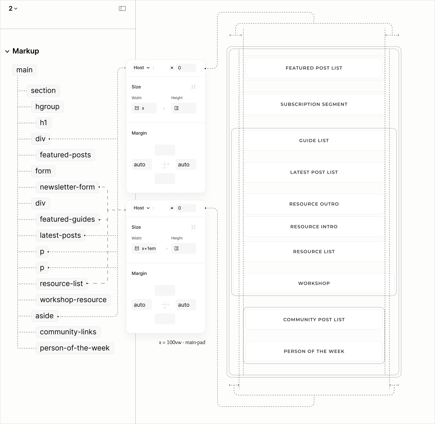
After the second breakpoint, Same strategy the body use in laying the Resource Nav and Article Search on the same row while others are on their own is also used on the Root Section to place the segment for Featured Posts and Form Segment on the same row in 60:40. 6.8
However, the width of those two persist and cause overflows.
Overflow of the Subscription Segment, after placing it and Featured Posts on the same row.
Making their widths auto stops the overflow, but it also stops the padding trick. 6.9
To fix, a right padding on Newsletter Segment, a left padding on Features Segment, and a column gap on their parent fixes the spacing. 6.10
Post List
Reset states of Latest Posts, Featured Posts, and Community Posts.
A block display model on Post Title preserves the inline display of its siblings to fake 3 optical blocks, making components of the Latest Posts on their required levels. 7.1
Components of Latest Posts on their expected levels, with their skin styles.
On Featured Posts, it takes an additional block display on the avatar and the Continue-more components to get all components on their expected required levels. 7.2
Components of Featured Posts on their expected levels, with their skin styles.
As for Community Posts, it requires an inline display model on both Post Info and Post Excerpt, to make two blocks look like one block. 7.3
To mark the end of the first block, and beginning of the second, the first uses an after-pseudo element to insert an em-dash. 7.4
Components of Featured Posts on their expected levels, with their skin styles.
In this refactored site, List Titles are not static content like the legacy sites. They are interactive content. They are disclosure widgets.
Without having to make new, and different style, the refactored site maintains the wide line as marker of the List Title in the legacy site. This time for the expanded state. 7.5
As for the collapsed state, that line is shortened to hint at a change of state. 7.6
Structure and styles of List Titles, shown on Latest Posts.
To strictly imitate the legacy site, well, this time, the List Title of Featured Posts is taken out of flow, out from the visible area, when expanded. 7.7
When there's a focus, that List Title is brought back, floating on top the avatar. 7.8
At that floating state, if clicked to collapse the Featured Posts, the disclosure summary must stay visible, in its original space, not floating space. 7.9
Structure and styles for maintaining and floating the disclosure widgets.
Now that components within the Post component are in the right viewport and level, enter spacing:
The spacing starts from the inside-out, using margins instead of gaps since some components are block-level while others are inline-level.
It starts with a value of 0.375rlh.
For Featured Posts, this value applied as a bottom margin on the avatar, to separate the avatar from the inline-level content that follows. 7.10
Then, as a top margin on all Post Titles, to separate these titles from the inline-level content that precedes them. 7.11
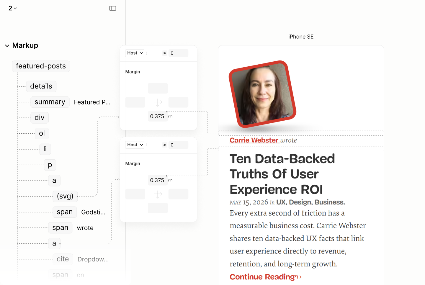
0.375rlh spacing on Featured Posts
0.375rlh spacing on Latest Posts
0.375rlh spacing on Community Posts
That spacing value, 0.375rlh, grew by 25% to 0.5rlh.
This new value applies on each item of the Latest Posts, as grid gap, to separate all three block-level children. 7.12
Both 0.375rlh and 0.5rlh spacing on Latest Posts.
It also applies as bottom margin on the Post Title of the first item in Featured Posts, to separate the title from the inline-level content that follows it. Its 25% increase complementing the descender space to match the top margin and its ascender space. 7.13
Both 0.375rlh and 0.5rlh spacing on Featured Posts.
Like it is in the leading item of Featured Posts, 0.5rlh also applies as bottom margin on Post Titles of Community Posts. 7.13
Both 0.375rlh and 0.5rlh spacing on Community Posts.
In one branch, that second spacing value, 0.5rlh, further grew by 33% to 0.75rlh, to separate the optical blocks of the lead item in Featured Posts, to complete the spacing in items of Featured Posts.
It applies as grid gap on that item to separate Post Info and Post Excerpt. 7.14
Then, as top margin on the Continue-Reading component, to separte itself from the excerpt, to make the last optical block. 7.15
All 0.375rlh, 0.5rlh, and 0.75rlh spacing on the lead item of Featured Posts.
In a second branch, that second branch, 0.5rlh, grew by 375% to 1.875rlh, to separate Post Items, as well as Post List from their More-link component. Both, via grid gap since their are no mixed-level children. 7.16
All 0.375rlh, 0.5rlh, and 1.875rlh spacing on the Featured Posts — the Post List without a more link.
All 0.375rlh, 0.5rlh, and 1.875rlh spacing on the Lastest Posts — a Post List with a more link. Same view applies to the Community Posts.
In the third and final branch, that second space value, 0.5rlh, grew by 250% to 1.25rlh to separate List Title from their List when expanded, and form a tighter bond to lead users to the first item. 7.17
All 0.375rlh, 0.5rlh, 1.875rlh, and 1.25rlh spacing on the Latest Posts — a Post List with an always-visible List Title. Same view applies to the Community Post.
That completes the spacing on Featured Posts, Latest Posts, and Community Posts.
Design of all three Post Types in iPhone SE, respectively, showing the only two items.
Comparing Featured Posts of the Legacy Site vs Refactored Site in iPhone SE
Comparing Latest Posts of the Legacy Site vs Refactored Site in iPhone SE
Comparing Community Posts of the Legacy Site vs Refactored Site in iPhone SE
States of Featured Posts, Latest Posts, and Community Posts, after the first breakpoint.
To reposition the avatar to the side of both inline-level and block-level content, the technique starts with absolute positioning to an anchor. 7.18
Then, ends with applying a left padding on the parent of both levels to make a space across both levels.
On the lead of Featured Posts, where the avatar must not only be at the side, but also on top of the excerpt, it takes a left padding on the Post Info. For others, it takes on the Post Item. 7.19
Avatar reposition in Featured Posts
Avatar reposition in Latest Posts
Avatar reposition in Community Posts
To avoid any case where Post Info has a small height, likely due to short Post Title, and thus make avatar run into the Excerpt below, Post Info of Featured Posts uses a minimum height of the avatar. 7.20 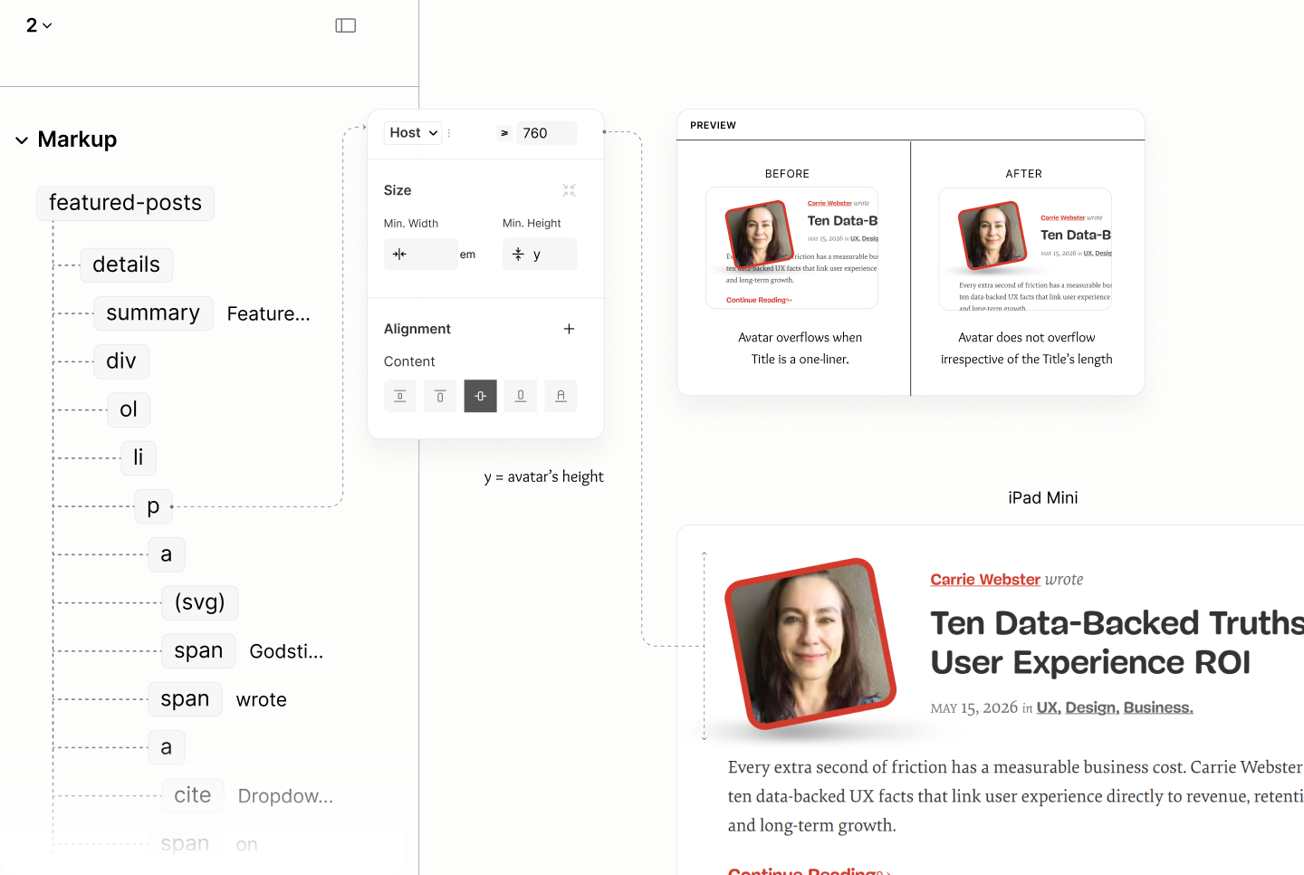
That completes the styles for the first breakpoint.
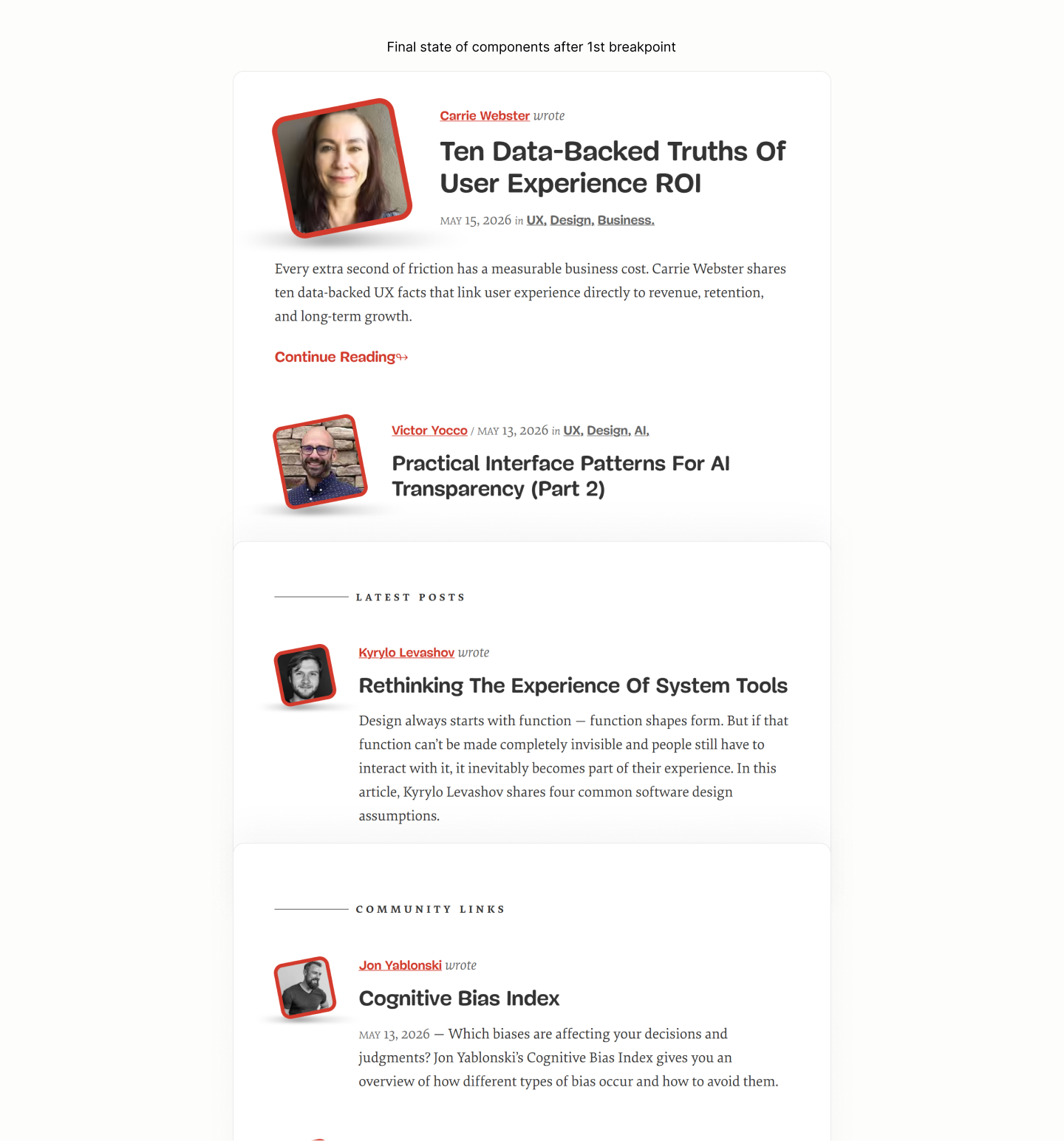
Final states of components after the first breakpoint.
Comparing Featured Posts of the Legacy Site vs the Refactored Site in iPad Mini
Comparing Latest Posts of the Legacy Site vs Refactored Site in iPad Mini
Comparing Community Posts of the Legacy Site vs Refactored Site in iPad Mini

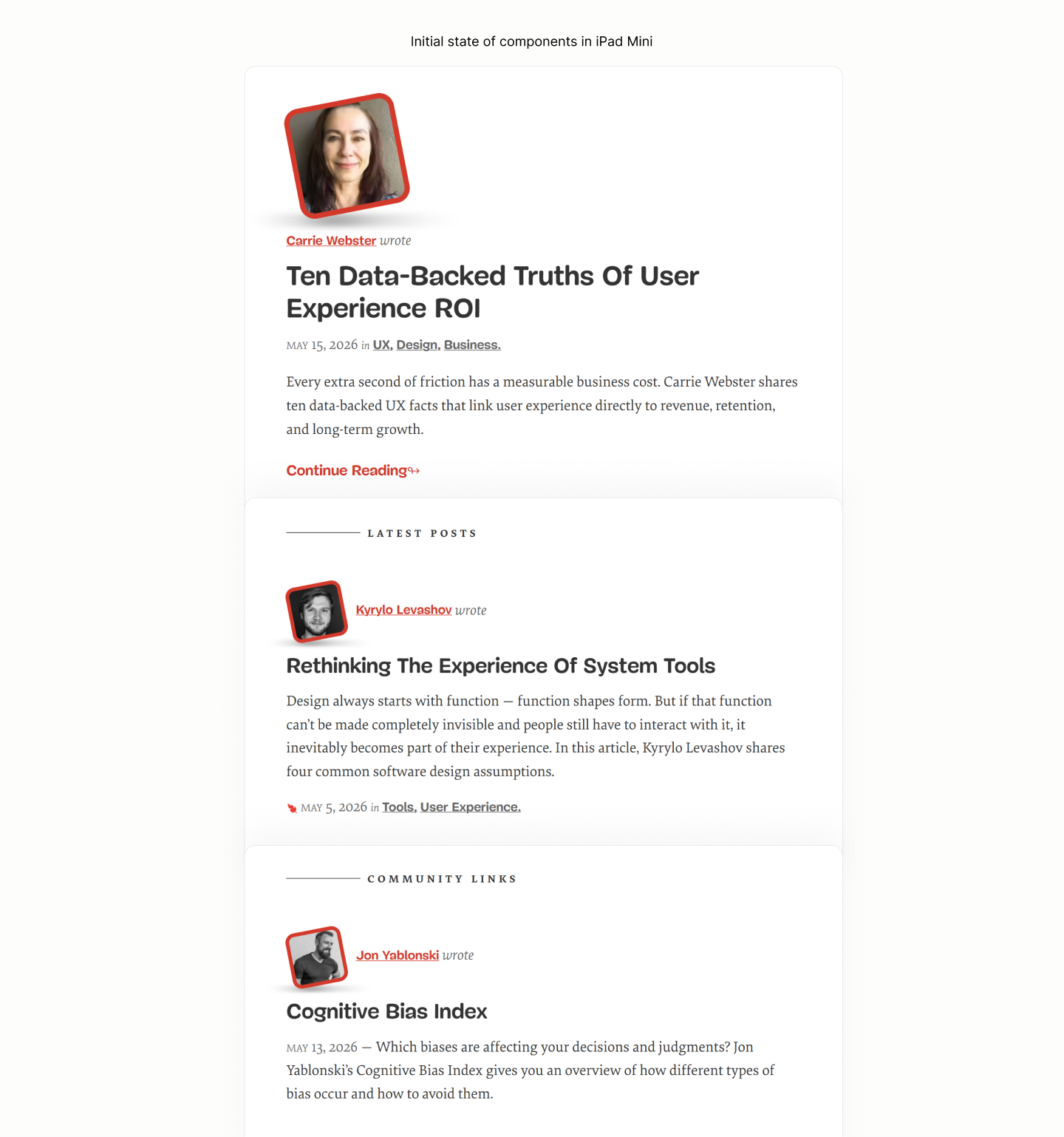
Initial state of components after the second breakpoint.
After the second breakpoint, Post Lists of Latest Posts and Community Posts uses a two-column grid for its layout with a row-gap of 2.5rlh, with items aligned to start to avoid excessive space in between. 7.21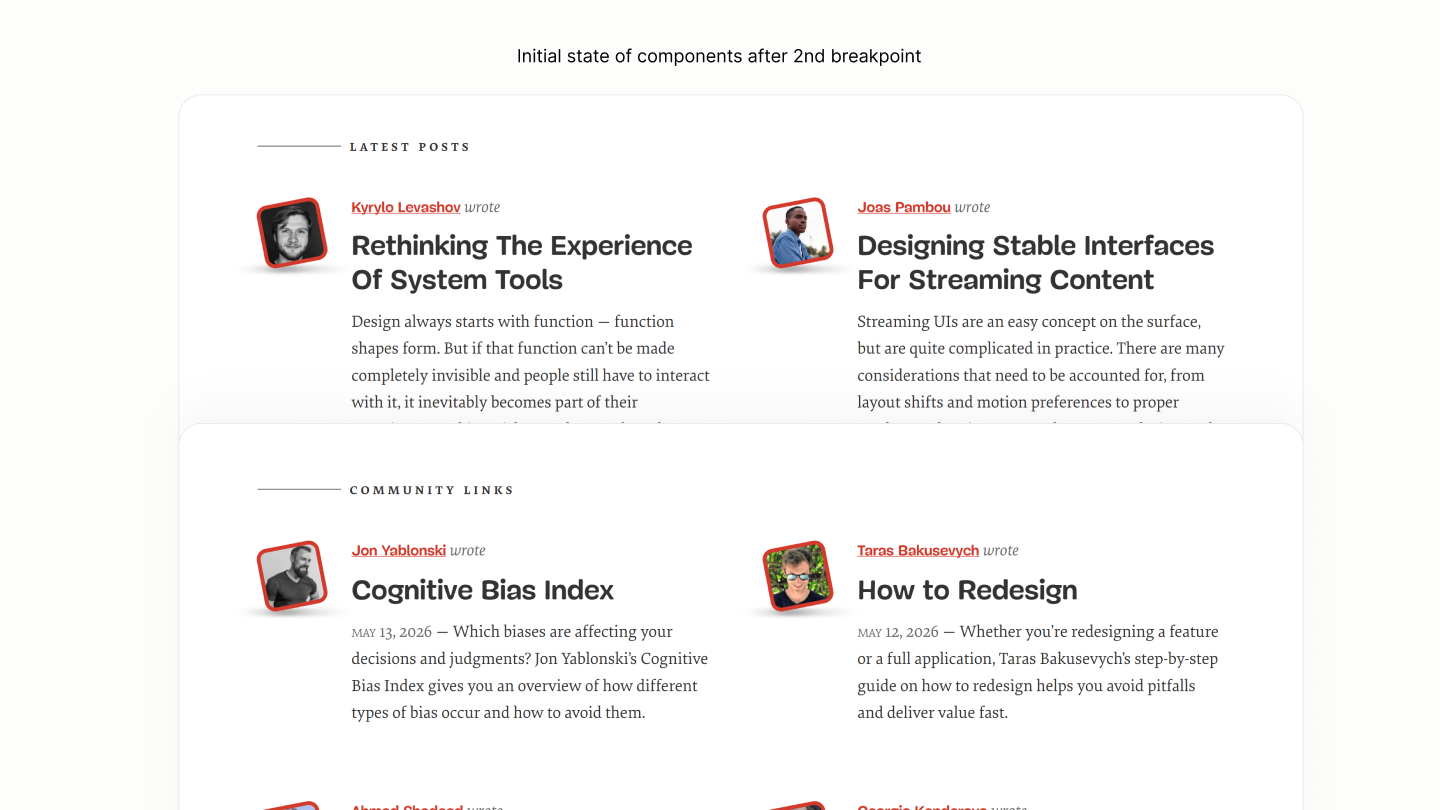
Because of Avatars hanging to the left, the avatar area of those at the first column makes it as if the entire Post List is titled to the right. To make it seem centered, the avatar area, a sum of the avatar size and avatar margin, is applied as right padding on those Post Lists. 7.22 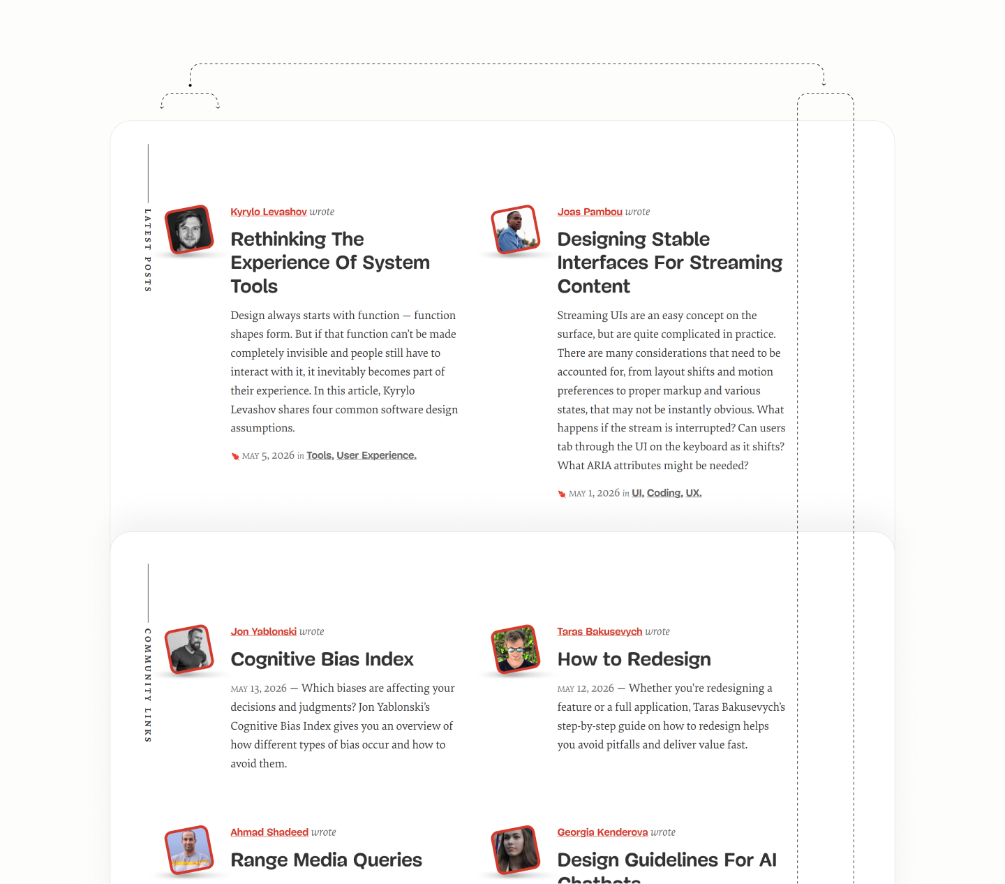
Comparing Featured Posts and Subscribe Form of the Legacy Site vs Refactored Site in Surface Pro 7
Comparing Latest Posts of the Legacy Site vs Refactored Site in Surface Pro 7
Comparing Community Posts of the Legacy Site vs Refactored Site in Surface Pro 7
Subscribe Form
Reset state of the Subscribe Form
Since the Newsletter Title must have a list-item display model for it to show its marker, a grid or flow layout to stack its content as required by design will lose that marker. 8.1
Instead, to keep that marker, a block layout on the Kicker part of the Title, a middle element, stacks neighbours. Making all 3 siblings looks like they are in a column. 8.2
It takes a grid layout on the forms' container to make each of the 3 children input, button, and note, on single column. With grid, not flex column, there'll be flexibility, later on at an upcoming breakpoint, to make a 2 column and 1 column for first and second rows respectively. 8.3
Now, components of different inline component stacks on top of another without having to inform this via markup.
Components of Subscribe Form on their own level.
Rather than having to center each descendant, their ancestor, the Newsletter component, is centered to cascade down the effect to children of both Summary and Content. This cascade centers the marker, and the text of subtitle, description, and note. 8.4
As for the Kicker which has a block layout, it takes an auto horizontal margin to force it into the center. 8.5
Same margin applies to the form subtitle, and the form description container, to center their full-width forms when the capped width takes effect. 8.6
As the viewport go wider, the Subtitle and Description grow too wide. 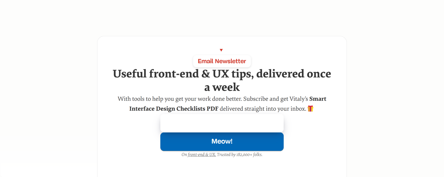
That cap width on subtitle is such that it forms an implicit up-facing triangle with the kicker and marker above it. It forms a progressive wideness on each element of the summary. 8.7
While that on Description Block forms an implicit down-facing triangle with the forms and note below it. To avoid orphans. It forms a degressive wideness on each element of the Content. 8.8
The vertical spacing starts with 0.5rlh to separate the innermost optical level.
It separates the three children of the disclosure summary via a top and bottom margin on the kicker, the middle element. 8.9
It also separates the two forms and one note, via a row-gap on their parent. 8.10
A double of that value, 1rlh, separates components in the upper optical level.
It separates the description and the forms' container, via a row-gap of the Disclosure Content. 8.11
It should also separate the Disclosure Title from the Disclosure Content, which is part of the optical level, but because of the descender space of the large-size subtitle, a dip of 1rlh by 25% was used instead, via a row gap on the Disclosure Component itself. 8.12
Spacing on Newsletter Segment. The gap in Details and Content leveraged a grid layout to take effect.
To introduce the avatar, first, the ancestor, Disclosure Component, needs to be an anchor, use a top margin half the size of the avatar to contain the first half of the avatar, and use a top padding half the size of the avatar to contain the bottom half of the avatar. 8.13
And to complete the padding on the Disclosure Component, there's an addition of 1rlh horizontal padding, and a 1rlh bottom padding. 8.14
Finally, via the before pseudo, it uses a background image of the avatar, absolutely positioned to the anchor with a top offset negative the half of the avatar. To center, it uses an auto horizontal margin with a zero horizontal offset. 8.15
Introduction of the avatar and the component's padding.
That completes the design for the Subscribe Form, before the first breakpoint. 
Comparing the Subscribe Form of the Legacy Site vs Refactored Site in iPhone SE
State of the Subscribe Form after the first breakpoint
After the first breakpoint, the Forms' block uses a two column layout to place both Email Form and Submit Form on the same row in 60:40. 8.16
With both on the same line, joining each other, the right corners of form email and left corners of form submit are zeroed to make both look whole. 8.17
With that two-column layout, the third component, the Note, is centered to one column. To center to both, it takes the Note to span both columns. 8.18
Comparing the Subscribe Form of the Legacy Site vs the Refactored Site in iPad Mini
After the second breakpoint, when the root section lays both Features Segment and Subscribe Form on the same row, for alignment, the round illustration on Newsletter needs an offshoot to match the mostly flat surface of Feature Segment. Reducing the margin top area by half a line height did the trick. 8.19
Comparing the Subscribe Form of the Legacy Site vs the Refactored Site in Surface Pro 7
Guide List
Reset State of the Guides Component.
Two steps make sub-components of this components be on their required levels, looking as required
- A grid display model on the Block, to put the Title and the following Content on their own levels. 9.1
-
A block display model on the Guide Link put it on a new level, letting the preceding inline components look as though they are on one level. 9.2
Flow of components in Featured Guides with their type system.
These three optical blocks separates themselves with 1rlh space via a row gap on Block, and a top margin on Link. 9.3
Same 1rlh value pads the block. 9.4
Moving up from these separations within Block, the Blocks, being the sole child of an Item, separates themselves with 1.5rlh row gap via the List, the parent of the Items. 9.5
Same value, 1.5rlh, separates the List and the More Component. 9.6
Spacing in Featured Guides with their box system.
The choice of a grid layout for that gap is to help lay its Items in a fluid grid. A fluid system such that whenever the content area of the list, excluding the gaps, can fit in a 234px, the minimum width for a guide to avoid content overflow, a new column of that guide appears. 9.7
With this grid layout, the irregular heights of guides is pronunced when there are two or more guides on the same row. 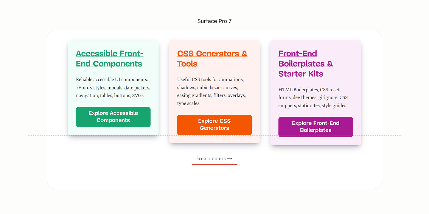
To fix, each guide takes on a height of 100%, a height of the longest guide. 9.8
Then, a top alignment of content to avoid extra space being distributed between the rows, but after the last row of content, after the Guide Link. 9.9
Balancing and aligning the height of Guides.
Comparing Featured Guides of the Legacy Site vs the Refactored Site in iPhone SE
Comparing Featured Guides of the Legacy Site vs the Refactored Site in iPad Mini
Comparing Featured Guides of the Legacy Site vs the Refactored Site in Surface Pro 7
Resource List
Reset state of the Resources Component
Like the Guides Component, the Resources Component makes each Guide Block a grid layout, and the Link a block layout, to make the Title, Description, Link, and Note, on their own optical block. 10.1
Sub-components of each Guide Block on their own level.
It takes the List with an horizontal flow layout, and an auto overflow, to lay each Item and their Block side-by-side in a scrollable container. 10.2
To give more room to each Guide in smaller devices, each Item, for their Block to inherit, uses a full width shy of 20px — a space to hold the indicator that hints at the scrollable container. 10.3
To prevent that full width declaration from going too wide in wider viewports, each Item has a max width of 20.5em. A width that ensures one line of Title, and three lines of description across all Blocks when spaced. 10.4
Flow of Resouce List's Item with Type Styles.
The indicator, introduced via an after psuedo element on the List, taking full height because it is a flex item, leverages a background color and a border color, sticked to the top right corner. 10.5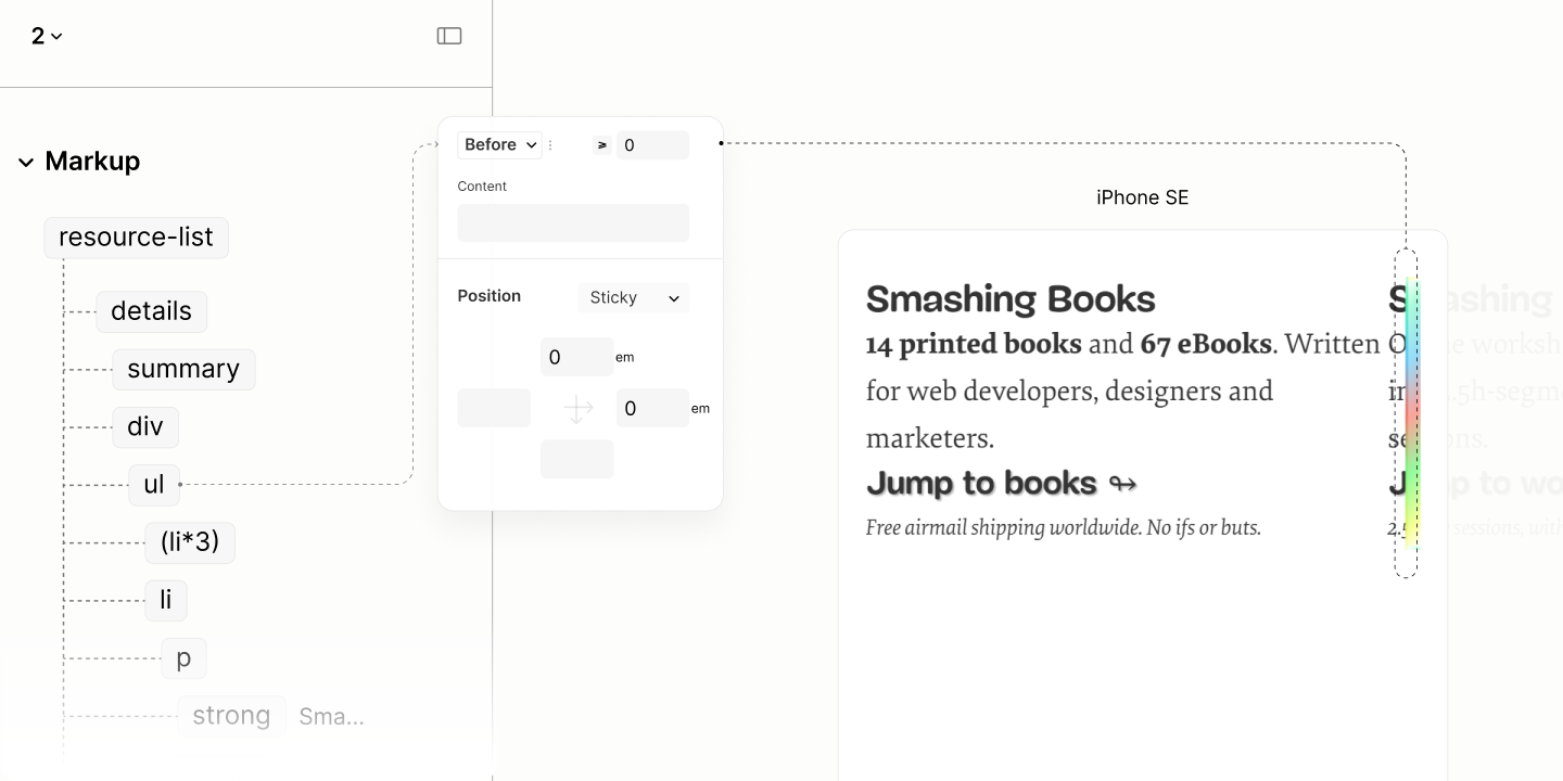
Since the Content can't use a gap to separate its children because all except the link and note are block-level content, it takes a vertical margin on the link, the middle-ish element to create a gap between it and the set of inline element above it, as well as it and the note beneath it. 10.6
However, it takes a row gap on the Block to separate the grid items. 10.7
As well as a padding of the same amount to stop content from touching the edges of their painted background. 10.8
Moreso, same value as column gap on the List, to separate the items. 10.9
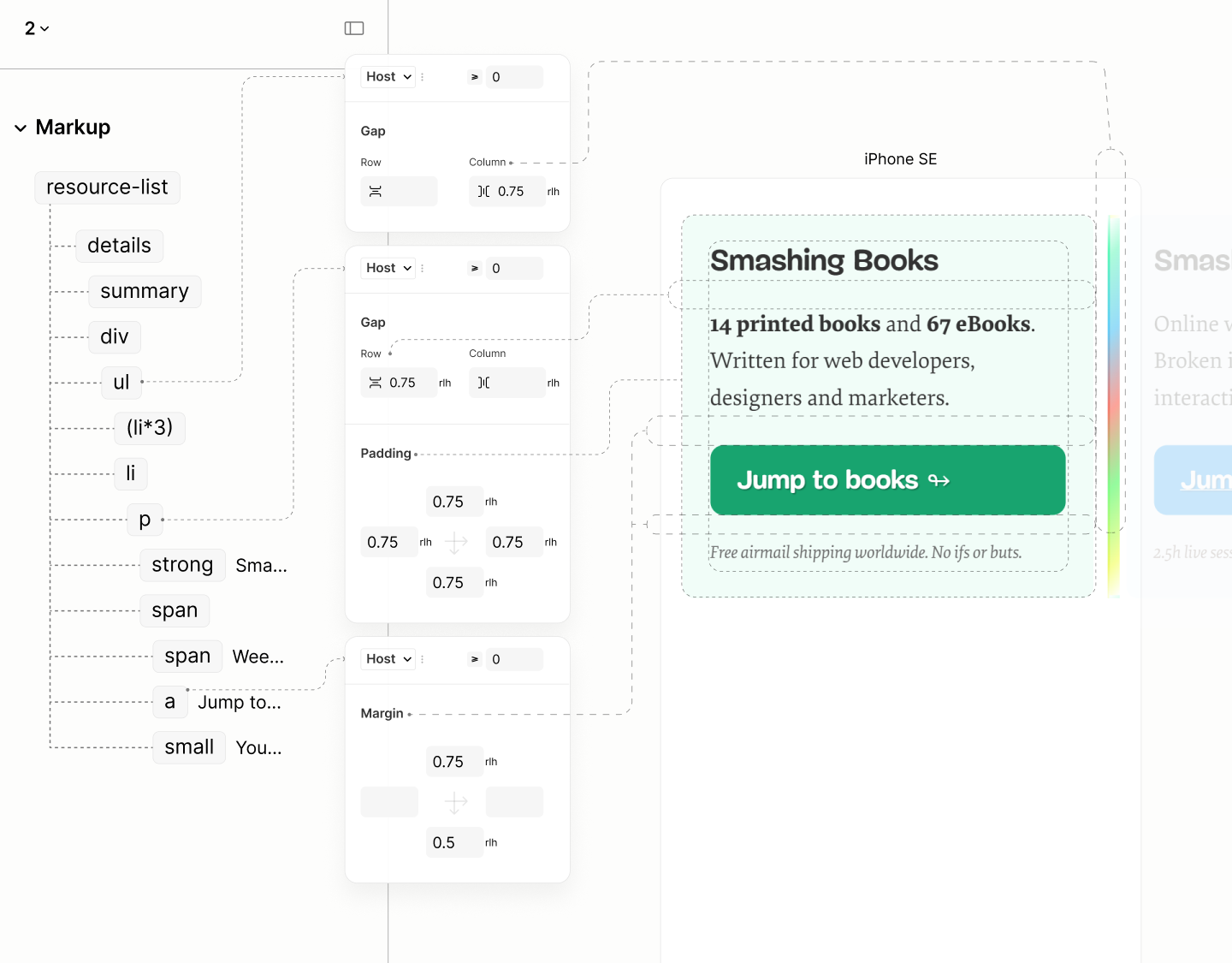
Spacing of Resouce List's Item with Color Styles.
In a tighter screen real estate, like on Galazy Z Fold 5, when content of some items reflow and others dont, the background color reveals differing heights. 
To keep them equal at all times, each block takes the height of the longest with 100%. 10.10
Then, a top alignment of content to avoid extra space being distributed between the rows, but after the last row of content, after the Resource Link. 10.11
Besides, when the note wraps, for its smaller line height, which differs from its parent line height to take effect, it needs at least a display of inline-block. 10.12
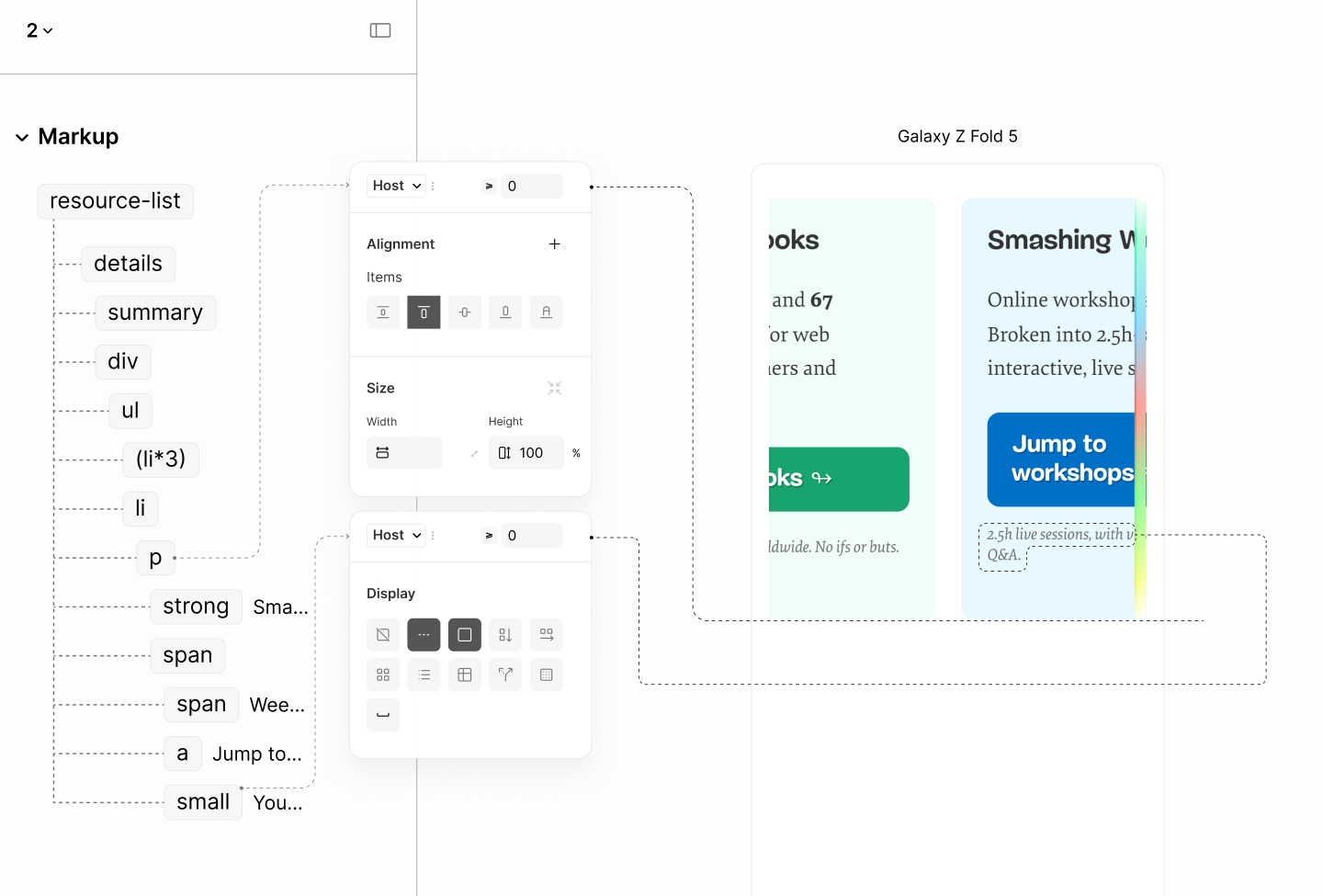
Spacing in Smaller viewports.
Per design, text of each block are centered via each Block. 10.13
For aesthetics, to give the set of inline elements before the link a chance to extend beyond the width of the link, the link reduced its width and have its bounding box centered with auto horizontal margin. 10.14
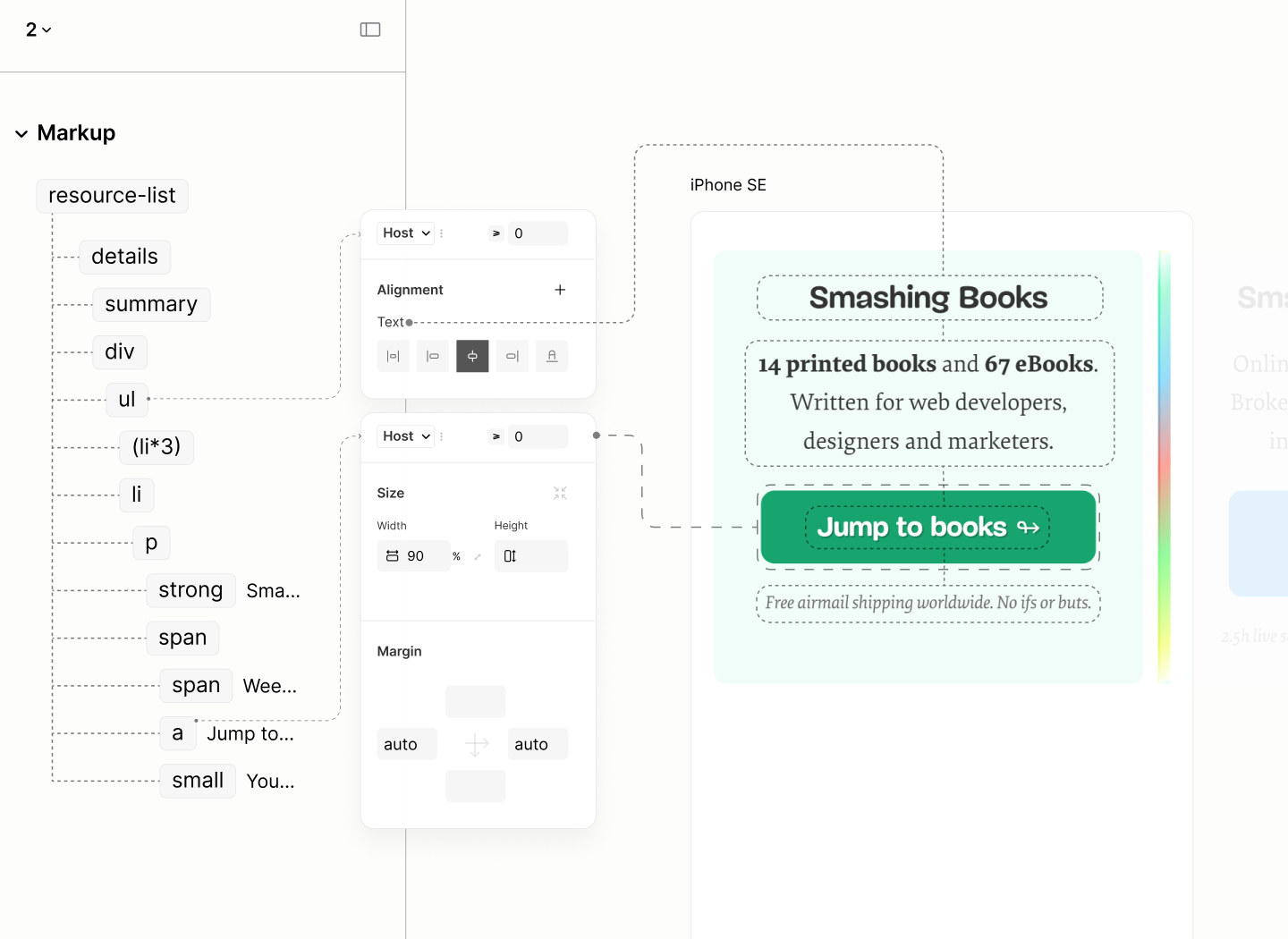
Alignment of Resouce List's Item.
Like the Subscribe Form, same strategy introduces the avatar. This time, on each block, centered to match the text. 10.15
This time though, to maintain the top padding already specified, it is added to half the avatar size on the top padding of the avatar. 10.16
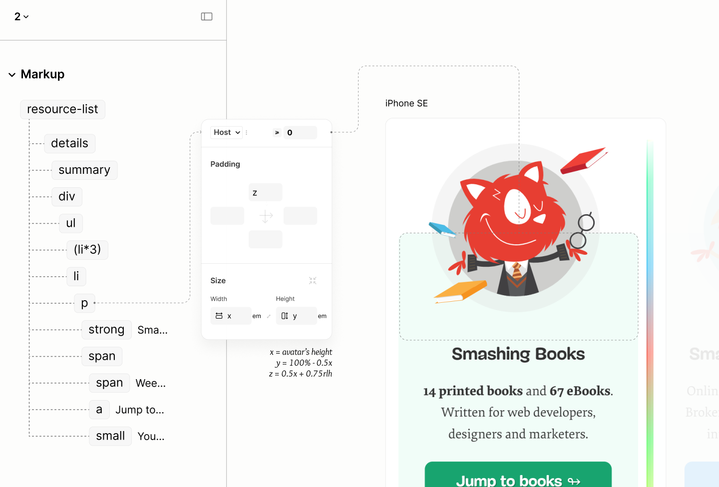
Introduction of Avatars, while still maintaining the top padding.
A bottom padding of 1rlh applies on the Resource List to keep the scrollbar away from the edge of the List when it appears. 10.17
Comparing the Resource List of the Legacy Site vs the Refactored Site in iPhone SE
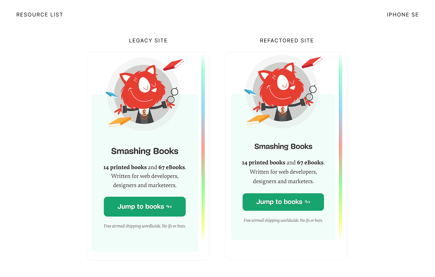
Comparing Resource List of the Legacy Site vs the Refactored Site in iPad Mini
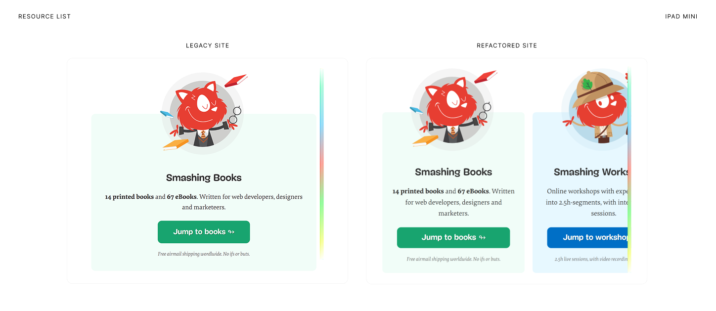
Comparing Resource List of the Legacy Site vs the Refactored Site in Surface Pro 7
Workshop Resource
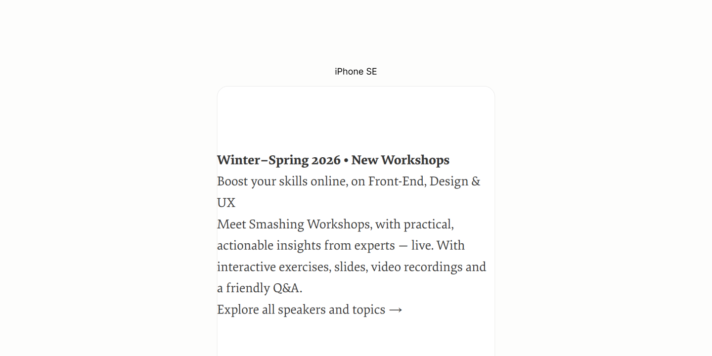
Reset of the Workshop Component with an unreset marker for the disclosure.
The Workshop needs no content reflow. All Content are in the right level, by default, in the markup.
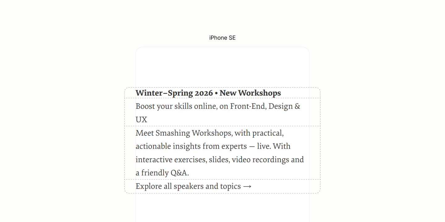
Layout of content.
However, the Offer block won't stay as a block-level element because of its inline underlining style. Still, it'll look block-level because neighbouring blocks are block-level.
To create an underline that doesn't inherit the text shadow, a restricted background color helps but the layout type must be inline. 11.1
Per design, the avatar is bought into flow via an after psuedo on the Disclosure Component when opened. 11.2
To hint at the semantics of this Disclosure Container, the marker is brought back from reset, inside the summary. 11.3
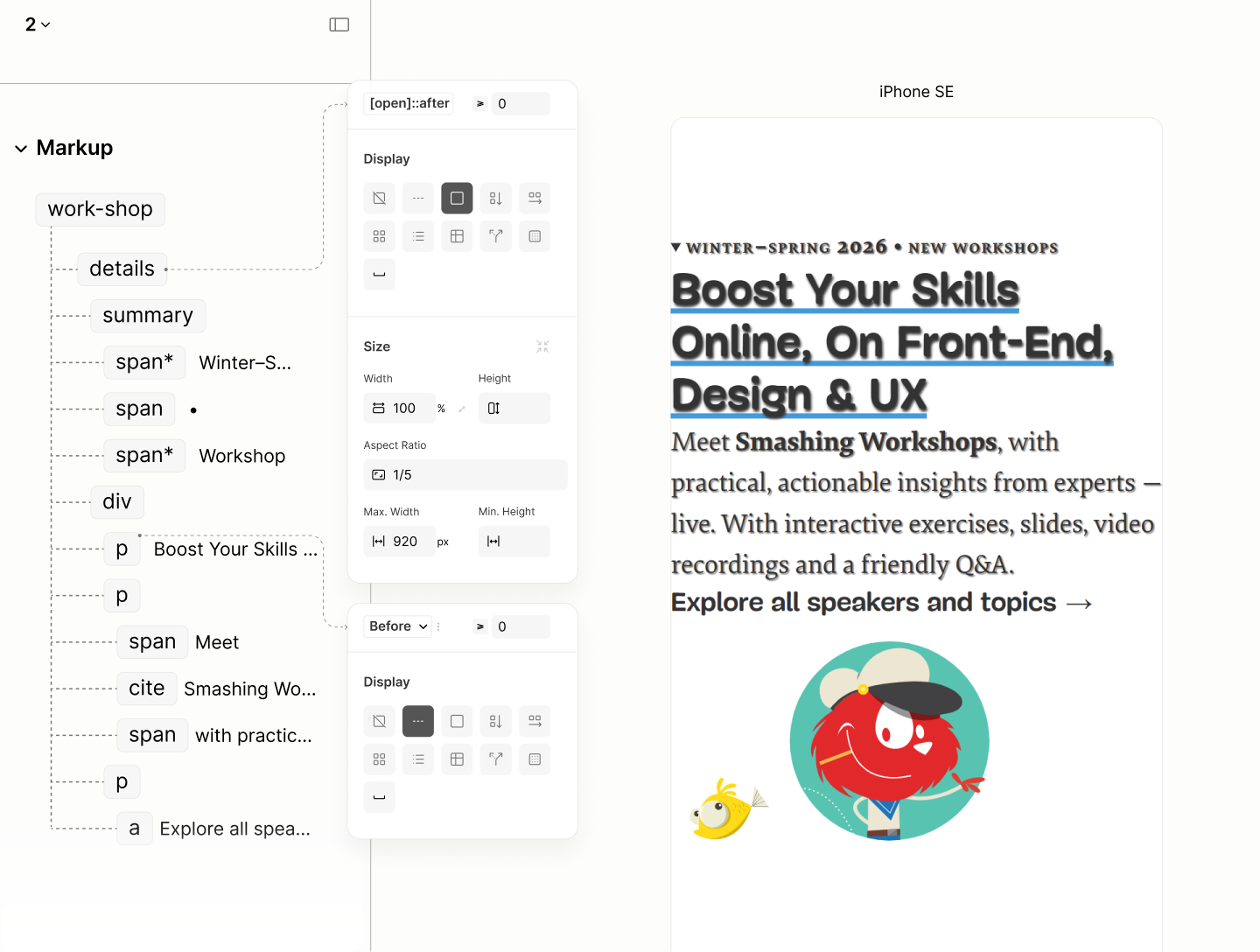
Flow Layout with typography scales and inline styles.
If the Offer Block need not use inline display, its landlord, Content, could have spaced all three tenants with a grid gap.
Instead, it relies on 1rlh vertical margin on Description Block for the job. 11.4
Same 1rlh separate the Disclosure Content from the Title via a grid gap on Disclosure Component, when opened. 11.5
Also on the Disclosure is a block padding whose top value is twice the bottom to, in addition with the marker, hint at a disclosable widget, when closed. 11.6
In addition, a horizontal padding with value inherited from the token on the Body, so content of this component can horizontally align with content outside of it. 11.7
To ensure the avatar can be clipped at the bottom, per design, the bottom padding when the disclosure is expanded is set to zero. 11.8
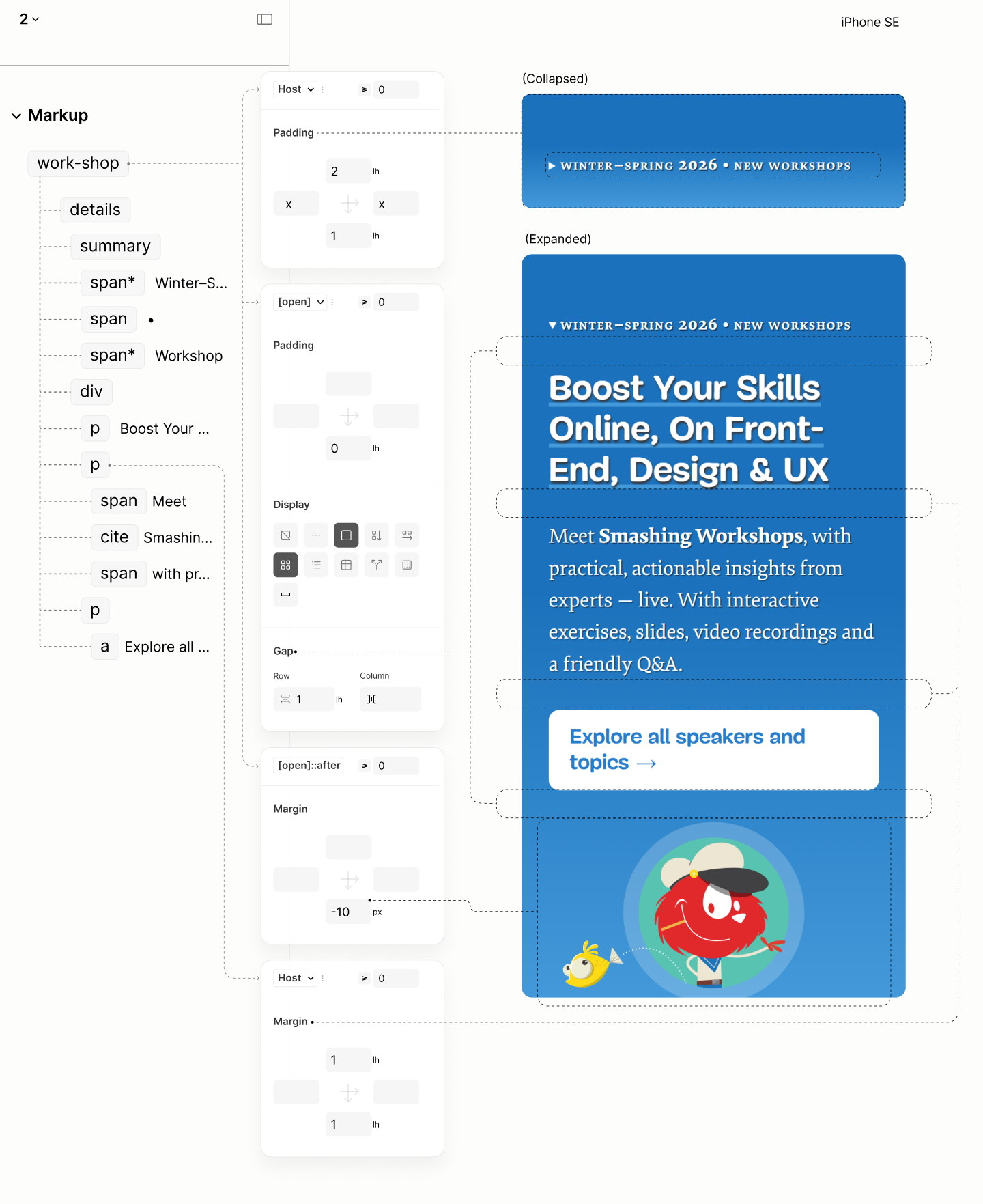
Spacing the component
Through the disclosure, a text align of center makes text of blocks which have full width automatically becomes centered to the device viewport. 11.9
As for the Workshop Avatar, which has its width contrained, it takes an auto horizontal margin to center it when the constraint is in effect. 11.10
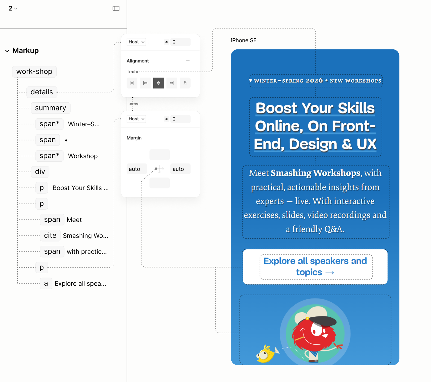
Alignment
As the viewport go wider, centered text becomes too wide.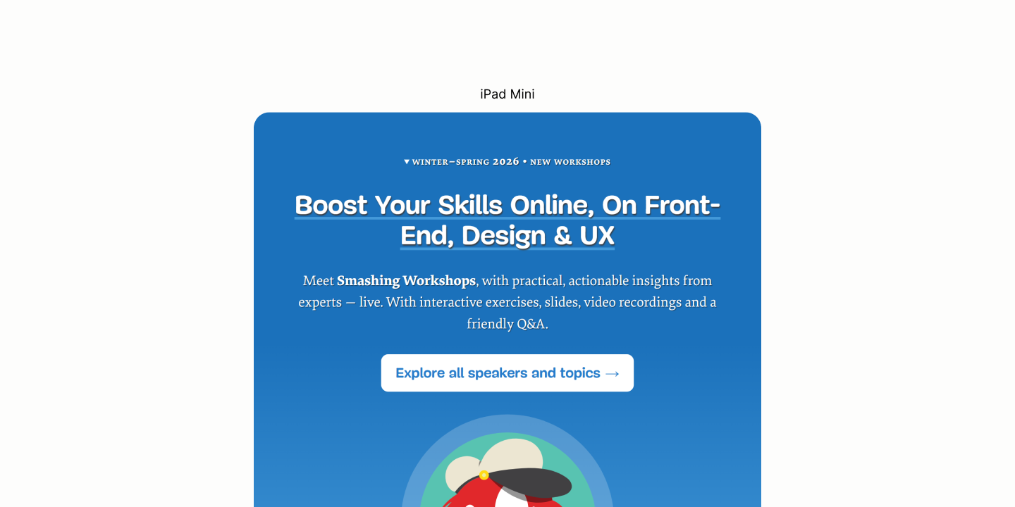
A max-width on the Offer Block can constraint the text. Same for the Description Block. But the inline layout of the Offer Block birth a problem: it can't have a maximum width. And the solution to this affects the Description Block.
Rather than hardcoding a line break via the markup on the Intro, like the Legacy Site did, which breaks the content even when it isn't supposed to, the Refactored Site uses a better technique.
It uses a max-width on the parent element of the Offer Block, the Disclosure Content, based on the font size of the block at a multiple that reflows the text after the first comma. 11.11
But since there's a max-width on Content, it take an auto margin to center the block itself to the viewport, making all text seems at the center of the workshop, not only the center of the content. 11.12
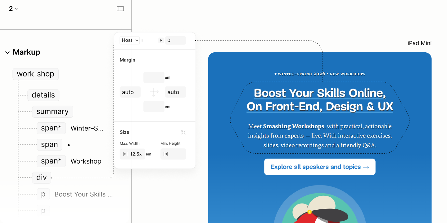
Constraining wide centered text
Aesthetically, the Description should extend beyond the title. But since the max-width constraint is via a parent, the remedy is to overflow the container but this must be done at a breakpoint where the overflow wont cause a scrollbar.
Since this is not a critical issue, it's done at the first breakpoint, rather than some arbitrary new breakpoint.

State of the Workshop Component in iPhone SE, before the first breakpoint.
Comparing Workshop Resource of the Legacy Site vs the Refactored Site in iPhone SE
Initial State of the Workshop Component after the first breakpoint.

To make the Description Block wider than the Offer Block, wider than its container, it takes two steps.
-
A width of 35em. A value that overflows the container. A value where the block forms an implicit shape that compliments other components. 11.13
-
A max width based on the viewport. 80vw. A value that stops the component from overflowing the page. 11.14
Now, to re-center this wider-than-container block, it uses a 50% left offset to move the top-left corner of this block to the center of its container, then a -50% x-axis translation to move the mid of this component to the mid of the parent. 11.15
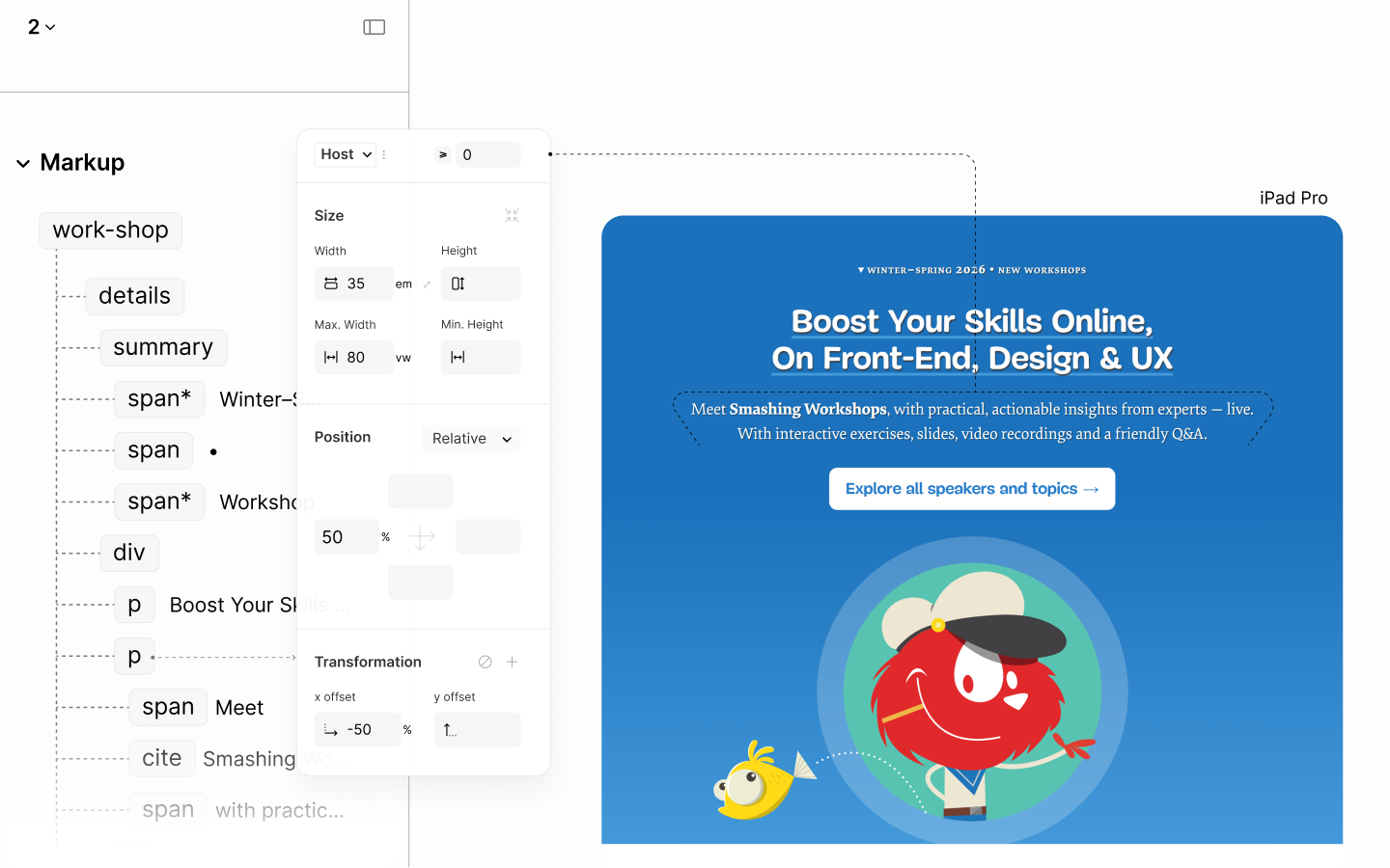
Resizing and recentering the Description Block
Final State of the Workshop Component after the first breakpoint.

Comparing the Workshop Resource of the Legacy Site vs the Refactored Site in iPad Mini
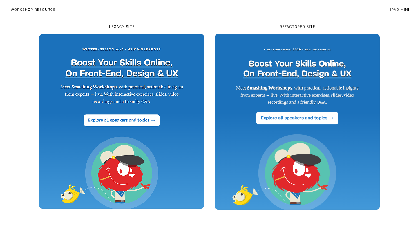
Comparing Workshop Resource of the Legacy Site vs the Refactored Site in Surface Pro 7
Person-of-the-Week Component
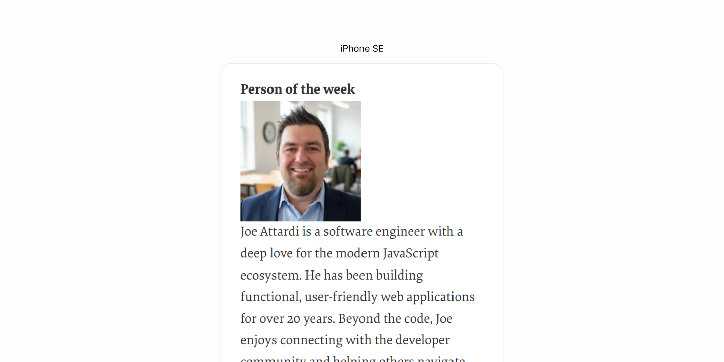
Reset of the POW Component.
While all components are in their respective level, the avatar needs a repositioning from below to above the Disclosure Title.
For that, the Disclosure Container becomes the anchor. 12.1
Then, it uses a top padding to create a space for the avatar on top of the title. The value is the height of the avatar and a gap between the avatar and the title. 12.2
The joint value ensures that, at a later breakpoint, when the avatar needs to be repositioned to the left, with the same padding trick, space goes along without leaving any residues.
The avatar, itself, is then absolutely positioned to the top left of the Disclosure Container, so it sits on the top padding area of the container, just before the title. 12.3
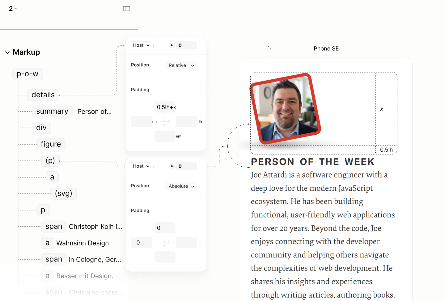
Repositioning the Avatar.
Irrespective of where the avatar is, at the top, or, later, at the left, the Disclosure Container uses a gap of half a line height to separate the Disclosure Title from the Disclosure Content that follows it. 12.4 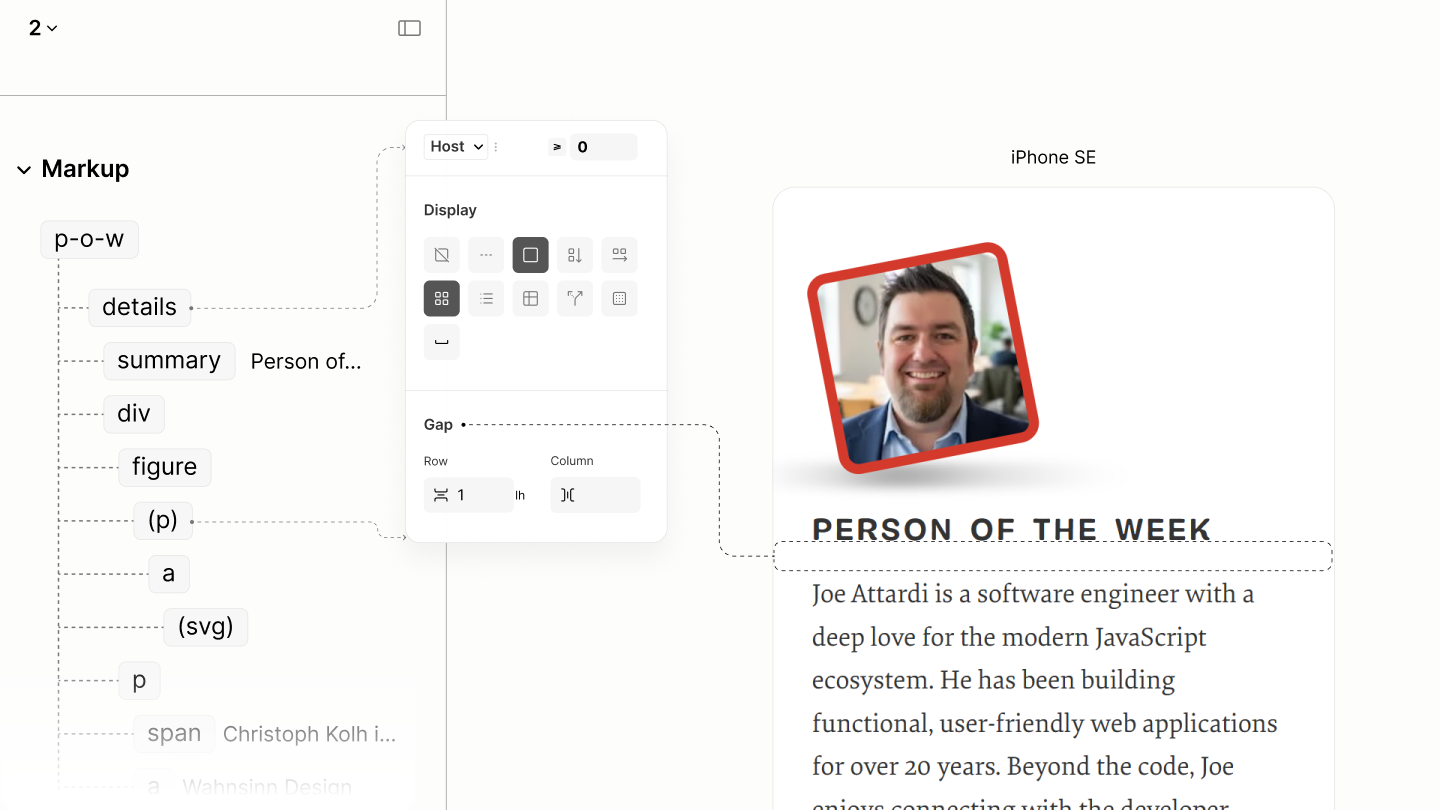
Final state of this component in iPhone SE, before the first breakpoint.
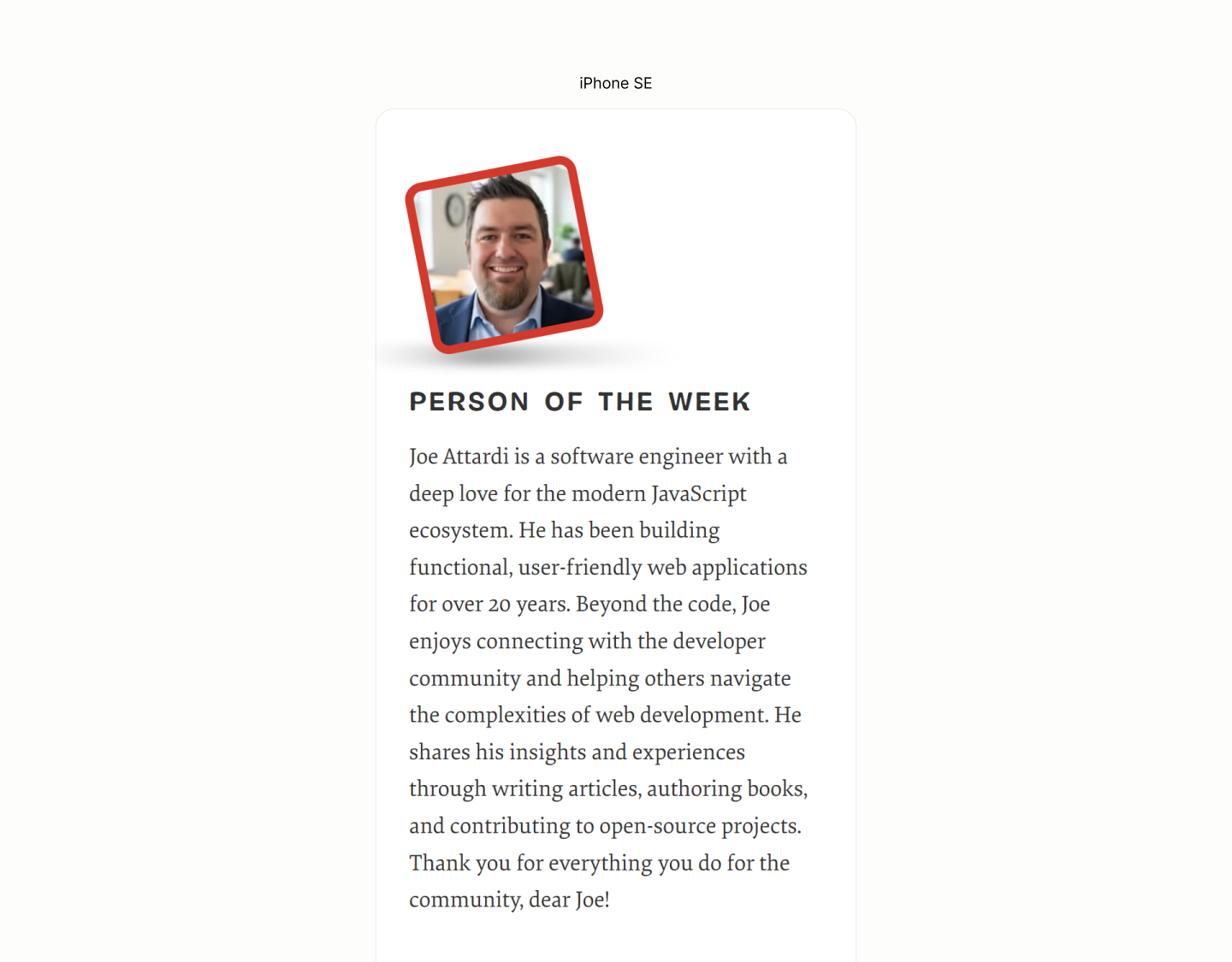
Comparing the Person-of-the-Week Component of the Legacy Site vs the Refactored Site in iPhone SE
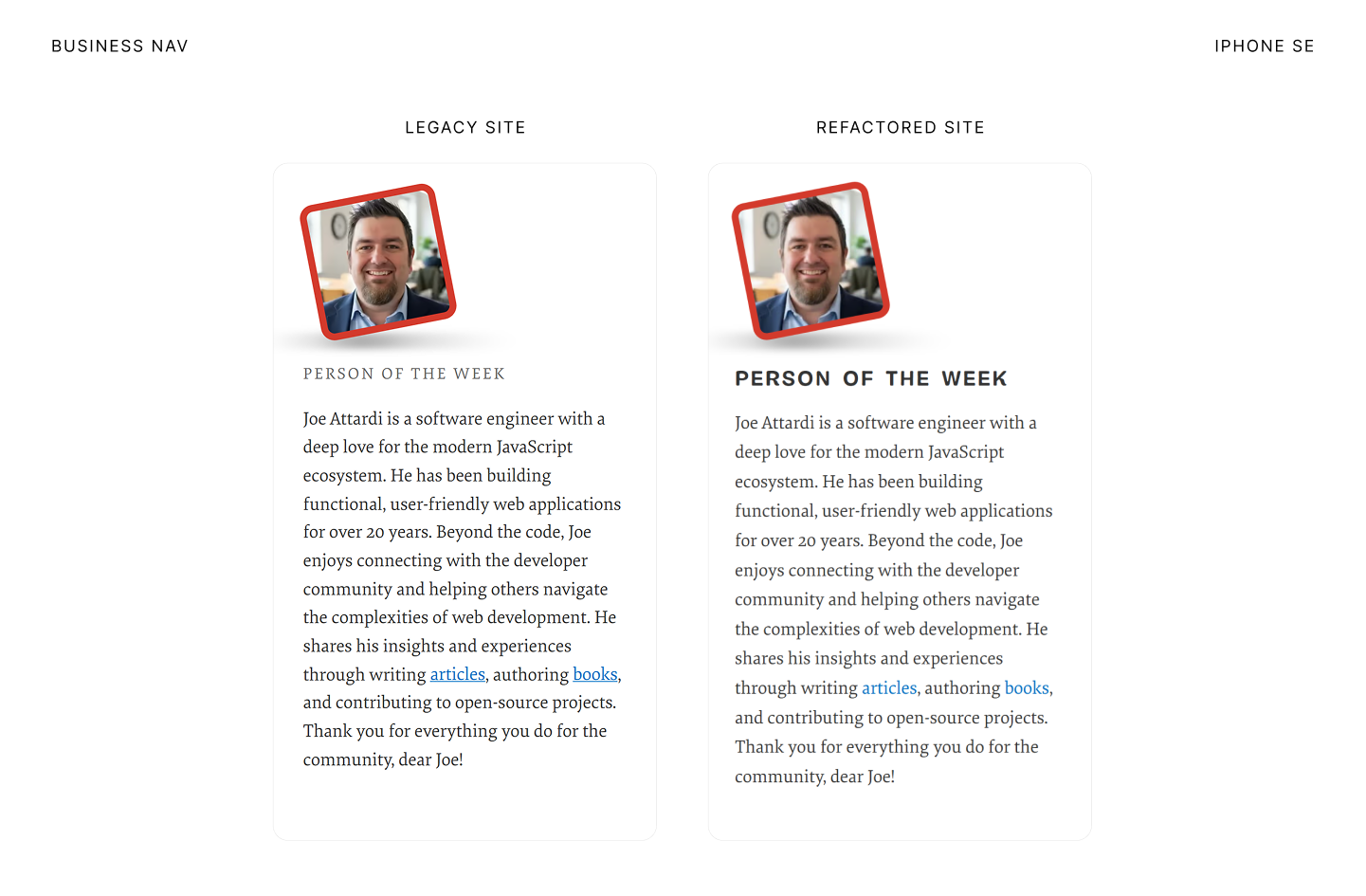
Initial state of this component in after the first breakpoint.
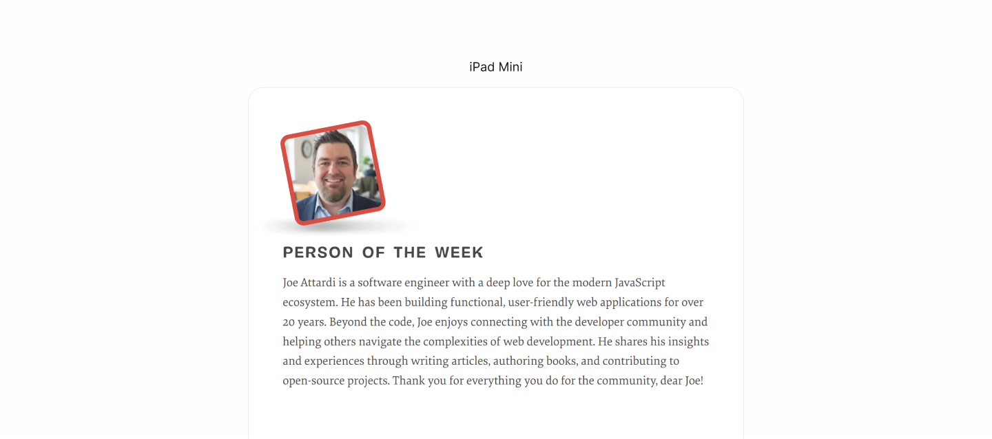
After the first breakpoint, the Disclosure Container repositions the avatar to the left by nullifying the previous top padding, and setting a new left padding with a similar value structure. 12.5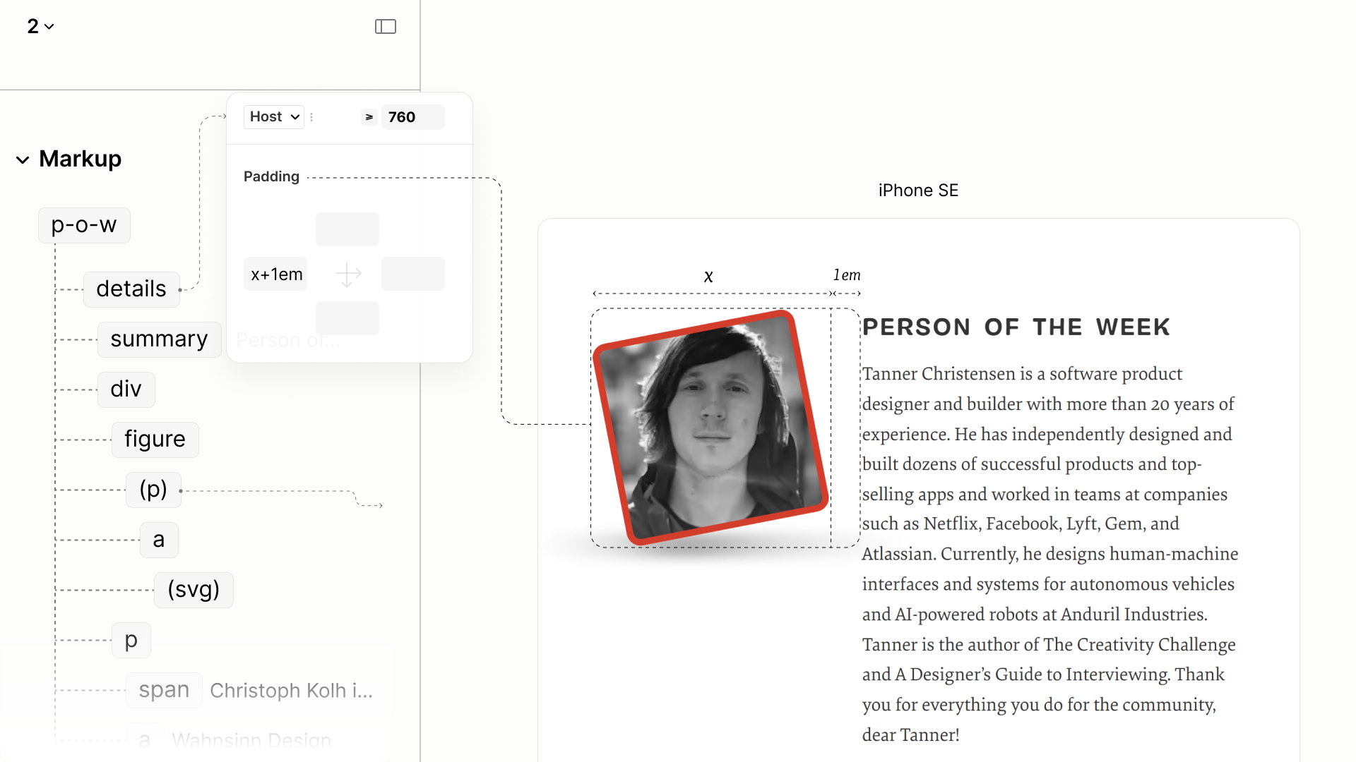
Comparing the Person-of-the-Week Component of the Legacy Site vs the Refactored Site in iPad Mini
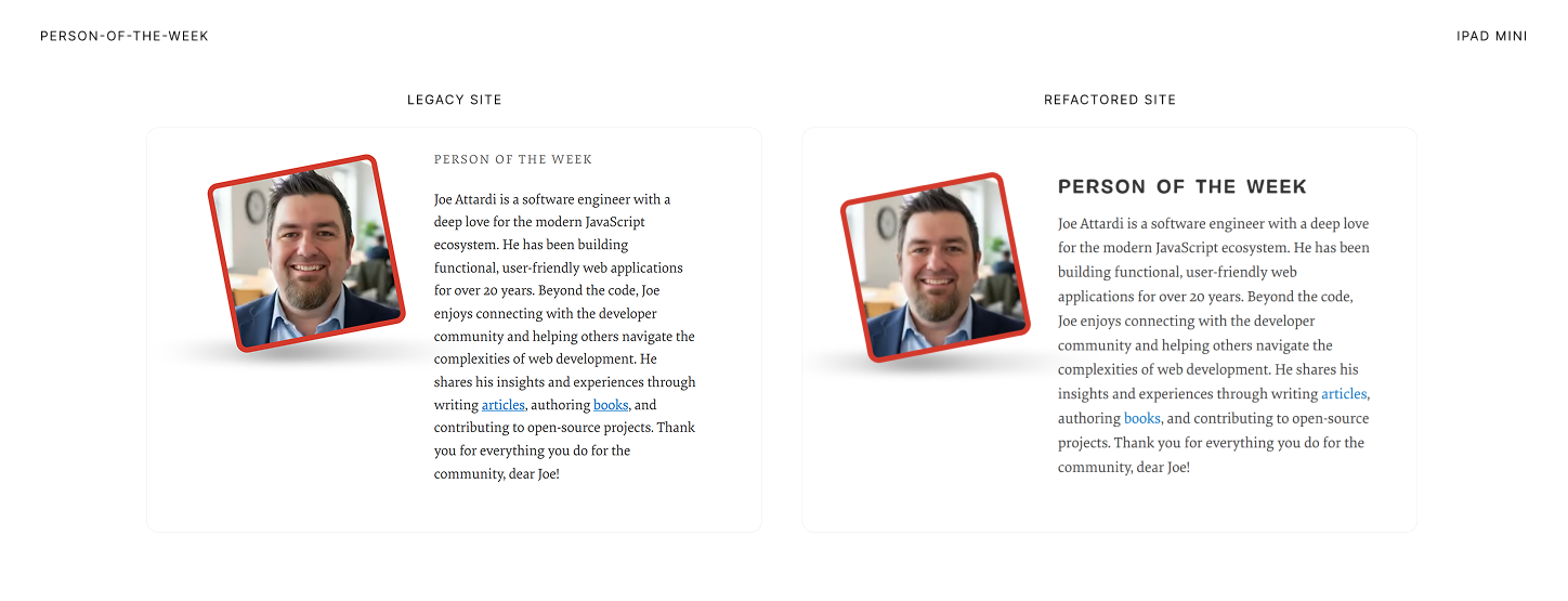
Comparing the Person-of-the-Week Component of the Legacy Site vs the Refactored Site in Surface Pro 7
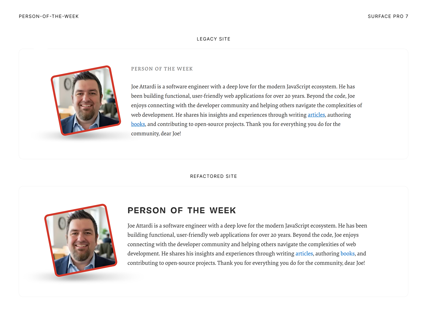
All-Topics Nav
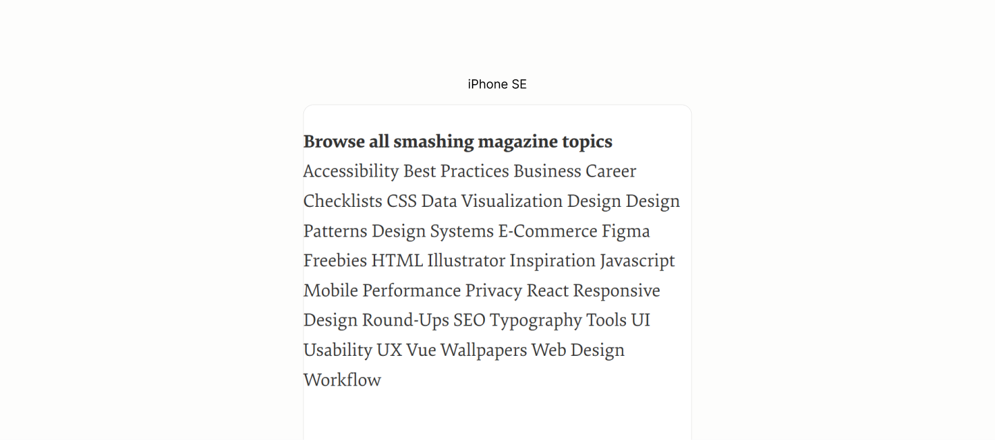
Reset of the All Topics Navigation Landmark.
It takes a grid flow on the Block to make the Title and its Content on their own level. 13.1
Then another grid flow on the Content, this time, a multi-column system to make new columns of links appear as the viewport permits. 13.2
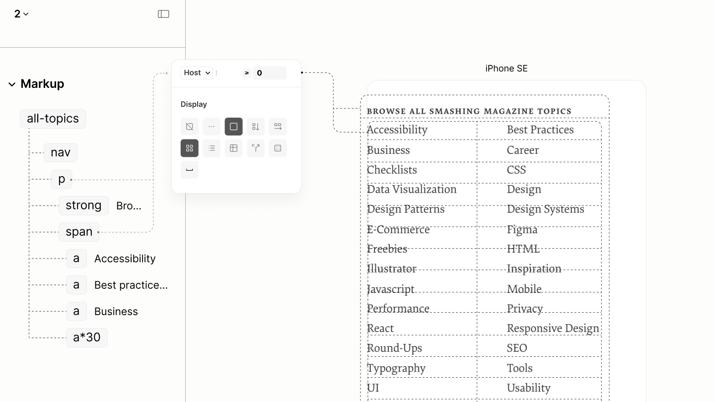
Flow with Type system
Content uses both a gap of 0.375lh, matching the legacy site, to separate the cells. 13.3
While the Block uses the double, 0.75lh, as a row gap, to separate the Title and the Content. 13.4
Also on the Block is a vertical padding that is a double of that double, and an inline padding of that Body padding token 13.5
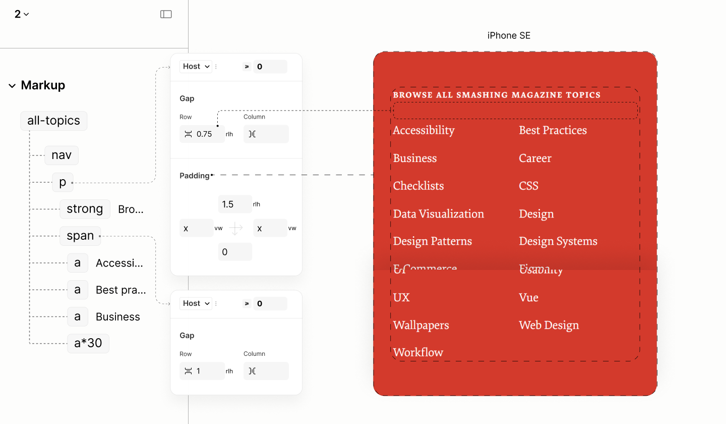
Spacing with color system
To introduce the bullets that makes each link looks like a list item, per design, a before psuedo element is injected into the markup with a bullet content. 13.6
A margin to separate this bullet from its text is half a character space, stored as a variable in the host element so that it can be used outside of this pseudo element, in a later breakpoint. 13.7
Then, a top offset is used to push the bullet towards the center. 13.8
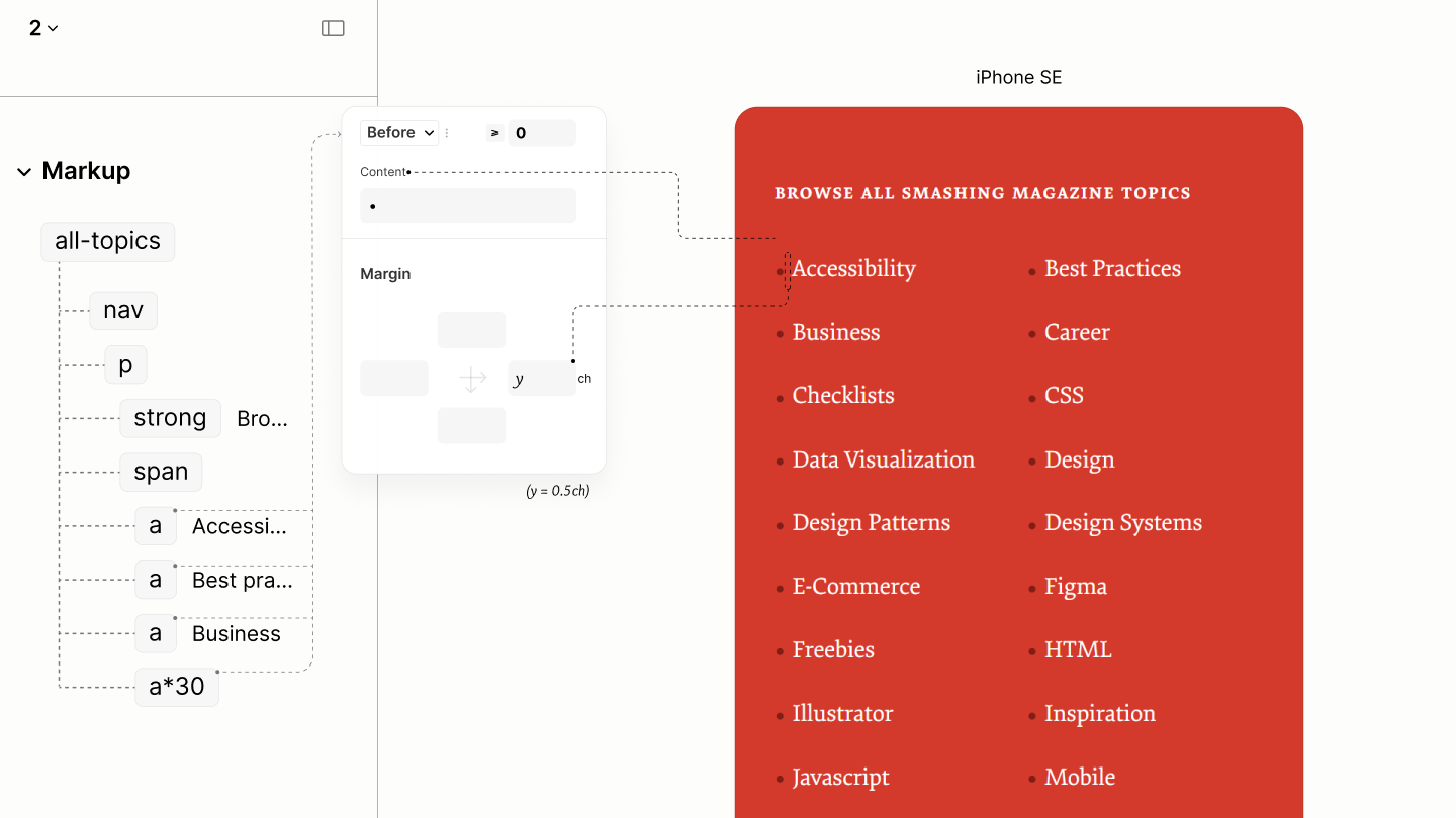
Each link with their bullets.
Final state of this component in iPhone SE, before the first breakpoint
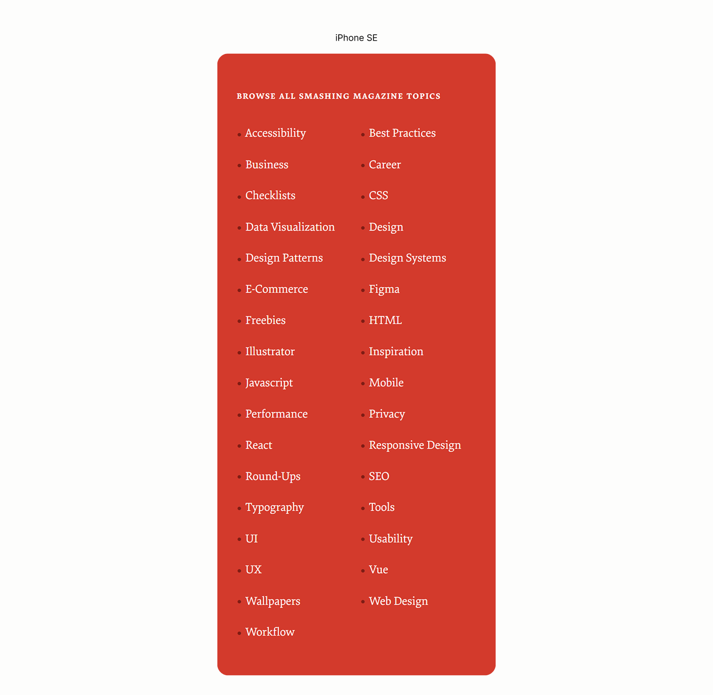
Comparing All-Topics Navigation of the Legacy Site vs the Refactored Site in Surface Pro 7
Initial state of this component after the second breakpoint
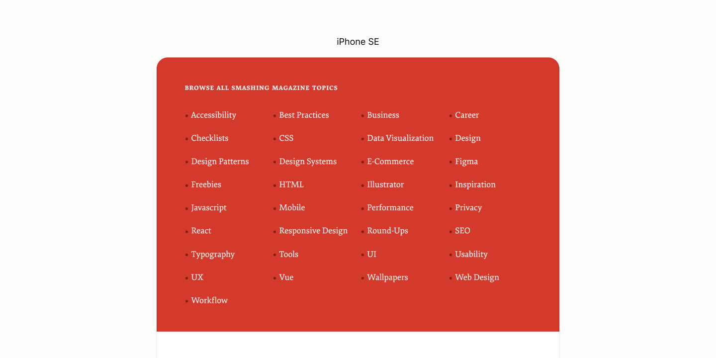
After the second breakpoint, the layout of Content changes from a fluid grid to a horizontal flex that wraps. 13.9
The column gap that separate each link is the same space that separates a bullet and its link. So that it looks as though the bullet between any two links is in their center. 13.10
These links are capped, such that when content are justified to the center, they form an implicit trapezoid shape. 13.11
With this cap, is the introduction of an auto horizontal margin to center the box. 13.12
Like the centered links, the title has it text aligned to the center. 13.13
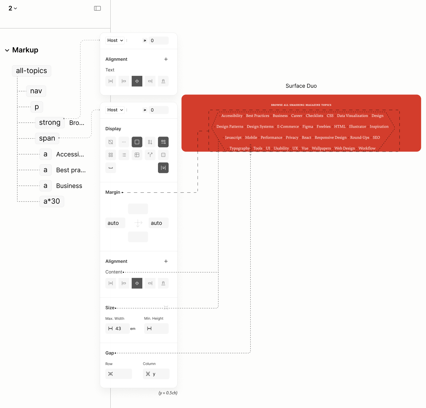
Reflowing the All Topics Navigation Landmark.
Comparing the All-Topics Navigation of the Legacy Site vs the Refactored Site in iPad Mini
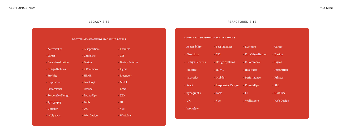
Comparing the All-Topics Navigation of the Legacy Site vs the Refactored Site in Surface Pro 7
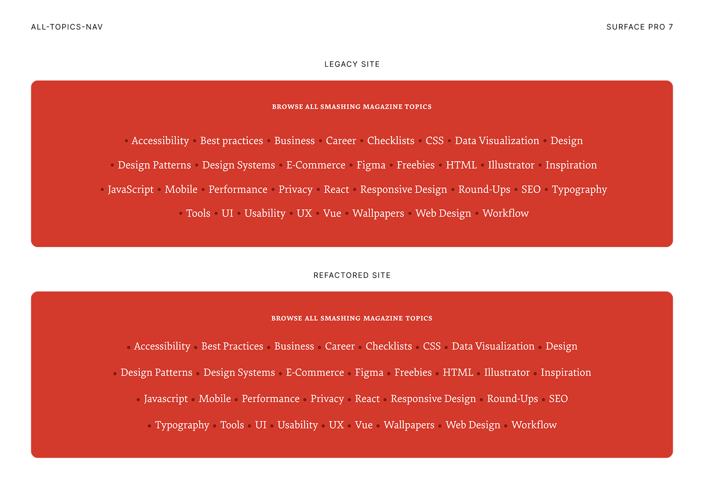
Colophon Nav
Reset of the Colophon Component.
The refactored markup needs no reflow. Not one to imitate a sub-par version on the Legacy Site.
Being a single block, at the middle of two other landmarks, all three acting as one optical block, sharing the same background, it uses a vertical padding of 1rlh to separate its siblings. 14.1
The horizontal padding is that from the Body 14.2
It won't keep content align to those outside this landmark, because text will be align. Instead, it keeps content from touching the edges of the viewport.
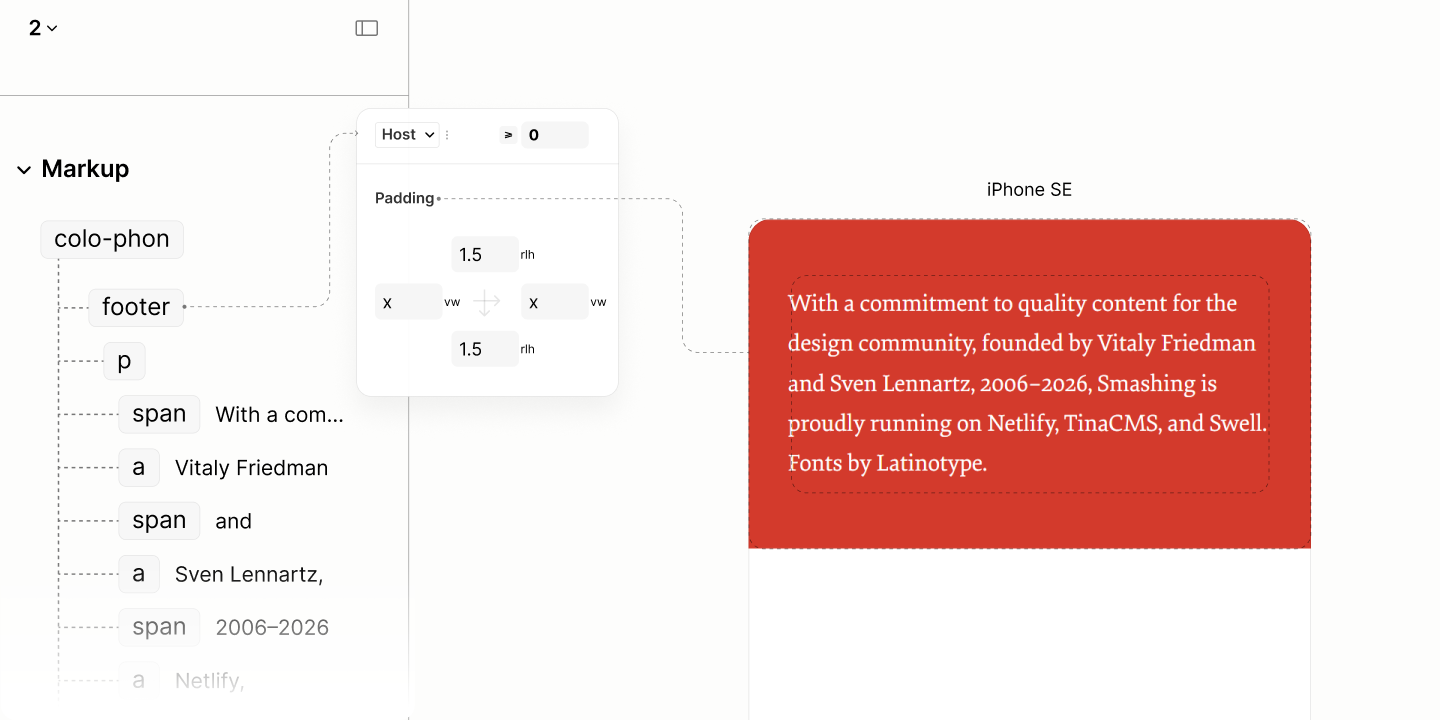
Spacing the Colophon Component, with color system
By design, this block has its text centered. 14.3
To maintain a good form for the centered text of the block when its viewport is wide, it uses a max width. 14.4
In target to a wide screen, it's capped to form and implicit trapezium. Because of this cap, it take an auto horizontal margin to center the block itself.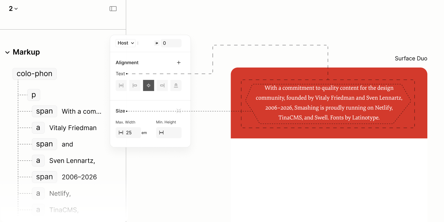
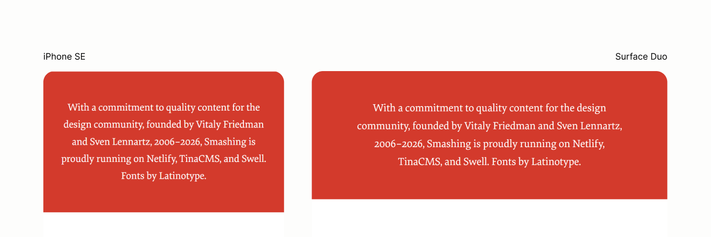
Final state of this landmark, in iPhone SE, before the cap takes effect, and in Surface Duo, after the cap takes effect.
Comparing the Colophon Navigation of the Legacy Site vs the Refactored Site in iPhone SE
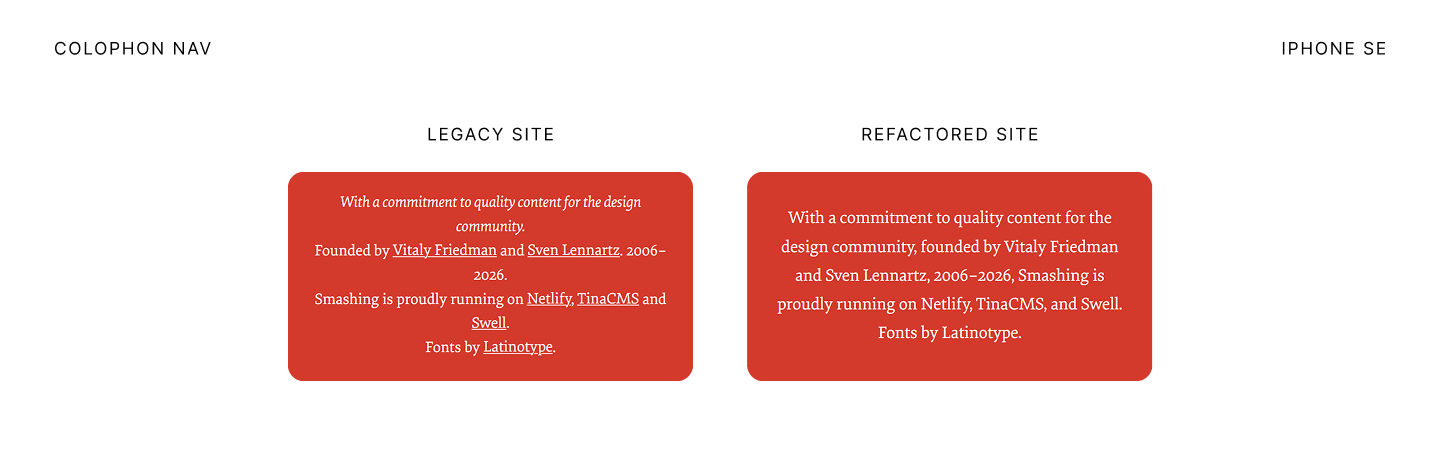
Comparing the Colophon Navigation of the Legacy Site vs the Refactored Site in iPad Mini
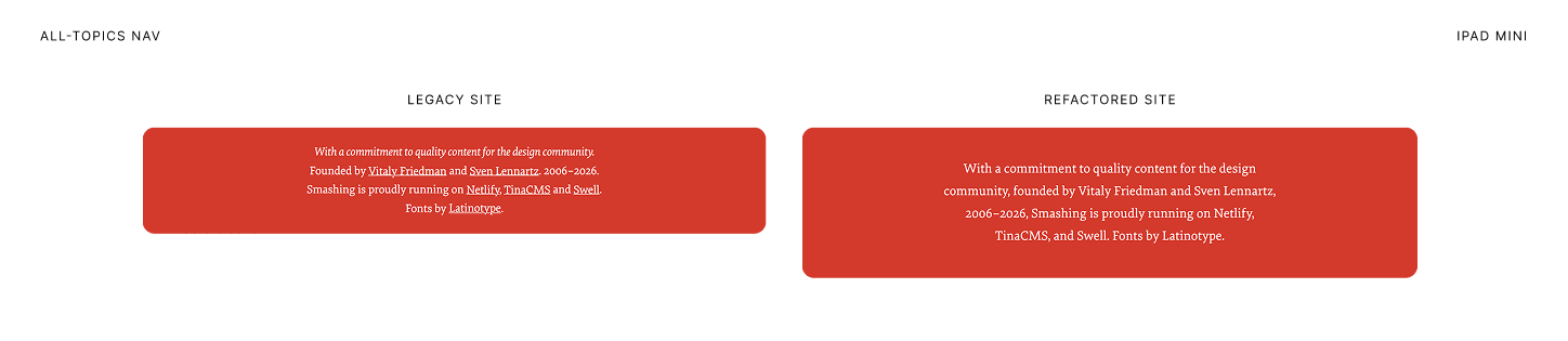
Business
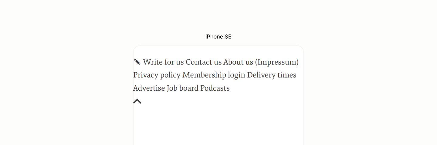
Reset of the Business Navigation Landmark.
Business Nav is in flow, links are in line and wraps to the next line when needed.
To space them, the block for the set of links maintains the flow direction with a horizontal flex that wraps. 15.1
Now, it can use a gap of 0.5rlh to separate these links. 15.2
Also, justify the content to the center. 15.3
Same padding on the Colophon applies here, for the similar reasons. 15.4
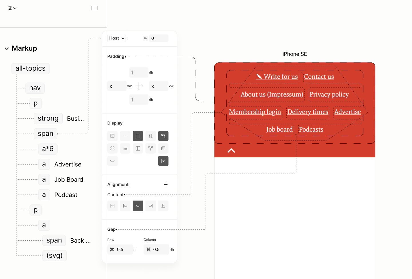
Laying out the set of links
As for the graphic content of the Top Link, its size, 3em, is set at its block via tokens, so the background illustrations, which will be inserted via the block's background, can use it for positioning. 15.5
To make the link fit the graphic within, without extraneous inline spaces, it takes on a flex display model. 15.6
A padding keeps the link away from the edges of the viewport, as well as from the set of links above it. 15.7
To move the link from its natural left position to the right of the viewport, it takes a justification of content to the end on its parent, but, first, a horizontal flow layout. 15.8
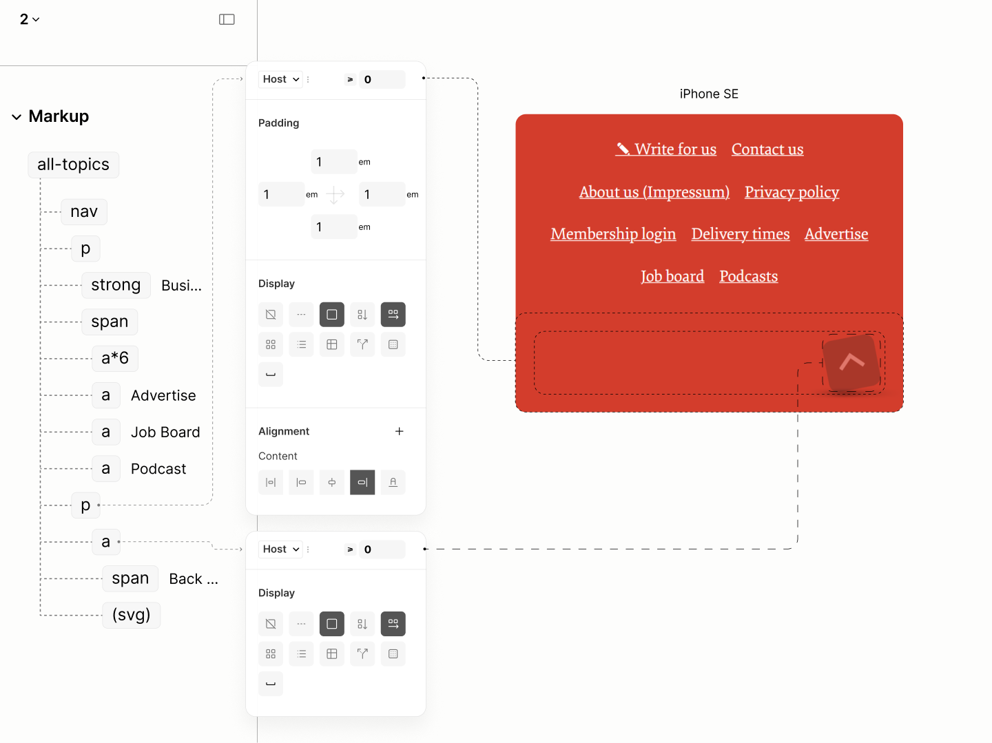
Layout of the Top-Link.
The block containing the Top-Link introduces the illustrations as background images, with 8em height, aligning its base to that of the Top-Link. 15.9
To ensure it's not cropped off, to ensure there's enough containing space, the padding top is overidden with 6em: 1em for the initial padding plus 5em, the addition required to 3em size of the Top-Link's graphic, a total of 8em, the background height. 15.10
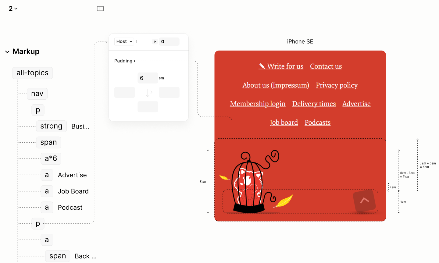
Reset of the Business Navigation Landmark.
That completes the design for this landmark before the first breakpoint.
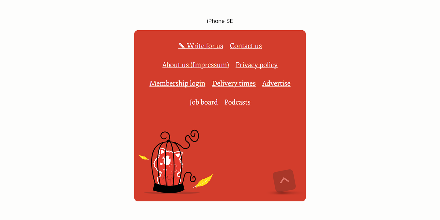
Final state of this component in iPhone SE, before the first breakpoint.
Comparing the Business Navigation of the Legacy Site vs the Refactored Site in iPhone SE
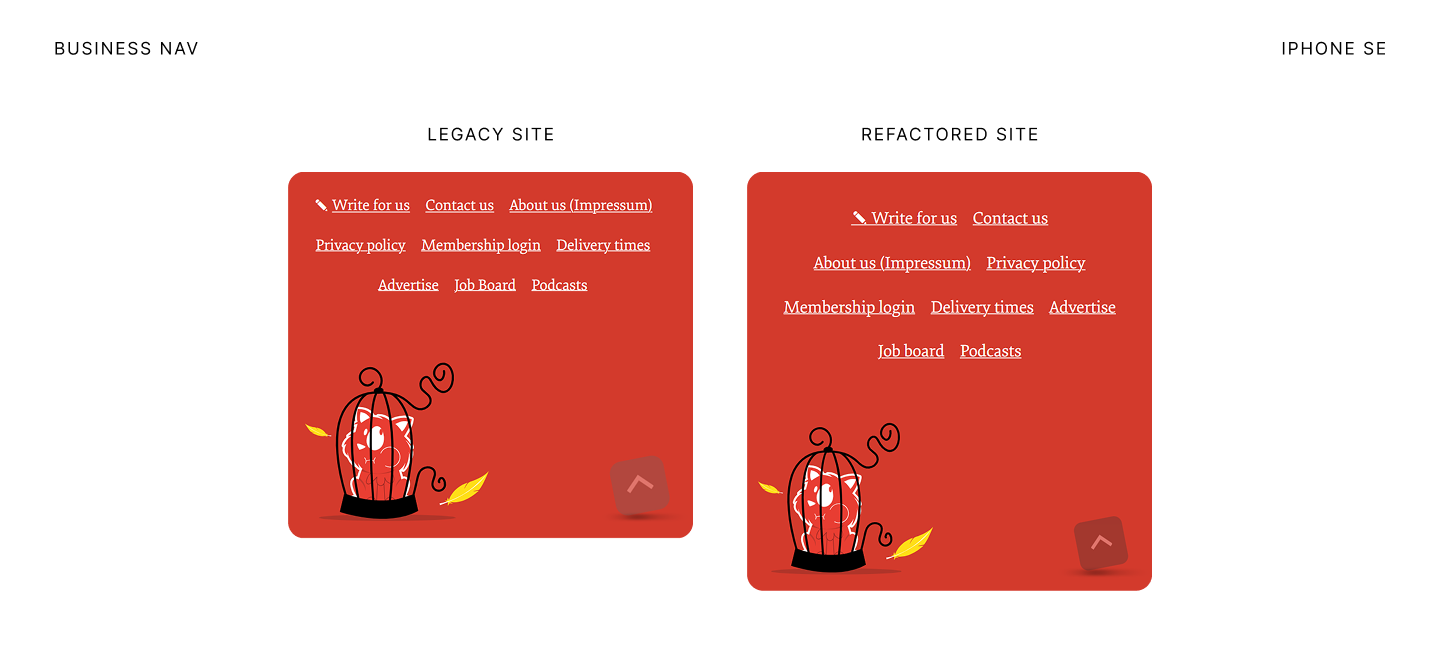
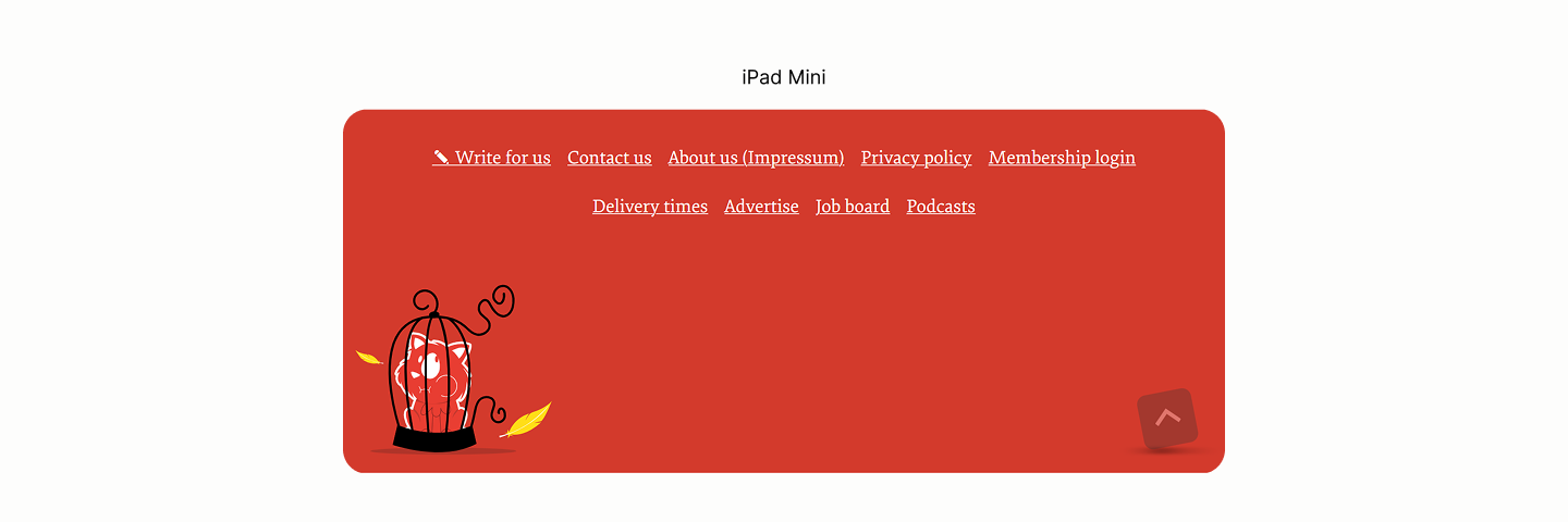
State after the first breakpoint
After the first breakpoint, the space between the left illustration and the Top-Link has grown wider, enough to fit it the the Link Set above it in two steps.
-
The Content containing the Link Set must have a max width that is less than the space between the two targets, and an auto horizontal margin to keep it in the center. 15.11
-
The Block for the Top-Link pulls the Link Set with a top margin of negative 8em, that 8em. 15.12
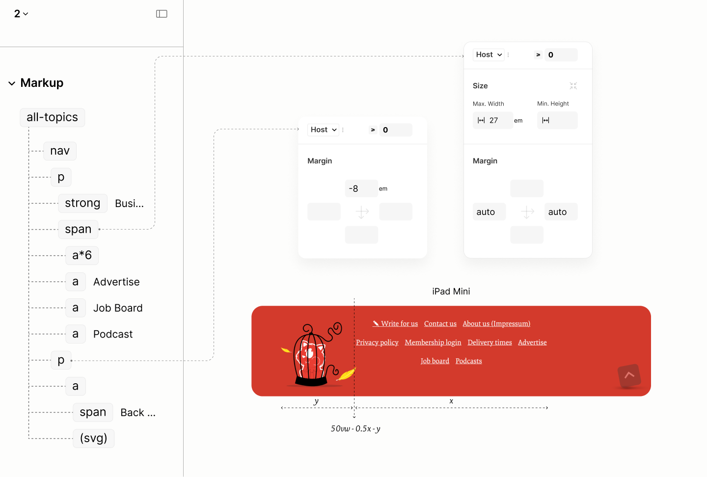
Positioning the Link Set within the Block for Top-Link
That stables the landmark untill the second breakpoint.

State in iPad Mini, before the second breakpoint.
Comparing the Business Navigation of the Legacy Site vs the Refactored Site in iPad Mini
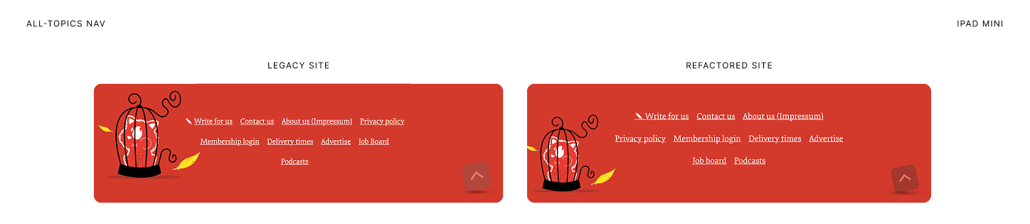

State of this landmark after the second breakpoint.
As the viewport go wider, another illustation is brought in to fill in space that has crept in. 15.13 
Comparing the Business Navigation of the Legacy Site vs the Refactored Site in Surface Pro 7